Skeleton Screens: Faster by Faking It
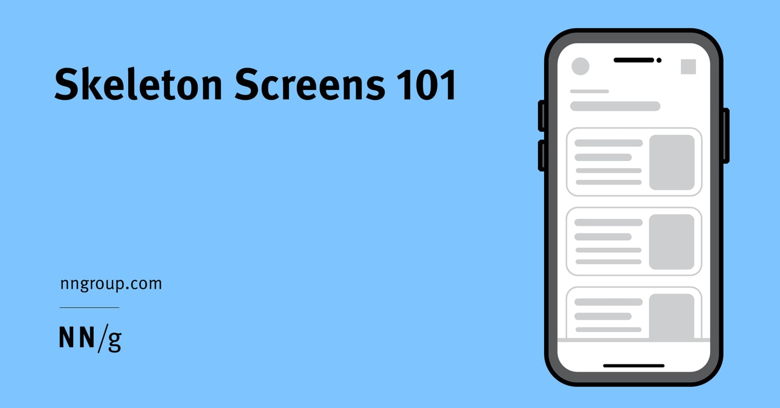
Skeleton screens create the illusion of speed by showing a wireframe-like preview of a page while content loads. They're used for full-page loads to set expectations about the layout. The footgun is showing just the app frame, which gives no structure.
Why it exists
Users perceive blank screens during page loads as broken or slow, often leading them to abandon the site. Skeleton screens were invented to manage this perception of waiting by providing immediate visual feedback that is more informative than a generic spinner.
The mental model
A skeleton screen is a wireframe placeholder that appears instantly. Instead of an indeterminate loading animation, the user sees a low-fidelity preview of the page's layout—gray boxes where images, titles, and text will eventually appear. This gives a sense of progress and structure, making the wait feel productive.
How it works
When a user requests a page, the application immediately renders a static layout composed of simple shapes, usually light gray boxes. These shapes mimic the final page's structure: large squares for images, long rectangles for headlines, and smaller lines for body text. As the actual content loads from the server, it replaces this visual scaffolding. Some skeletons add a subtle shimmer or pulse animation to signal that the system is still working, but the core value is the layout preview.
When to use it
Use skeleton screens for full-page loads or when loading significant, predictable content areas. They excel at helping users anticipate the page's layout, focus on where content will appear, and perceive the load time as shorter than it actually is. This is especially effective in content-heavy apps like news feeds or dashboards.
When not to use it
Avoid skeleton screens for very fast operations (under a few hundred milliseconds), as they may just flash on the screen and create a jarring effect. The main anti-pattern is the "frame-display" skeleton, which only shows the application's header and footer. This style provides no structural information and is no better than a generic spinner, potentially confusing users into thinking the page is broken.
One canonical example
Headspace uses a static skeleton screen effectively. When loading a new section, it displays gray boxes that clearly map to the final layout. A thick gray line at the top represents the page title, a smaller line indicates descriptive text, and a series of cards with placeholders for an image, title, and text shows the user exactly what kind of content to expect and how it will be organized.
Interview question
What is the primary advantage of implementing a skeleton screen compared to a simple loading spinner?
- a.It instantly displays the application's main navigation and branding elements.
- b.It provides users with an immediate, structured preview of the page's upcoming layout.Correct
- c.It significantly decreases the server response time for content delivery.
- d.It allows for partial content rendering, showing text before images are fully loaded.
Why? this is the answer
The card states skeleton screens provide a 'low-fidelity preview of the page's layout' to give a 'sense of progress and structure,' which helps users anticipate content. Option A describes the 'frame-display' anti-pattern, which the card explicitly warns against as it offers no structural information.
Just read this? Test yourself on what you have been reading.
Read the original → nngroup.com
You just looked this up. Could you explain it out loud?
That is the part interviews actually test. Tezvyn takes questions like this one and gives you what the interviewer is really checking, the answer that lands, and the mistake that ends the conversation, in the four minutes before your next meeting.
The iPhone app is on the way
We are building it. Until it lands, nothing here is held back from you: every interview card, your saved cards, streaks and the job board all work in Safari, plus hundreds of free practice quizzes of thirty questions each. Sign in and it all carries over to the app the day it arrives.
Want it as an icon? Tap Share at the bottom of Safari, then Add to Home Screen. It opens full screen and the cards you have read stay available offline.
We are hiring for this. Open roles that interview on design systems — each one lists the topics its interview covers.
See open roles