Visual Hierarchy: Guiding the User's Eye
Visual hierarchy guides the user's eye by making important things look important. It uses contrast in size, color, and placement to create a path of importance, like a big headline versus small footer text.

Nielsen's 10 Heuristics: Rules of Thumb for UI Design
Nielsen's Heuristics are ten rules of thumb for evaluating if a design is user-friendly. Use them to spot usability issues in any interface, from apps to stovetops. The biggest mistake is treating them as strict laws, not flexible guidelines.

Design Token Transformation: One Source for All Platforms
A design token standard is a universal adapter for your style. It defines properties like color in a standard JSON format, which tools then transform into platform-specific code for iOS, Android, and web. The footgun is building bespoke transformation logic.

Reduce Time-to-Market with a Design System
A design system is a shared toolkit of pre-built UI components, not just a style guide. It lets teams build interfaces from a library of pre-coded parts, drastically cutting repetitive work. The footgun is treating it as a static document, not a living system.

A Design System Newsletter: Make Invisible Work Visible
A design system newsletter makes your team's invisible infrastructure work visible. Use it to announce component updates and share challenges, keeping stakeholders engaged.
Form Layout Best Practices
Guide users with a clear visual path, not a maze. A single-column layout with consistent spacing creates a streamlined data entry experience. Use it for everything from contact forms to complex UIs.
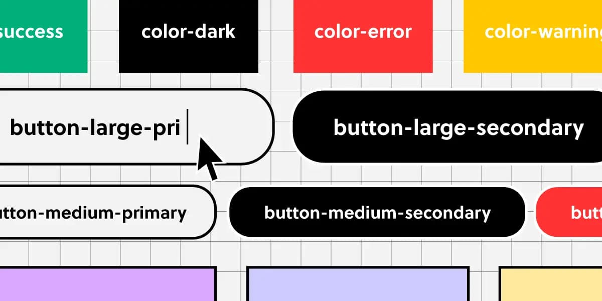
Component Naming: A Shared Language for UI
Think of naming conventions as a shared dictionary for your team. A name like `ButtonPrimary` should mean the same thing in Figma and in code, ensuring consistency.

Conversational Component Model: Building Blocks for Voice UI
Think of conversational components as LEGO bricks for dialogue. You assemble standard pieces like questions, confirmations, and apologies to build a natural flow for voice assistants or chatbots.

Design System Pilots: Test Your System Before You Ship It
A design system pilot is like a TV pilot: you test your system's core ideas on a real product before a full v1 launch. Use it to battle-test components and find the 20% of work that solves 80% of problems.
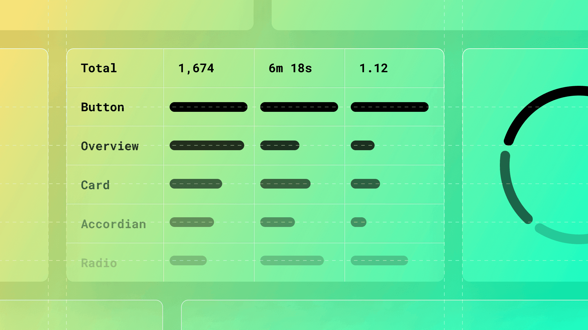
Measuring Documentation Effectiveness
Treat your design system docs like a product, not a library. Use analytics on page views, search queries, and user feedback to find confusing components and content gaps. The footgun: high traffic can signal a confusing page, not just a popular one.

Empty State Pattern: More Than Just a Blank Page
An empty state turns a blank screen into a helpful guide, showing users what's possible and how to get there. It's crucial for first-time use, 'no results' searches, or after data deletion. The footgun is treating it as an afterthought, leaving users stuck.
Semantic Colors: Naming a Color's Job, Not Its Value
Semantic colors name a color's purpose (e.g., `color-background-interactive`) instead of its value (`#007BFF`). This simplifies theming, like light/dark mode, by mapping roles to specific primitive colors, ensuring a consistent UI across an application.
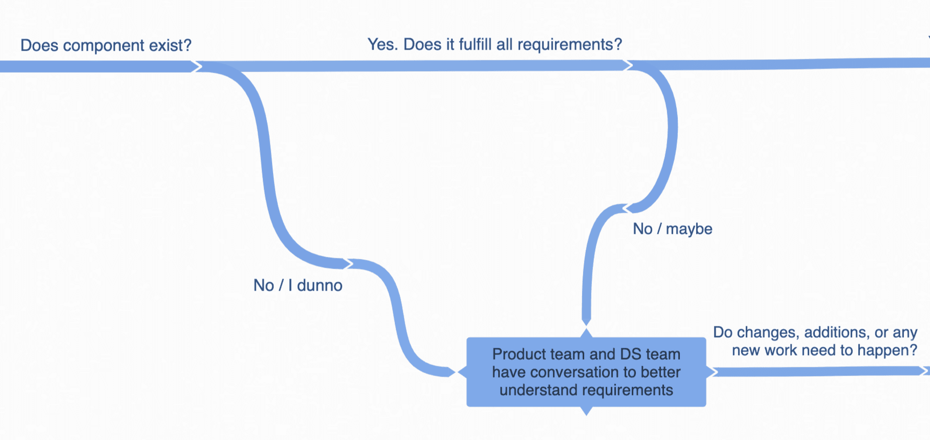
Design System Governance: A Process for Evolution
Design system governance is a process for when components don't meet a team's needs. It guides teams on whether to create a one-off "snowflake" or contribute a new component back to the system. The footgun is letting teams "find a way," leading to chaos.
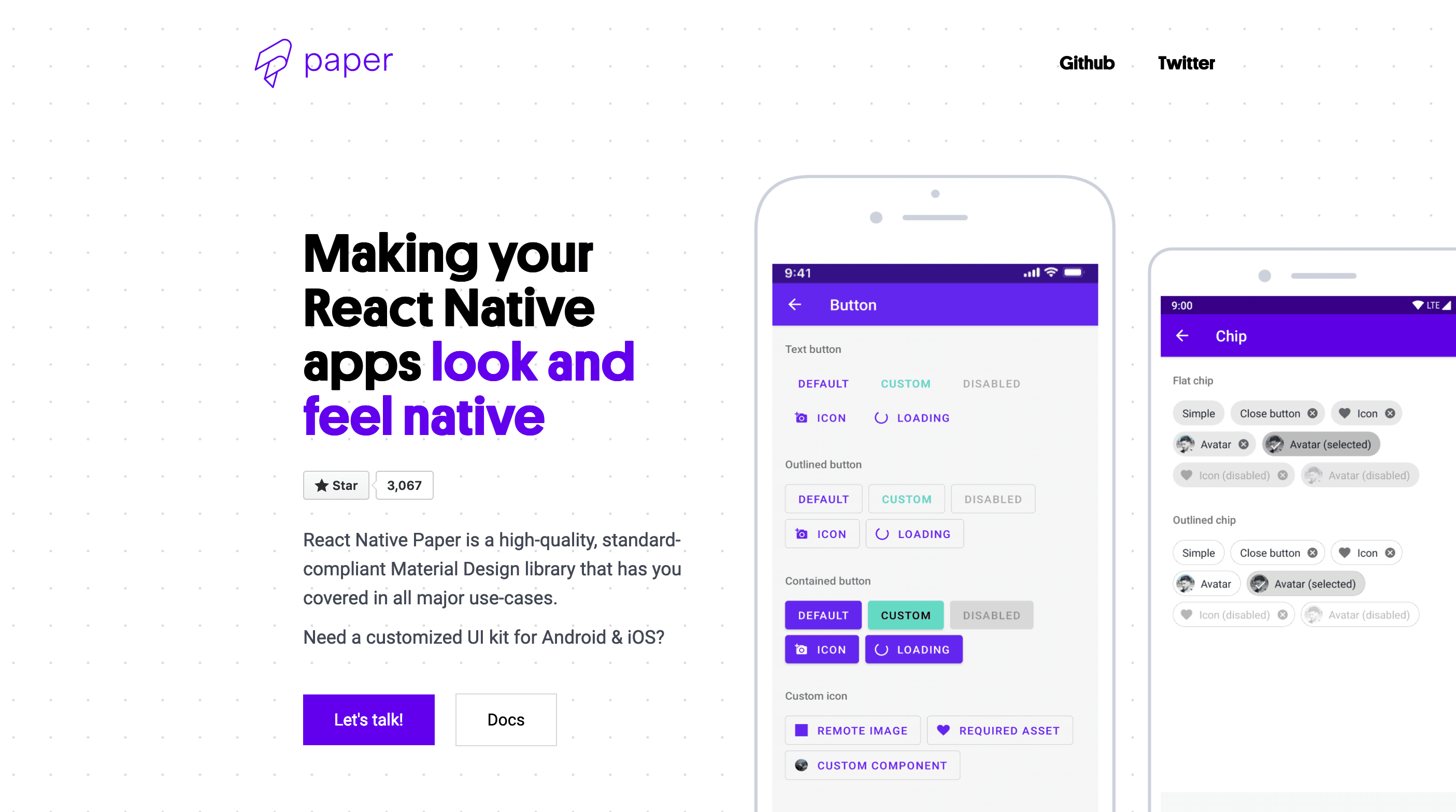
Using Component Libraries in React Native
A component library is a pre-fab UI kit for your app. Instead of building every button from scratch, you get polished, ready-to-use pieces that handle platform-specific animations and accessibility.

VUI Design: Making Computers Talk Like People
Think of VUI design as scripting a helpful human conversation, not just a command-line interface with a voice. It's key for voice assistants and smart speakers. The footgun is ignoring persona; if you don't design one, you'll get 'boring' by default.

Theming with CSS data-* Attributes
Think of `data-` attributes as labels for UI state, like `data-theme='dark'`. CSS uses attribute selectors (`[data-theme='dark']`) to apply styles directly, avoiding complex class logic.
CSS `color-scheme`: Opting Into Browser UI Themes
The `color-scheme` property tells the browser your site supports light/dark modes, automatically styling UI like scrollbars and form controls to match the user's OS preference.
Dynamic Theme Switching with CSS
Let your app's theme automatically follow the user's OS setting. CSS's `prefers-color-scheme` media query lets you define styles for light and dark modes. The footgun is forgetting the 'no-preference' state, which can result in an unstyled default.
White-Label UI: Design Once, Rebrand Infinitely
White-label UI is like a WordPress theme for your product: a single design that other companies can rebrand. It lets agencies serve multiple clients without rebuilding the UI from scratch.
Theme Object: Your Design System's Single Source of Truth
A theme object is a central dictionary for your UI's design tokens, like colors and font sizes. It ensures consistency across components by providing a single, shared source for styling values.