
The Design Critique: Improving Work with Focused Feedback
A design critique is a structured conversation to measure a design against its goals, not a session for subjective opinions. It helps get early feedback on feasibility or catch inconsistencies.

Usability Testing: Watch Real Users, Not Just Experts
Usability testing evaluates a product by observing real, first-time users interact with it, revealing flaws that designers often miss. It's used to validate design intuitiveness before launch.
Automated Design Linting: Your Design System's Spellchecker
Design linting is like a spellchecker for your UI, automatically flagging inconsistencies against your design system. It catches missing styles or wrong colors before handoff, ensuring consistency. The footgun: a 'clean' file isn't necessarily a good design.

Designing for Reduced Motion
Treat UI animations as an enhancement some users must disable for comfort. The `prefers-reduced-motion` media query lets you respect system-level accessibility settings, preventing vestibular triggers.

Screen Readers: Designing for a Non-Visual UI
A screen reader navigates your UI's invisible DOM structure, not its visual layout. Think of it as a text adventure where headings are rooms and links are doors. This is essential for all web UIs, checked via alt text and keyboard focus.

Accessible Form Design: A Conversation, Not an Interrogation
Think of a form not as a data bucket, but a structured conversation. Every field is a question needing a clear prompt. This is vital for logins and checkouts, especially for users with screen readers. The footgun: using placeholder text as a label.
Semantic HTML: Use the Right Element for the Job
Think of HTML tags as pre-built components, not just style containers. Using `<button>` instead of a styled `<div>` gives you keyboard navigation and screen reader support for free. The biggest mistake is using generic `<div>`s for interactive elements.
Alt Text: Giving Images a Voice for Everyone
Alt text gives an image a voice when it can't be seen. It's read by screen readers for accessibility and displayed if an image breaks. The footgun is writing "image of..." or leaving it blank; instead, describe the image's content and purpose.
Measuring Design System ROI: From Cost to Investment
Frame a design system not as a cost but as a force multiplier for your team's time. Calculate its ROI to show management how much money reusable components and clear standards will save.
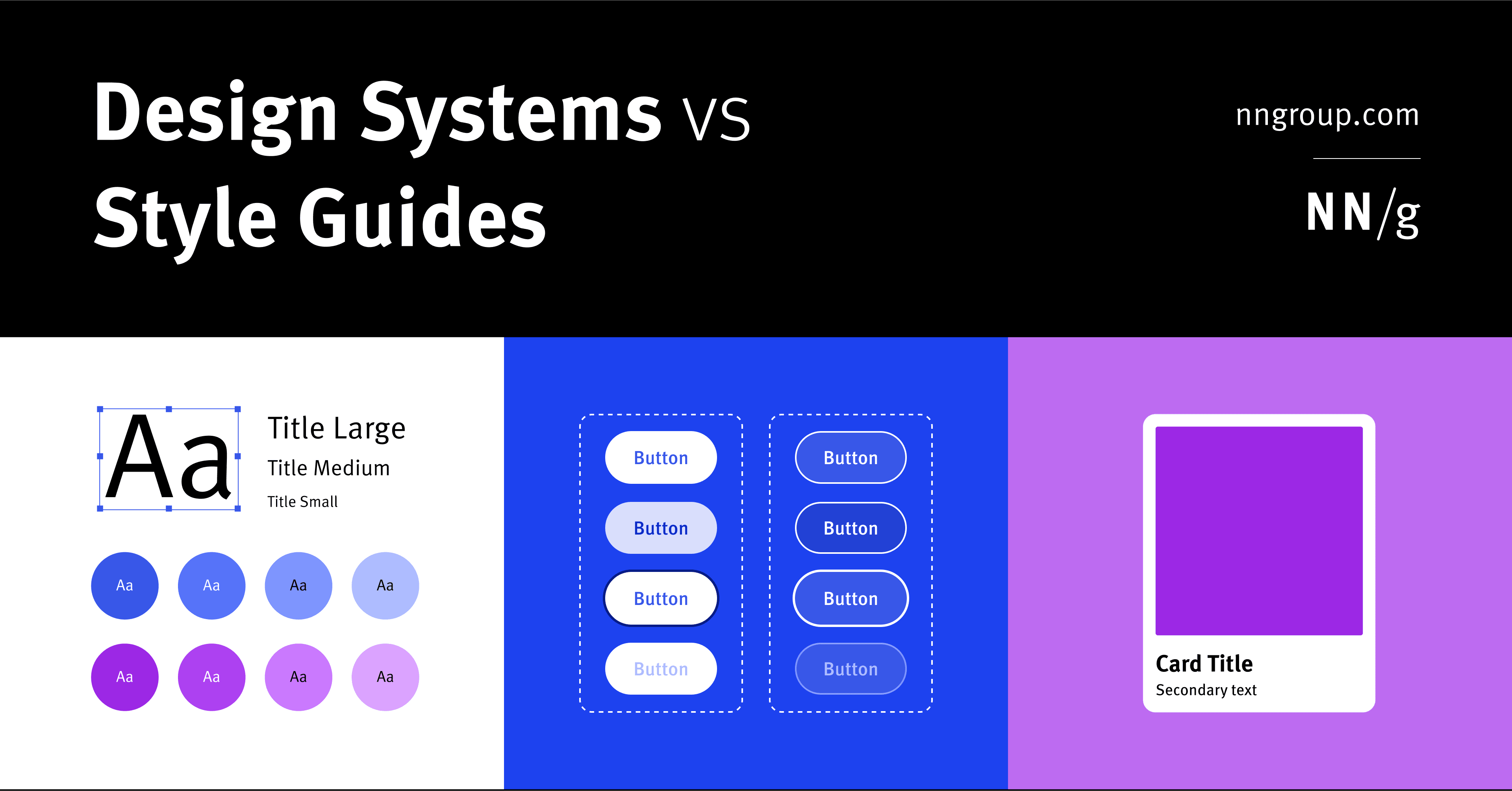
Design System vs. Style Guide: The Parent and the Child
A Design System is the parent; a Style Guide is just one child. The system is a complete toolkit for building products, containing reusable components and code, used by large teams to maintain consistency.
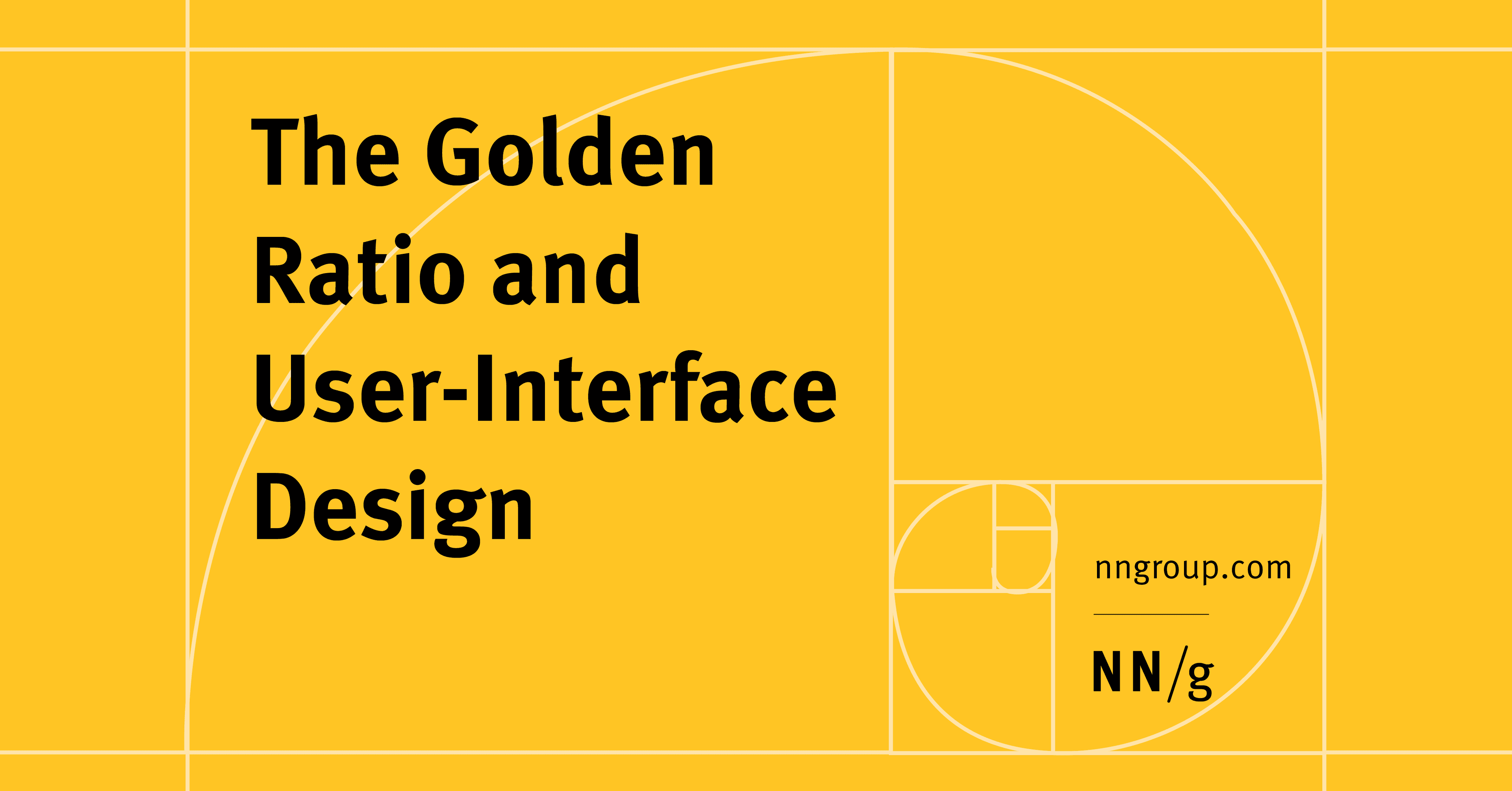
The Golden Ratio in UI Design
The Golden Ratio (1.618) is a proportion from art and nature used to create visually harmonious UI. Apply it to set layout dimensions or create a typographic scale (e.g., a 26px header for 16px body text).
Modular Grid: Organizing UI with Cells, Not Just Columns
Think of a modular grid as spreadsheet cells for your UI. It extends a column grid with horizontal rows, creating a matrix of modules. It's ideal for repeating items like product cards or dashboard widgets.

Focal Point: You Can't Emphasize Everything
A focal point guides the user's eye by making one element dominant. To make something stand out, other elements must fade into the background. Use it to draw attention to a call-to-action or headline. The footgun is trying to emphasize everything at once.

Semantic Naming for Design Tokens
Don't name a token by its value (`blue-500`); name it by its job (`color.action.primary`). This decouples design intent from implementation, making systems scalable. It's key for theming and avoiding "lie" variables when designs change.
.png&w=3840&q=75)
Icon System Design: Build Once, Use Everywhere
Treat icons as reusable building blocks, not one-off graphics. A systematic setup in Figma ensures consistency and speeds up your entire design process. The footgun is skipping standardization, which creates tedious overrides and visual debt later on.
SVG: Code-Based, Infinitely Scalable Graphics
Think of SVG as HTML for graphics. It's an XML file with drawing instructions, not pixels, so images scale perfectly. It's ideal for logos and icons on responsive sites. The footgun: SVGs can contain JavaScript, posing a security risk (XSS) if not sanitized.

Rule of Thirds: Guide the Eye, Don't Just Center
Don't center your subject; place key elements along the lines or intersections of a 3x3 grid. This creates a more dynamic, visually interesting composition in photos and UI layouts. The footgun is treating it as a rigid law; sometimes centering is better.
RGB vs. HSL: Two Ways to Tell a Computer 'Color'
RGB tells a computer how to mix light (Red, Green, Blue), while HSL describes color how humans perceive it (Hue, Saturation, Lightness). Use RGB for brand colors and HSL for intuitive variations. The footgun is creating low-contrast UIs that are unreadable.

Cognitive Load: Don't Make Users Think (Too Hard)
Think of a user's brain like a computer with limited RAM; cognitive load is the processing power your UI demands. High load from cluttered interfaces slows users down, causing them to miss details or abandon tasks.

Jakob's Law: Don't Reinvent the UI Wheel
Users spend most of their time on other sites, so they expect yours to work like everything else they already know. Leverage familiar patterns for navigation, icons, and workflows.