
Automated Prop Docs with Storybook Autodocs
Treat your component stories as the single source of truth for documentation. Storybook's `autodocs` reads your code to generate interactive docs automatically. It's used in design systems to prevent stale docs. The footgun: sparse types yield sparse docs.

Writing Accessibility Docs for Your Components
Accessibility docs are the user manual for your component's a11y features. They guide consumers on correct usage, like required ARIA attributes or keyboard behavior.

Design System Changelogs: For Humans, Not Machines
A design system changelog translates code changes into human-readable impact. It's a curated notice for consumers—not a raw git log. It's essential for communicating new components, token updates, and breaking changes so teams can adopt updates safely.
Design System Onboarding: The Welcome Mat
Design system onboarding is a welcome mat, not a full manual. It orients new users by explaining the system's purpose and scope, then routes designers to interactive guides and engineers to implementation docs. The footgun is information overload.
The Slot Pattern: Making UI Components Composable
The Slot Pattern makes components flexible by defining areas for custom content, like a picture frame for your UI. It's used in Cards or Modals to allow varied content in a consistent frame. The footgun is that too much flexibility can break consistency.

Wizard/Stepper Pattern: Guide Users Through Complex Tasks
A wizard or stepper pattern is like a recipe for a complex task, breaking a long process into numbered, manageable steps. It's ideal for multi-stage forms like onboarding or checkout flows.
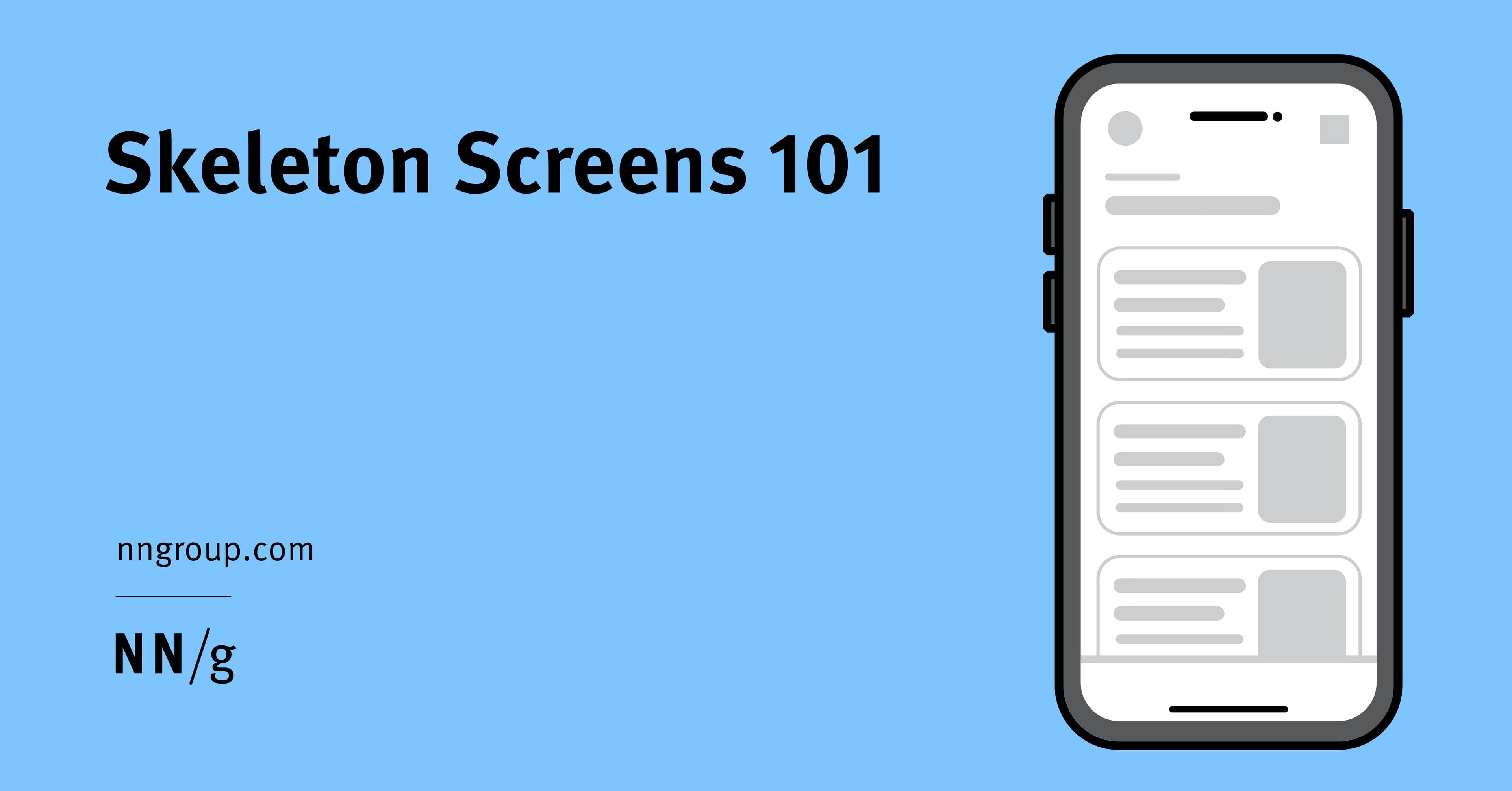
Skeleton Screens: Faster by Faking It
Skeleton screens create the illusion of speed by showing a wireframe-like preview of a page while content loads. They're used for full-page loads to set expectations about the layout. The footgun is showing just the app frame, which gives no structure.
Header Components: An Exception to Reusability
Treat your site header as a unique beast, not a reusable component. Its complexity—managing branding, responsive navigation, and sticky positioning—makes abstraction brittle. The footgun is reusing the entire header instead of just its internal components.
Modal Dialogs: The Focus Trap Pattern
A modal dialog is a "focus trap" that overlays the UI, forcing a user to complete a task. It's used for critical confirmations or focused inputs, like a date picker. The main footgun is failing to trap keyboard focus, letting users tab into the inert.

Style Encapsulation with Shadow DOM
Shadow DOM creates a private DOM tree for a component, acting like a one-way mirror for CSS. This prevents style collisions in complex UIs, ensuring a button's CSS doesn't break a header.
Component-Driven Development: Build UIs Bottom-Up
Component-Driven Development (CDD) builds UIs bottom-up, like assembling a car from its engine and wheels. It's used to manage complex UIs by creating small, independent components first. The footgun is building components too coupled to app-specific logic.

Controlled vs. Uncontrolled Components
A controlled component is a puppet; its parent pulls the strings via props. An uncontrolled one manages its own state. This pattern is key for coordinating siblings, like ensuring only one panel in an accordion is open.
Component Variants: One Component, Many Forms
Component variants are like Lego bricks for your UI: one block can build many things. Instead of creating a unique component for every button state or size, you define properties to manage its variations.
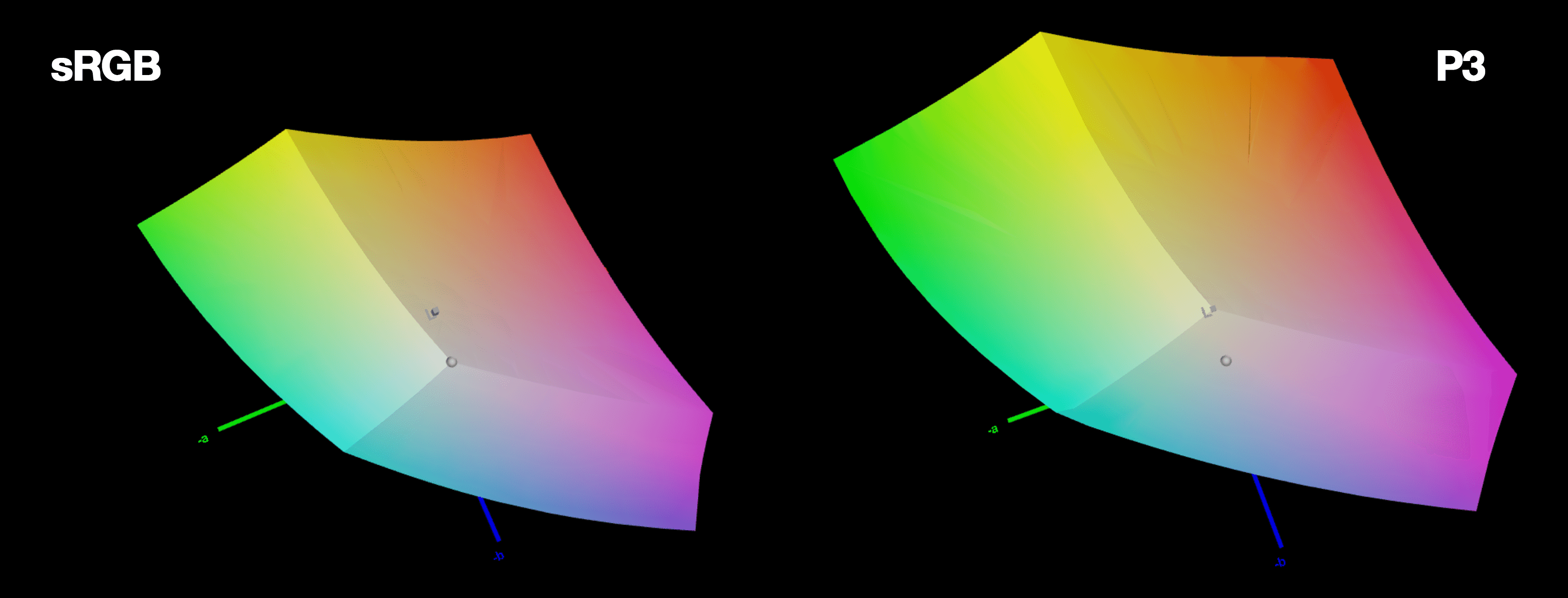
LCH Color: More Vivid, Predictable UI Colors
LCH is a color space that aligns with human perception. It fixes HSL's broken lightness and unlocks 50% more vivid colors on modern screens. The footgun: LCH hue angles don't match HSL's; 0° is magenta, not red, so you can't just swap them.
CSS clamp(): Fluid Sizing Without Media Queries
CSS clamp() sets guardrails for a value, letting it scale fluidly but never going outside a min/max bound. It's ideal for responsive typography, allowing font-size to grow with the viewport. The footgun: the preferred value is ignored at extreme screen sizes.

Vertical Rhythm: A Formula for Consistent Spacing
Vertical rhythm is a system for consistent spacing derived from your body text's line height. Use this calculated unit between all elements—paragraphs, lists, and after headings—to create harmony.

Spacing Scales: Using Multiples for Consistent UI
A spacing scale builds consistent UI layouts from a limited set of values, usually multiples of a base unit like 8px. It's used for everything from button padding to page gaps. The footgun is using arbitrary pixel values, which breaks the system's rhythm.

Typographic Scale: A System for Consistent Text
A typographic scale is a predefined set of font sizes and line heights that creates visual harmony. Design systems use it for consistent, readable text across devices. The footgun is adding one-off font sizes, which breaks the system's rhythm and consistency.
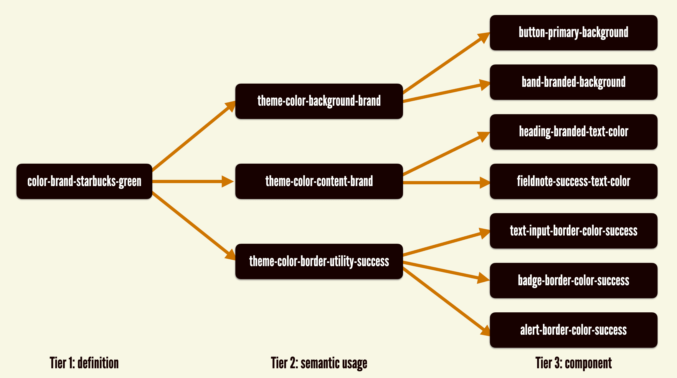
Theming: One Design System, Many Visual Styles
Theming lets one component library wear many visual styles, like skins on a character. You can support multiple brands or dark/light modes by swapping design tokens instead of rebuilding components.
Design Systems: From UI Kits to Business Infrastructure
A design system is business infrastructure, not just a UI kit. It translates brand consistency into measurable ROI by reducing costs and accelerating delivery.