All bites
The whole library, newest first. Filter by what you are here for, or pick a topic if you already know.
4330 bites
Page 114
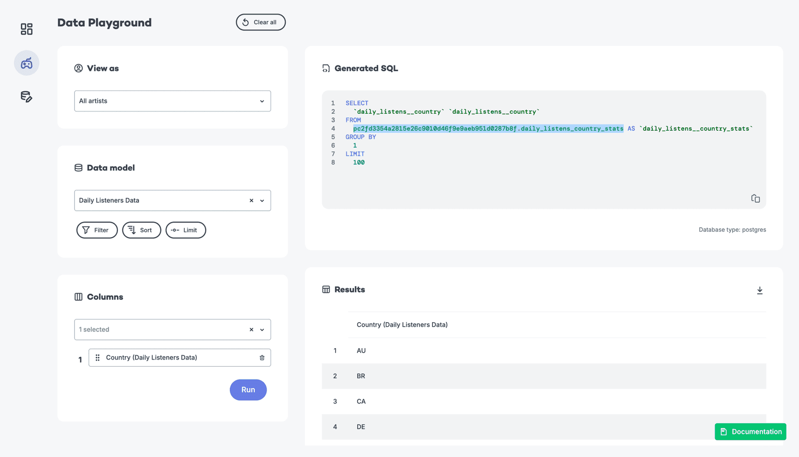
Trade-offs: Pre-aggregation vs. Querying Raw Data
Tests your grasp of data system trade-offs. A great answer weighs pre-aggregation (fast, cheap, stale) against querying raw data (slow, costly, fresh, flexible) and proposes a hybrid solution. A red flag is declaring one method universally superior.
Trade-offs: Pre-aggregation vs. querying raw event data
This tests your grasp of data engineering trade-offs for analytics dashboards. A great answer contrasts pre-aggregation (fast, cheap, stale) with on-the-fly queries (slow, costly, fresh) and mentions hybrid solutions.
What are the challenges of grouping by a high-cardinality dimension?
Tests columnar storage internals and query engine scalability. A strong answer covers memory pressure from giant hash tables, destroyed compression ratios, and massive result-set overhead.
Challenges of Grouping by High-Cardinality Dimensions
This tests your grasp of system-level impacts of data shape. A good answer explains how high cardinality strains memory during aggregation, reduces compression, and inflates index size, leading to slow, expensive queries. A red flag is just saying 'it's slow'.
Challenges of Grouping by a High-Cardinality Dimension
This tests your grasp of how data shape impacts system resources. A great answer explains that high cardinality explodes memory usage for aggregation state, increases CPU load, and hurts storage compression.

How do you manage event schema evolution without breaking reports?
Backward-compatible serialization, nullable new fields, raw versus modeled layers, versioned schemas, and consumer alerts.
How do you manage schema evolution in an analytics pipeline?
This tests your grasp of data as a contract. A great answer covers schema registries, backward compatibility, and a phased rollout from producer to warehouse. A red flag is only mentioning an ALTER TABLE command, ignoring the entire data pipeline.
How do you manage an event schema change?
This tests your understanding of data contracts and backward compatibility. A great answer details a phased, backward-compatible rollout (add nullable field), starting with consumers (warehouse) then producers, and mentions using a schema registry for…

When is a pie or donut chart appropriate?
Tests judgment of part-to-whole encoding. Answer: use for few categories with clear dominance, cite a share scenario like device traffic, and name angle-comparison difficulty and 3D distortion as pitfalls.
When is a pie chart an appropriate visualization?
Tests your grasp of data viz principles for part-to-whole data. A good answer defines this use case (e.g., market share), then lists pitfalls like too many slices or comparing multiple pies. A red flag is defending pie charts for complex data.
When is a pie chart an appropriate choice for visualization?
Tests data viz principles for part-to-whole data. A good answer defines this use case, gives a clear example (market share), and lists pitfalls like too many slices or similar values. A red flag is defending them for complex data or time-series analysis.
Compare five companies' market share: bar or line chart?
This tests categorical vs. temporal encoding. Pick a bar chart because companies are discrete categories, not a time series; line charts falsely imply sequence or trend. Calling a line chart acceptable is a red flag.
Bar Chart vs. Line Chart for Market Share Comparison?
This tests your grasp of visualization fundamentals for categorical vs. time-series data. A bar chart is correct for comparing discrete categories (companies) at one point in time. A line chart wrongly implies a trend. Red flag: justifying a line chart.
Bar Chart vs. Line Chart for Market Share Comparison?
Tests basic chart selection: comparing static categories vs. showing trends. A bar chart is correct for comparing discrete companies at one point in time. A line chart wrongly implies a time-series relationship. Red flag: choosing a line or pie chart.

How would you structure a user engagement dashboard for PMs?
Tests narrative sequencing of metrics across abstraction layers. Strong answer: DAU headline for health, retention cohorts for pattern diagnosis, feature adoption funnels for root-cause drill-down.
How would you design a product management dashboard?
This tests your ability to structure data hierarchically for a specific persona (PM). A great answer outlines a 3-tier structure: summary KPIs, trend analysis, and drill-downs. A red flag is listing charts without explaining how they guide PM decisions.
How would you design a product management dashboard?
Tests your ability to structure data into a decision-making narrative. A good answer moves from a high-level summary (DAU) to trends (retention) and then actionable details (feature adoption). A red flag is simply listing charts without a narrative connection.
Stakeholder claims feature usage drives retention. How do you validate?
Probe confounders, reverse causality, selection bias; propose diff-in-diff or propensity scores; plot lagged usage vs retention.
Stakeholder claims correlation implies causation. How do you investigate?
This tests your scientific rigor beyond the simple "correlation isn't causation" mantra. Acknowledge the finding, probe for confounding variables, suggest cohort analysis, and propose an A/B test. A red flag is reciting the mantra without a concrete plan.
Feature A correlates with retention. Should we invest more?
Tests your ability to move beyond clichés to propose concrete analysis. A great answer questions the correlation, suggests cohort analysis or A/B testing, and probes for confounding variables. Red flag: just saying 'correlation isn't causation' with no plan.