All bites
The whole library, newest first. Filter by what you are here for, or pick a topic if you already know.
8664 bites
Page 56

Objection Handling: Turning Customer 'No's into Trust
Objection handling turns customer feedback into trust, even when you say 'no.' Instead of just rejecting a feature request, you explain the 'why' behind your roadmap.
Keeping a level playing field for partners
First-party consumes the same public APIs, equal rate limits and data access, technical walls against privileged data, transparent changes.
Product Vision: The User's Future, Not Yours
A product vision is a shared picture of the future your product creates for users, not a feature list. It aligns distributed teams when data is ambiguous. Teams often mistake it for a mission statement or roadmap, producing vague slogans, not a useful filter.
Making the case for reliability over a risky feature
Quantify reliability cost in churn and revenue, show the feature's risk to existing customers, propose a sequenced path.
Vision Storytelling: Turn Roadmaps Into Shared Futures
Vision storytelling makes strategy tangible by narrating the future your team is building. Use it when roadmaps explain what but not why. The footgun is confusing slogans for stories; without a user, conflict, and resolution, you get branding, not alignment.
Now-Next-Later Roadmaps: Commitment Over Calendar Dates
Now-Next-Later buckets work by commitment, not dates, keeping priorities visible without false precision. Use it when teams need alignment more than Gantt charts. The fatal mistake is letting stakeholders map buckets to quarters, recreating the deadline trap.
Sales-Led Growth: High-Touch Revenue Motion
Sales-led growth uses human reps as the primary engine, not self-serve signup. It fits complex, high-price products with procurement hurdles. The footgun is hiring sellers before repeatable messaging exists, burning cash on custom pitches that never scale.
Three Horizons: Core, Growth, Future
Three Horizons splits energy across core defense, scaling winners, future bets at once. Use it when your roadmap is only incremental tweaks with no long-term bets. The footgun is seeing horizons as sequential stages, not parallel portfolios needing fuel today.
The Platform Chicken-and-Egg Trap
A platform is worthless until both sides show up, yet neither arrives first without the other. Marketplaces and payment networks face this coordination trap. Growing both sides at once starves the platform because neither reaches critical mass.
Minto Pyramid Principle: Answer First
Start with the answer, then stack the proof beneath it. Use it when executives will cut you off if you don't reach the point in 30 seconds. The footgun is messy buckets: overlapping supporting arguments collapse the pyramid and make correct answers look…
Shopify's 0% to 100% Fix: Design Dialects Over Rigidity
Shopify Polaris hit 0% completion for gloved warehouse pickers until a dialect with 90px targets and dark UI hit 100%, cutting onboarding from three weeks to one shift. Atlassian formalized this into a three-tier Flexibility Framework. Rigid systems break.
Vienna Circle Café Culture Holds Web Civility Lessons
Vienna Circle's 1928-34 meetings kept Gödel and Wittgenstein productive despite vicious feuds. Leader Moritz Schlick and lingering-friendly cafés turned conflict into collaboration.
8 Free Personas Spot Accessibility Issues in Design
8 free accessibility personas shift designer burden from memorizing WCAG to recognizing exclusion during work. Applying Nielsen's heuristic #6 to creators means fewer bad websites from good designers. Add them to your design critiques this sprint.
What is a design system's purpose and how does it enforce consistency?
This tests if you see a design system as a single source of truth for design, not just a UI kit. A strong answer cites components and style guides that standardize output. Calling it only a Figma file without developer adoption is a red flag.
User-Centered Design: Build for Who, Not What
User-Centered Design (UCD) puts the user's goals, tasks, and environment at the core of development. This process shapes software and websites through user personas and real-world testing.
Explain UI feedback and implement immediate feedback for API calls
Define feedback as real-time state communication; describe optimistic UI or spinners resolving to success or error after the API call.
Nielsen's 10 Heuristics: Rules of Thumb for UI Design
Nielsen's Heuristics are ten rules of thumb for evaluating if a design is user-friendly. Use them to spot usability issues in any interface, from apps to stovetops. The biggest mistake is treating them as strict laws, not flexible guidelines.
How would you show system status during a multi-megabyte file upload?
Tests turning Nielsen's heuristic into concrete frontend patterns for uncertain waits. Cover granular progress like percent and bytes, distinct states for upload versus processing, time estimates, and error recovery.
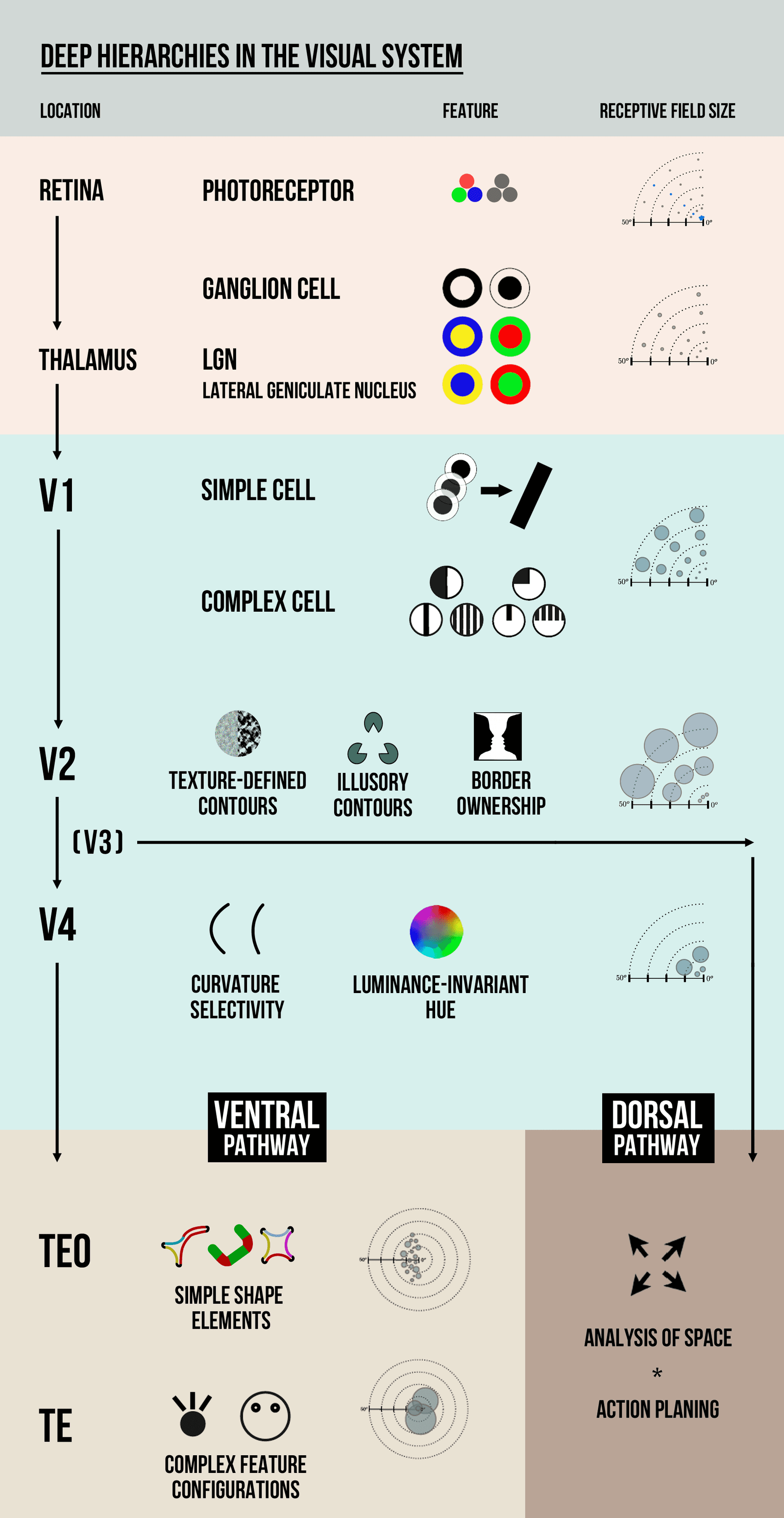
Visual Hierarchy: Guiding the User's Eye
Visual hierarchy guides the user's eye by making important things look important. It uses contrast in size, color, and placement to create a path of importance, like a big headline versus small footer text.

How do you apply progressive disclosure and hierarchy in complex data tables?
This tests layered UI decomposition. Strong answer: default to essential columns with horizontal dividers; disclose sort and filter on interaction; paginate at 48-56px row height; apply contrast and color cues sparingly.