All bites
The whole library, newest first. Filter by what you are here for, or pick a topic if you already know.
8667 bites
Page 421

Data-Ink Ratio: Maximize Signal, Minimize Noise
The Data-Ink Ratio states that a good chart maximizes the ink showing data and minimizes everything else. It's a call to erase 'chart junk'—heavy gridlines or 3D effects—that doesn't convey information.
Gestalt Principles: How Brains Group Visuals
Gestalt principles explain why we see organized patterns, not random dots. Use them in data visualization to group related metrics with proximity or color, guiding users to see the intended story. Ignoring them creates confusing charts that obscure insights.

Chart Selection: Match Purpose, Not Looks
Start with the purpose, not the chart. The question you're asking—'how do these compare?' or 'what's the trend?'—determines the best visualization. A line chart shows trends; a bar chart compares categories.

Anscombe's Quartet: When Numbers Lie
Anscombe's Quartet shows how four datasets can share identical summary stats (mean, variance) but look completely different when plotted. It's a classic reminder to always visualize your data before trusting numerical summaries.
The Semantic Layer: A Business Map for Company Data
A semantic layer is a translation dictionary for data, mapping cryptic database columns to plain business terms like "Revenue." It lets non-technical teams build reports without writing SQL.
Exception Reporting: Focus on Signals, Not Noise
Exception reporting filters out the noise, showing only data that breaks predefined rules. It's used in financial reconciliation to flag mismatched transactions or to alert on system performance dips.
Benchmarking: Know Where You Stand in Your Industry
Benchmarking answers "Are we good?" by comparing your performance metrics against industry bests. It's used to set realistic goals for cost, quality, or time. The main footgun is comparing apples to oranges—using benchmarks from dissimilar companies.
Data Visualization: Turning Numbers into Insight
Data visualization turns raw data into pictures, revealing stories that numbers alone can't tell. It's used to spot trends, find outliers, and grasp complex relationships in datasets.

Ad Hoc Reporting: Answering One-Off Business Questions
Ad hoc reporting is your data "quick dive" for one-off questions, unlike static dashboards. A sales team might use it to see how a holiday affected regional sales.
Cross-Tabulation: Finding Relationships in Your Data
Cross-tabulation reveals how two variables are related by counting their joint occurrences in a grid. It's key for survey analysis or A/B testing. The footgun is assuming correlation implies causation; the table shows a relationship, not its cause.
Drill-Down Analysis: From Summary to Specifics
Drill-down analysis moves from a high-level data summary to the granular details composing it. It's used in dashboards to investigate a metric's change, like clicking a monthly sales dip to see daily figures.
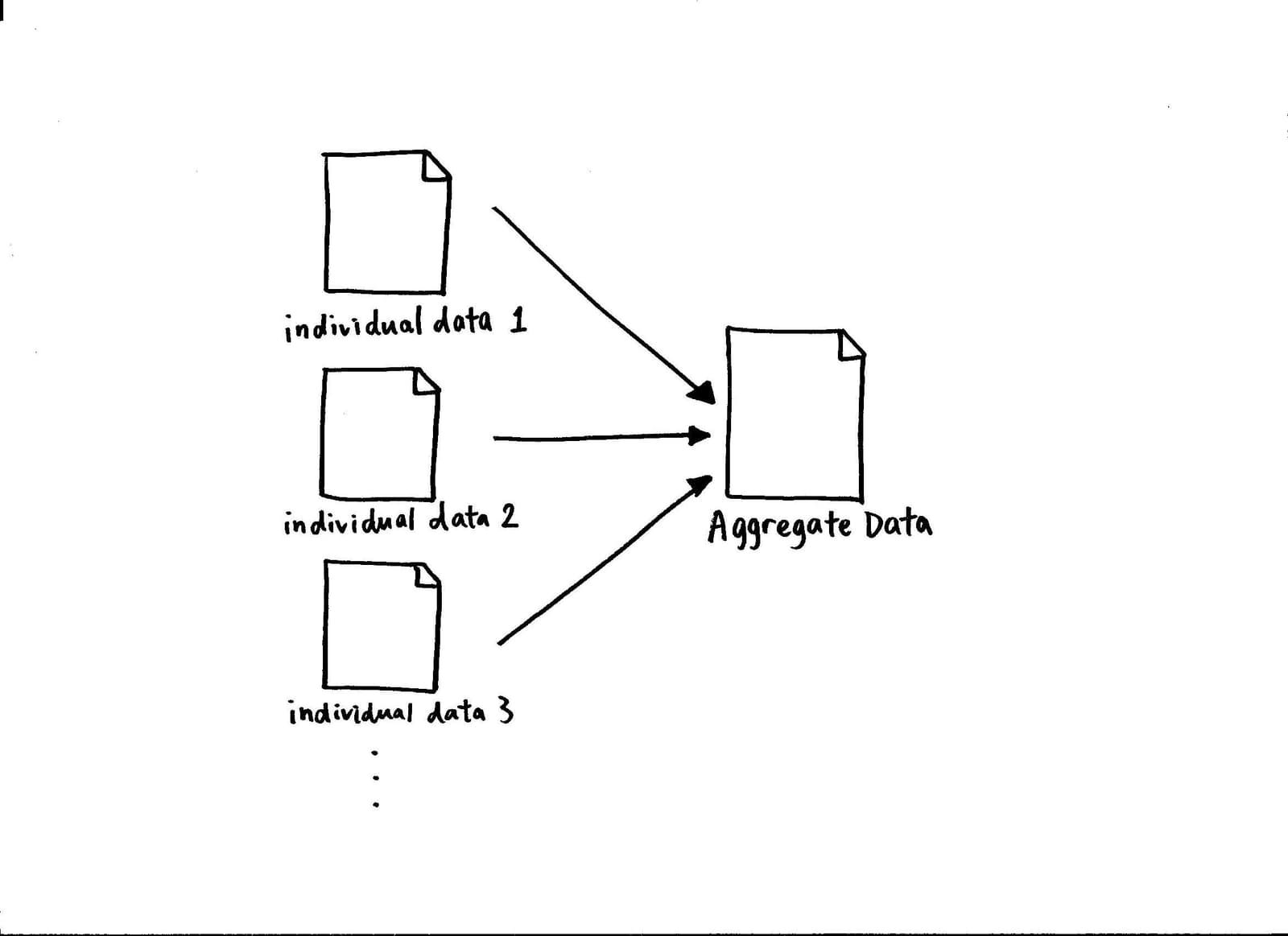
Data Aggregation: The Big Picture from Small Details
Data aggregation rolls up granular records into high-level summaries, like turning individual sales logs into a daily sales report. It's used to power dashboards and speed up warehouse queries.
Business Intelligence (BI) Tools: From Raw Data to Dashboards
BI tools turn raw company data into visual dashboards and reports. They let non-technical teams explore sales trends or user behavior from a data warehouse, but remember: a slick dashboard built on messy data is just a pretty lie.
Descriptive Statistics: What Your Data Looks Like
Descriptive statistics summarize the data you have, painting a picture of your sample without making guesses about the wider world. It's used for calculating things like average age or max response time.
Report Generation: Turning Raw Data into Human-Readable Documents
Report generators translate raw data into formatted documents for human eyes. They power business dashboards and sales summaries. The main footgun is forgetting the report is a stale snapshot, not the live data source itself.
Data Masking: Protect Data, Preserve Utility
Data masking creates a realistic but fake version of your data by scrambling sensitive fields. It's used to give developers and analysts safe datasets for testing or analytics without exposing real PII.
Data Stewardship: The Librarian for Your Data
A data steward is the designated owner of a data asset, responsible for its quality and business value, not just its storage. This role is crucial where data is shared across teams, ensuring consistency.
Master Data Management (MDM): The Single Source of Truth
Master Data Management (MDM) creates a single source of truth for core business entities. It's used when departments have conflicting data (e.g., 'ACME Inc.' vs 'Acme Corp').
Data Governance: Corporate Management vs. Global Policy
Data governance operates at two scales: managing data within a company and setting data policy between nations. It applies to corporate data management and international internet governance.

GDPR: Treating User Data as a Liability, Not an Asset
GDPR treats personal data as a liability borrowed from the user. It gives EU citizens strong rights over their data, like access and erasure, forcing any company processing it to comply. The footgun is assuming it doesn't apply if your company isn't in the EU.