LCH Color: More Vivid, Predictable UI Colors
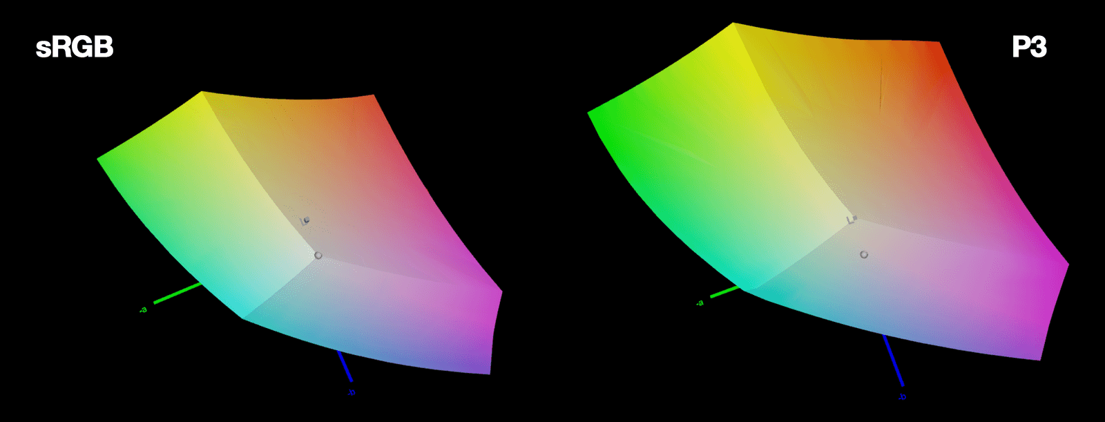
LCH is a color space that aligns with human perception. It fixes HSL's broken lightness and unlocks 50% more vivid colors on modern screens. The footgun: LCH hue angles don't match HSL's; 0° is magenta, not red, so you can't just swap them.
Why it exists
Monitor hardware evolved faster than CSS color specifications. While most modern screens can display a wide range of vivid colors (the P3 gamut), CSS was stuck in the smaller sRGB space. This means our websites are often washed out, unable to use one-third of the colors the screen can show. Furthermore, color spaces like HSL are mathematically simple but perceptually chaotic, making it hard to create predictable color systems.
The mental model
Think of LCH as a color system designed for the human eye, not for the computer screen. It is "perceptually uniform," meaning a change of 10 points in any value looks like the same amount of change to a person, regardless of the starting color. This makes color math predictable, like having a ruler for color instead of a warped measuring tape.
How it works
LCH stands for Lightness, Chroma, and Hue. Lightness (L) is a measure of perceived brightness, and any two colors with the same L value will look equally light. This fixes HSL's most famous flaw. Chroma (C) is the amount of color, like saturation, but is theoretically unbounded instead of a simple 0-100% scale. Hue (H) is the color angle, but its values don't match HSL's; for example, 0 degrees is magenta, not red.
When to use it
Use LCH when building design systems or UIs that require predictable, consistent color palettes. It excels at generating themes and color variations because you can adjust lightness without accidentally shifting the perceived hue. It is also essential for accessing the most vivid colors on modern displays, which are outside the default sRGB gamut.
One canonical example
The classic failure of HSL is the perfect argument for LCH. In HSL, pure yellow (hsl(60, 100%, 50%)) and pure blue (hsl(240, 100%, 50%)) share the exact same 50% lightness value. Perceptually, however, yellow is dramatically brighter than blue. In LCH, if two colors have the same lightness value, they are guaranteed to appear equally bright, making it a reliable tool for creating accessible and harmonious color schemes.
Interview question
What is the primary advantage of LCH over HSL for creating perceptually consistent UI color palettes?
- a.It provides access to a significantly larger color gamut, including P3, for more vivid displays.
- b.Its Lightness component ensures colors with the same 'L' value appear equally bright to the human eye.Correct
- c.Its Chroma component offers an unbounded scale, allowing for finer control over color intensity.
- d.Its hue angle starts at magenta (0°), offering a more intuitive color progression than HSL's red (0°).
Why? this is the answer
The card states LCH is "perceptually uniform" and fixes HSL's flaw where colors like yellow and blue at 50% lightness appear dramatically different. LCH's Lightness (L) guarantees that colors with the same L value are perceived as equally bright, which is fundamental for consistent palettes. While LCH does enable access to wider gamuts (option A), this is about the range of colors, not primarily about the perceptual consistency between colors within a palette.
Just read this? Test yourself on what you have been reading.
Read the original → lea.verou.me
- #css
- #color
- #design systems
You just looked this up. Could you explain it out loud?
That is the part interviews actually test. Tezvyn takes questions like this one and gives you what the interviewer is really checking, the answer that lands, and the mistake that ends the conversation, in the four minutes before your next meeting.
The iPhone app is on the way
We are building it. Until it lands, nothing here is held back from you: every interview card, your saved cards, streaks and the job board all work in Safari, plus hundreds of free practice quizzes of thirty questions each. Sign in and it all carries over to the app the day it arrives.
Want it as an icon? Tap Share at the bottom of Safari, then Add to Home Screen. It opens full screen and the cards you have read stay available offline.
We are hiring for this. Open roles that interview on css — each one lists the topics its interview covers.
See open roles