Search
Find a bite, explore a topic or look for a role.
Results for “React”
Bites 747
EventChannel: Streaming Data from Native to Flutter
EventChannel is a one-way radio from native code to your Flutter app, designed for continuous event streams, not single method calls. Use it to listen for ongoing platform events like sensor data, GPS location updates, or battery state changes.
Flutter Shaders: GPU Power for Custom Graphics
Shaders are small programs running on the GPU to create custom visual effects. Use them for high-performance graphics like frosted glass or animated gradients that standard widgets can't handle.
WidgetTester: Programmatically Drive Your Flutter UI
WidgetTester is a robot user for your app, programmatically tapping, dragging, and entering text. Use it in testWidgets to simulate user flows and verify UI state. The footgun is forgetting tester.pump() after an action; you'll assert against a stale UI.
RawKeyboardListener: Deprecated Hardware Key Events in Flutter
This is a deprecated Flutter widget for capturing raw hardware keyboard events, bypassing text input systems. It was for games or custom shortcuts, but the biggest mistake is using it now. Use KeyboardListener instead.
FocusNode: Programmatically Managing Widget Focus
A FocusNode is your handle to a widget's focus state, letting you programmatically request focus or listen for changes. It's essential for forms, like moving focus from one TextField to the next.
Flutter's State Lifecycle: From Creation to Disposal
A Flutter State object outlives its widget configuration. The framework manages its journey from creation (initState) to permanent removal (dispose), calling methods like build along the way. This governs all StatefulWidgets.
Declarative UI: Describe the 'What', Not the 'How'
Declarative UI means you describe your desired UI for a given state, and the framework figures out how to display it. It's the core of modern frameworks like Flutter. The footgun is manually changing UI instead of updating the state that drives it.
Dart Streams: Single-Subscription vs. Broadcast
A single-subscription stream is a private channel for one listener; a broadcast stream is a public radio station for many. Use single-subscription for one-off data like a file download and broadcast for shared events like UI updates.
StreamController: The Faucet for Your Data Stream
A StreamController is the faucet handle for your data stream. Use it to create a custom stream from any data source and push events to it. The main footgun is that a default controller only allows one listener; use StreamController.broadcast for multiple.
Dart's Control Flow: Telling Your Code What to Do Next
Control flow statements are the road signs for your code, directing execution beyond a simple top-to-bottom path. Use if/else for decisions, for/while for loops, and try/catch to handle errors. The footgun is forgetting break in a switch case.
Operator SDK: Build Kubernetes Operators Faster
The Operator SDK is a developer toolkit that scaffolds the boilerplate for building, testing, and packaging Kubernetes Operators. Use it to automate complex application lifecycle management, like deploying a database cluster that can self-heal and perform…

Kubernetes Admission Controllers: The API's Gatekeepers
Think of admission controllers as bouncers for your Kubernetes API. They intercept requests before objects are saved, enforcing custom policies like security rules or required labels. The footgun: a broken controller can block all changes to your cluster.

Reduce Time-to-Market with a Design System
A design system is a shared toolkit of pre-built UI components, not just a style guide. It lets teams build interfaces from a library of pre-coded parts, drastically cutting repetitive work. The footgun is treating it as a static document, not a living system.
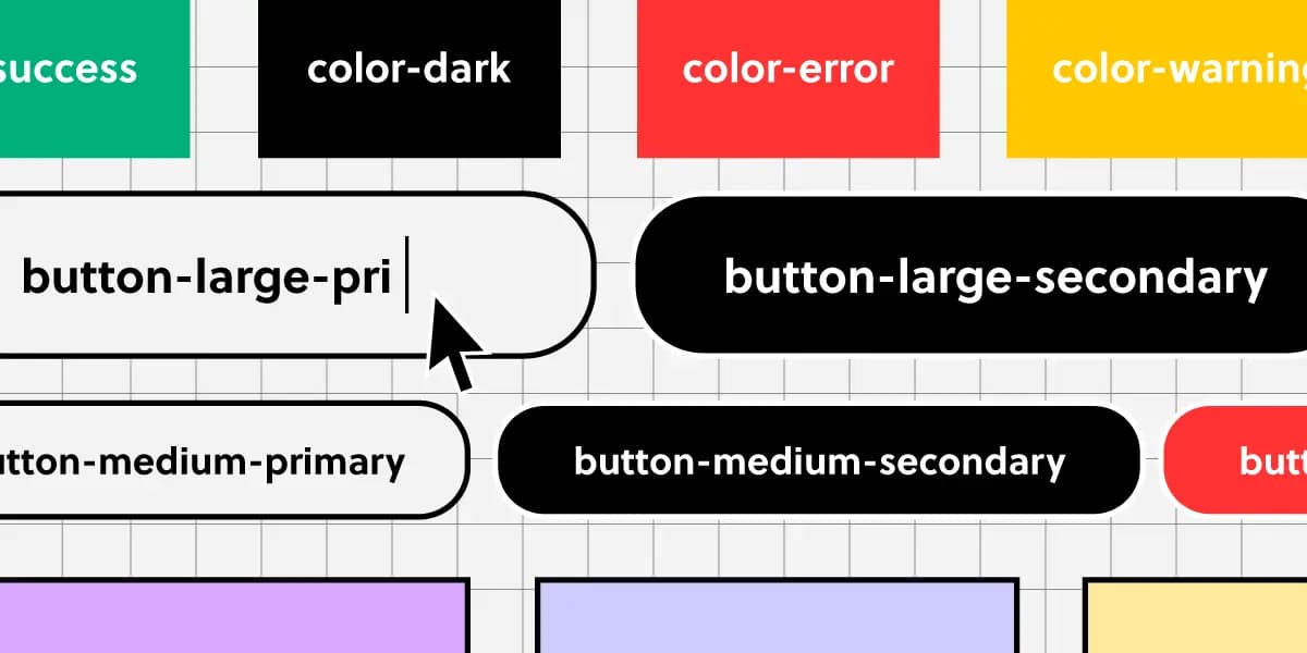
Component Naming: A Shared Language for UI
Think of naming conventions as a shared dictionary for your team. A name like ButtonPrimary should mean the same thing in Figma and in code, ensuring consistency.

Theming with CSS data-* Attributes
Think of data- attributes as labels for UI state, like data-theme='dark'. CSS uses attribute selectors ([data-theme='dark']) to apply styles directly, avoiding complex class logic.
Component Feature Flags: Opt-in to Breaking Changes
Component feature flags are a temporary opt-in switch for new versions, letting you adopt breaking changes before a major release. Design systems use them to roll out updates without forcing an immediate migration.
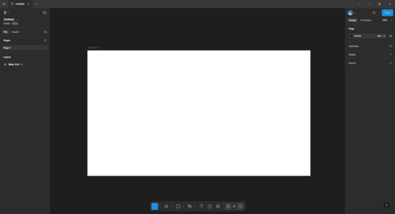
Figma-to-Code: From Pixels to Production Code?
Figma-to-code tools act as translators, turning visual mockups into code. This speeds up bootstrapping new components or prototypes, but the output is rarely production-ready and often needs heavy refactoring to be performant and maintainable.
Monorepos: A Design System's Single Source of Truth
A monorepo places your design system and its consuming apps in one repo. This enables atomic changes: update a component and all its consumers in a single commit. It's ideal for keeping UI consistent, but requires strict tooling to avoid becoming a monolith.
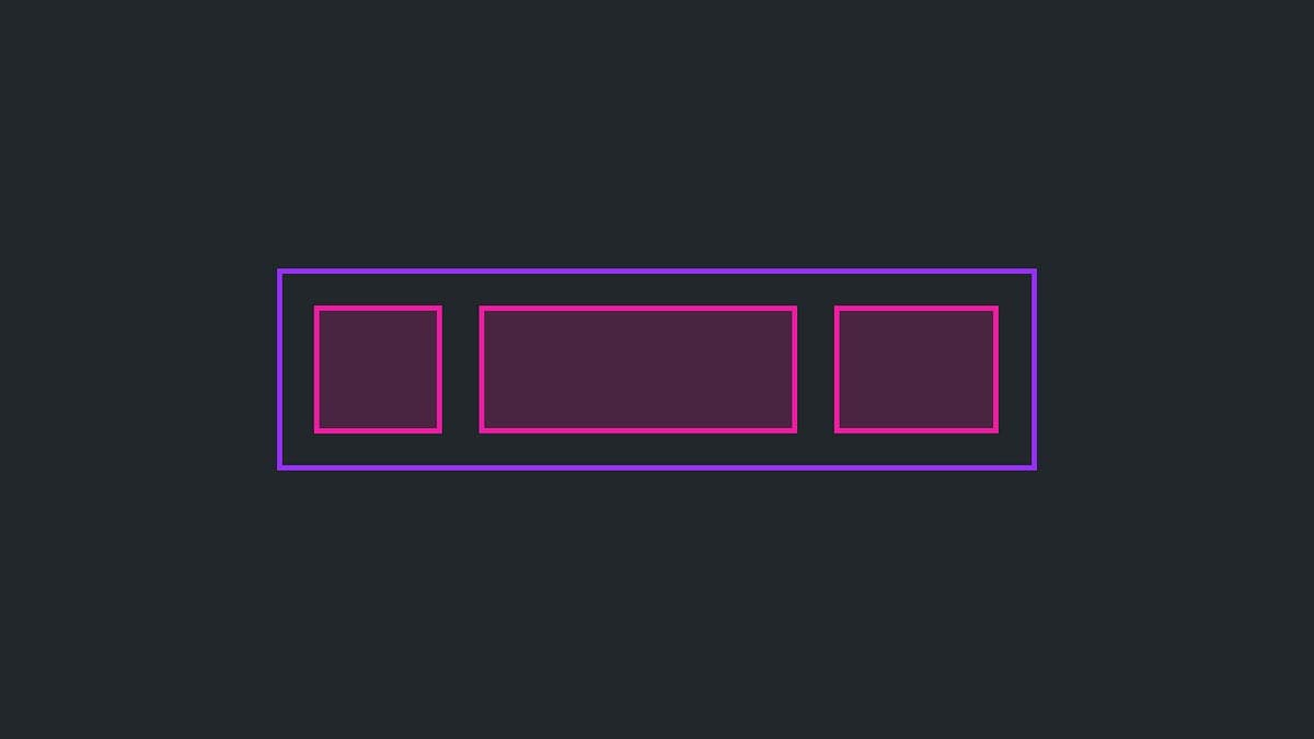
The Slot Pattern: Making UI Components Composable
The Slot Pattern makes components flexible by defining areas for custom content, like a picture frame for your UI. It's used in Cards or Modals to allow varied content in a consistent frame. The footgun is that too much flexibility can break consistency.
Controlled vs. Uncontrolled Components
A controlled component is a puppet; its parent pulls the strings via props. An uncontrolled one manages its own state. This pattern is key for coordinating siblings, like ensuring only one panel in an accordion is open.