Easy concepts in CSS & Design Systems
CSS Cascade: How Browsers Resolve Style Conflicts
The CSS Cascade is a tie-breaking algorithm that decides which style rule applies when multiple rules target the same element. It resolves conflicts between browser defaults, user styles, and your CSS.

CSS Specificity: The Browser's Tie-Breaking Rule
CSS Specificity is the browser's tie-breaking system for conflicting styles. Think of it as a score: an ID is worth more than any number of classes, and a class is worth more than any number of elements. The footgun: using !important to win.
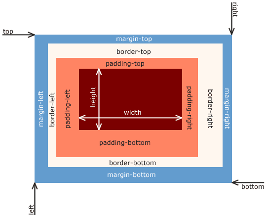
CSS Box Model: Every Element is a Box
Every HTML element is a box with layers: content, padding, border, and margin. This model dictates how elements take up space and align, forming the basis of all CSS layout. The footgun is the default sizing, which adds padding *outside* the set width.
CSS Inheritance: Styles Flow Downhill
CSS inheritance is like genetics for web elements: children inherit styles like color and font-family from their parents. This is why setting a font on <body> styles a whole page.
CSS Selectors: How to Target HTML for Styling
CSS selectors are like addresses for your HTML, telling the browser which elements to style. They're used to apply everything from colors to layouts. The main footgun is specificity: an overly specific selector can be difficult to override later.
CSS Color Values: From Keywords to Functions
CSS offers multiple ways to define colors, from simple names like red to functions like rgb(). Use keywords for mockups, hex for design handoffs, and HSL for intuitive manipulation. The main footgun: colors can look different across uncalibrated devices.
CSS `font`: The All-in-One Typography Shorthand
The font property is a single CSS declaration for setting multiple type styles at once, like size, weight, and family. Use it to define base typography for your site or components.
CSS `background`: The All-in-One Shorthand
The CSS background property is a shortcut for styling an element's backdrop, combining color, image, and position in one line. Use it for most background tasks, from simple colors to complex layered images.
border-radius: More Than Just Rounded Corners
The border-radius property rounds an element's corners, used for everything from buttons to circular avatars. The footgun is its shorthand syntax: one value is simple, but two, three, or four values follow specific clockwise rules that are easy to mix up.
CSS Flexbox: Mastering the Main and Cross Axis
Flexbox treats layout as a one-dimensional problem: either a row or a column. All alignment rules operate along a 'main axis' and a perpendicular 'cross axis'. Use it for navbars or card components.
CSS Grid: Defining a 2D Layout Container
Turn an element into graph paper with display: grid, making its children items you can place in rows and columns. It's ideal for page-level layouts or complex components. The footgun: grid properties only apply to direct children, not nested elements.
The `gap` Property: Spacing Without Margin Hacks
The gap property adds space *between* elements in a layout, not around them. Use it on Flexbox, Grid, or multi-column containers for clean, consistent gutters.
The @media Rule: CSS for Different Screens
The @media rule is like an if-statement for your CSS, applying styles only when conditions like screen size are met. It's the core of responsive design, creating different layouts for mobile, tablet, and desktop.
The Viewport Meta Tag: Your First Responsive Step
The viewport meta tag tells mobile browsers not to fake a desktop screen. It sets the page width to the device's width, enabling responsive design. It's essential for any modern site. The footgun: disabling user zoom (user-scalable=no) harms accessibility.
Fluid Layouts: Adapting Content to Any Screen
A fluid layout makes content flow to fill its container, preventing horizontal scrollbars. It's key for responsive sites that work on any device and for accessibility. The footgun: without constraints, content can become unreadably wide or awkwardly cramped.

Flexible Images: More Than Just `max-width`
Flexible images adapt to the device by providing different resolutions or crops. Use srcset for high-DPI screens and <picture> for art direction. The footgun is relying only on CSS max-width; this forces mobile users to download unnecessarily large…
CSS Transitions: Animating State Changes
CSS transitions turn abrupt style changes into smooth animations. Instead of a button's color snapping on hover, it fades gracefully. Use this for visual feedback on state changes like :hover or when adding classes with JavaScript.
CSS 2D Transforms: Move, Rotate, and Scale Elements
CSS transforms let you move, rotate, scale, and skew elements without affecting the document's layout flow. Use it for UI animations like hover effects or modal pop-ups.
pointer-events: Making Elements Click-Through
The pointer-events property makes elements invisible to clicks and hovers, letting events pass through to what's underneath. Use it for decorative overlays on clickable content or to temporarily disable buttons.
OOCSS: Reusable Styles for Maintainable CSS
Treat CSS styles like building blocks. Object-Oriented CSS (OOCSS) separates an element's visual 'skin' (colors, borders) from its 'structure' (width, height). This lets you create reusable classes, reducing duplication for faster, maintainable stylesheets.
We are hiring for this. Every open role lists the topics its interview covers, so you can prepare for the real thing rather than guessing.
See open roles