Intermediate concepts in CSS & Design Systems, page 2

CSS Keyframe Animations: Multi-Step Motion Control
Think of CSS keyframes as a flipbook for your UI. You define styles at specific moments, and the browser animates between them. It's for multi-stage sequences, like loading spinners, where simple transitions fall short.
CSS Cubic-Bezier: The Art of Animation Pacing
A cubic-bezier function defines an animation's speed curve, controlling its acceleration and deceleration. It's used in CSS to make UI motion feel natural. The footgun is mistaking presets: ease accelerates more sharply than the symmetrical ease-in-out.
animation-fill-mode: Hold Styles Before and After Animation
The animation-fill-mode property prevents the jarring "snap" back to an element's original state after a CSS animation. Use forwards to hold the final state or backwards to apply the start state during a delay.
CSS 3D Transforms: Adding Depth to the DOM
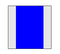
CSS 3D transforms treat flat elements like objects in a 3D space, adding depth with properties like rotateY and translateZ. Use them for card-flip animations or product carousels. The footgun: forgetting to set perspective on a parent makes 3D look flat.
CSS `perspective`: Creating 3D Depth
The CSS perspective property sets a 'camera' distance for 3D-transformed children, creating a sense of depth. Use it on a container to make elements appear to recede into the screen. The main footgun: a smaller value creates a *more* dramatic effect.
SMACSS: A Naming Convention for CSS Scalability
SMACSS organizes CSS into five categories to prevent spaghetti code. It's a naming convention and thought process, not a library you install. It's used in large codebases where teams need a shared vocabulary for styling components.
CSS Modules: Local Scope for Your Styles
CSS Modules treat your styles like local variables. Instead of a global stylesheet, each CSS file is scoped to the component that imports it, preventing name collisions in component-based apps.
CSS-in-JS: Scoped Styles via JavaScript
CSS-in-JS lets components own their styles in JavaScript, generating CSS and injecting it into the DOM at runtime. It prevents global namespace collisions in component frameworks. The footgun is runtime overhead and bigger bundles.
Styled Components: CSS-in-JS as Components
Think of your styles as React components. Styled Components uses JavaScript template literals to write CSS in your JS, creating components with encapsulated styles. It's ideal for building design systems where styles change based on props.

Tailwind CSS: Styling Directly in Your HTML
Tailwind CSS lets you build designs by composing utility classes like flex and pt-4 directly in your HTML. This avoids context-switching for rapid UI development. The main footgun is creating verbose, unreadable markup if not managed well.
Scoped CSS: Styling Components Without the Cascade Mess
@scope fences off your CSS, applying styles only within a specific part of the DOM. This lets you style a component without your rules leaking out or clashing with global styles.
Sass Mixins: Reusable Style Functions
Think of a Sass mixin as a function for CSS. It bundles style declarations you can reuse, avoiding repetitive code. Use it for common patterns like button styles or clearing floats. The footgun: mixins copy code everywhere, which can bloat your final CSS.
Sass Modules: Using @use for Clean, Scoped Styles
Think of @use as importing a JavaScript module. It loads Sass variables and mixins into a private namespace, preventing global style conflicts. Use it to structure large CSS codebases by breaking styles into logical partials.
Sass @extend: Inherit Styles, Not HTML Classes
@extend lets one selector inherit styles from another, grouping them in the final CSS without adding classes to your HTML. Use it for modifier classes to keep markup clean. The footgun: overusing it can generate long, complex selectors, bloating your CSS.
PostCSS: The 'Babel for CSS' Transformer
PostCSS is like Babel for CSS, transforming styles with JavaScript plugins. Use it to add vendor prefixes, enable future CSS features, or lint styles. The footgun: it's not a preprocessor like Sass, but a tool that enhances CSS, often used alongside it.
Stylelint: Your CSS Guardian for Rules, Not Just Formatting
Stylelint is a linter that guards your CSS logic and conventions, not just its formatting. Use it to catch errors like misspelled properties or enforce team rules. The footgun is confusing it with a formatter; Stylelint enforces rules, Prettier handles style.

UI Patterns: Reusable Recipes for Interfaces
UI patterns are reusable recipes for common interface problems, like tabs or accordions. They create a shared language for building predictable, accessible components. The biggest footgun is creating a component that looks right but lacks accessible behaviors.
Style Dictionary: A Build Tool for Design Tokens
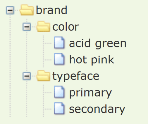
Think of Style Dictionary as a compiler for your design system. It takes abstract design tokens (like brand colors and fonts) and automatically generates platform-specific style files for web, iOS, and Android, ensuring consistency everywhere.
Composite Design Tokens: Bundling Style Properties
A composite design token bundles multiple style values into a single, semantic unit, like a "style kit" for shadows or typography. Use them to apply complex, multi-property styles like borders or text styles with one reference.
Shadow DOM: A Private Bubble for Your Components
Shadow DOM gives a component a private bubble, keeping its styles and structure isolated from the main page. This is key for building reusable Web Components and microfrontends.
We are hiring for this. Every open role lists the topics its interview covers, so you can prepare for the real thing rather than guessing.
See open roles