Interview questions in CSS & Design Systems, page 2

Explain flex-grow, flex-shrink, flex-basis and their interaction
Tests deep understanding of flexbox sizing beyond keywords. A strong answer defines grow and shrink as ratios for distributing leftover or overflow space, basis as the starting size, and explains the two-step calculation.
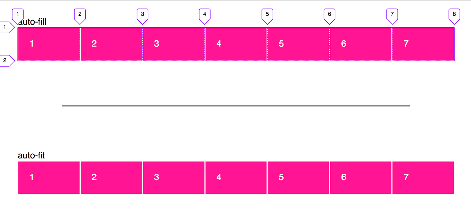
Create a responsive card grid without media queries
This tests CSS Grid intrinsic sizing. Answer: grid-template-columns with repeat(auto-fit, minmax(min, 1fr)), leveraging repeat, minmax, and auto-fit for fluid wrapping. Red flag: defaulting to Flexbox or media queries instead of intrinsic grid behavior.
Explicit vs implicit grid: how do you control implicit tracks?
Explicit tracks use grid-template; implicit tracks appear on overflow. Control via grid-auto-rows/columns and grid-auto-flow.
Implement a fixed-width sidebar with Flexbox and CSS Grid
This tests Flexbox as one-dimensional versus Grid as 2-dimensional. A strong answer covers Flexbox with flex: 1 on main and flex: none on sidebar, and Grid with grid-template-columns: 250px 1fr. Red flag: claiming Grid is always superior or ignoring overflow.
What problem does subgrid solve? Give a concrete example.
This tests whether you know nested grids create track contexts breaking cross-level alignment. A strong answer explains subgrid inherits parent tracks, using a card whose internals align to a global page grid.
How do min-content, max-content, and fit-content work in CSS Grid?
It tests intrinsic track sizing. A strong answer defines min-content as the smallest no-overflow width, max-content as widest no-wrap width, and fit-content as clamped max-content; then shows labels hugging longest word.

How can CSS aspect-ratio and modern layout properties prevent CLS?
Set width/height attributes, use CSS aspect-ratio for responsive scaling, and reserve container space with min-height.
What is the viewport meta tag and what does width=device-width, initial-scale=1.0 do?
This tests mobile viewport behavior and CSS pixels. The tag instructs browsers how to size the viewport; width=device-width sets width to screen CSS pixels; initial-scale=1.0 sets a 1:1 zoom ratio. A red flag is confusing viewport width with physical pixels.
Explain the mobile-first approach and how it differs from desktop-first
Mobile-first starts small, layers up with min-width; desktop-first starts large, overrides down with max-width.
Make an image scale fluidly without exceeding its original size
Tests intrinsic sizing awareness. Good answer: max-width: 100% scales the image down with its container but never stretches it beyond intrinsic size; add height: auto to preserve aspect ratio. Red flag: width: 100% or omitting height, causing distortion.
Key differences between responsive and adaptive design, and when to choose adaptive
It tests layout strategy trade-offs beyond media queries. A strong answer contrasts responsive fluid grids with adaptive device-specific layouts. Red flag: claiming they are identical or that adaptive means more breakpoints.
Build a responsive 3-column layout with Flexbox and Grid
Tests whether you pick right tool for responsive layouts. Good answers use flex-wrap and flex-basis for Flexbox, repeat() or grid-template-areas for Grid, in min-width 768px query. Red flag: desktop-first max-width queries or claiming Grid replaces Flexbox.
How would you use srcset and sizes for responsive image performance?
This tests responsive image selection in the browser. A strong answer covers srcset with w or x descriptors, sizes for layout width hints, and the browser picking before CSS loads. Red flag: suggesting JS detection or CSS backgrounds instead.
Explain advantages of rem and em over px in responsive design
This tests cascading font scaling and accessibility. Strong answers mention user zoom, root-level rem control, component em scaling, and avoiding px fragmentation. Red flag: claiming px handles all user preferences automatically.
What are CSS container queries and what problem do they solve?
This tests component-level responsive awareness. A strong answer states container queries style elements based on their container size, letting components adapt regardless of viewport. Red flag: believing media queries alone solve component context adaptation.
Implement fluid typography from 16px to 24px across 400px–1200px in one declaration?
This tests clamp() fluency for viewport-relative type scaling without media queries. A strong answer states clamp(16px, calc(16px + 8 * (100vw - 400px) / 800), 24px) and explains the slope math. A red flag is multiple media queries or calc() without clamp().
Using CSS Grid, how do repeat, auto-fit, and minmax create responsive columns?
Tests intrinsic sizing and responsive tracks without media queries. A strong answer gives repeat(auto-fit, minmax(250px, 1fr)), noting repeat generates tracks, auto-fit collapses empties, and minmax sets a floor with fractional growth.
How do you trigger a CSS transition? Provide two methods.
Set transition on the element, then change a property via :hover or by toggling a class with JavaScript.
Why is animating transform preferred over top or margin-left?
Grasp of the rendering pipeline and frame rate. A strong answer says transform skips layout and runs on the compositor, while top and margin-left force layout and drop frames.
Create a staggered list fade-in using only CSS
Tests CSS animation orchestration via keyframes and delay strategies. Great answers use :nth-child or --index variables for scalable staggering, set fill-mode forwards, and honor prefers-reduced-motion.
We are hiring for this. Every open role lists the topics its interview covers, so you can prepare for the real thing rather than guessing.
See open roles