Everything in CSS & Design Systems, page 8
Semantic vs. Primitive Design Tokens
Semantic tokens give meaning to raw values so components bind to intent, not hex codes. They let you rebrand or theme by changing aliases, not component code.
Voice and Tone in Design Systems
Voice is personality; tone is the mood for the moment. Lock both in your design system so UI text feels like one product. The footgun is documenting voice while letting teams pick their own tone, breaking consistency when users are stressed.
BEM: Scoped CSS Naming by Convention
BEM is a naming convention that scopes CSS classes like postal addresses, preventing specificity wars in component systems. It shines in large codebases with many developers. The footgun is deep element nesting, which bloats markup into unreadable strings.

CSS :has(): Query Parents and Previous Siblings
CSS :has() styles an element based on its children or later siblings, like highlighting a section with a featured card. Previously this required JavaScript. If unsupported, the whole selector block fails, so wrap it in :is() or use progressive enhancement.
Design System Dependency Update Automation
Automating dependency updates pushes design system releases to apps without manual pull requests. It matters when token changes must reach dozens of repositories at once. The footgun is automating bumps without visual regression, which silently breaks UI.
CSS-in-JS: Scoped Styles via JavaScript
CSS-in-JS lets components own their styles in JavaScript, generating CSS and injecting it into the DOM at runtime. It prevents global namespace collisions in component frameworks. The footgun is runtime overhead and bigger bundles.
Component Usage Guidelines: The Manual for Your Design System
Usage guidelines are the instruction manual for your design system, ensuring consistency. They prevent developers from guessing button states and designers from stretching logos.

Bundle Size: When Runtime Dependencies Defeat Tree Shaking
Tree Shaking is static, but your app is dynamic. It can fail when a component imports a large dependency for an optional, runtime-configured feature. A UI library's provider might pull in an entire form library, even if you don't use it.

Atomic CSS: Styling with Single-Purpose Utilities
Atomic CSS builds interfaces with tiny, single-purpose classes directly in your HTML, like using LEGO bricks for styling. It's the core of frameworks like Tailwind CSS, letting you build UIs without writing custom CSS. The footgun is creating unreadable HTML.
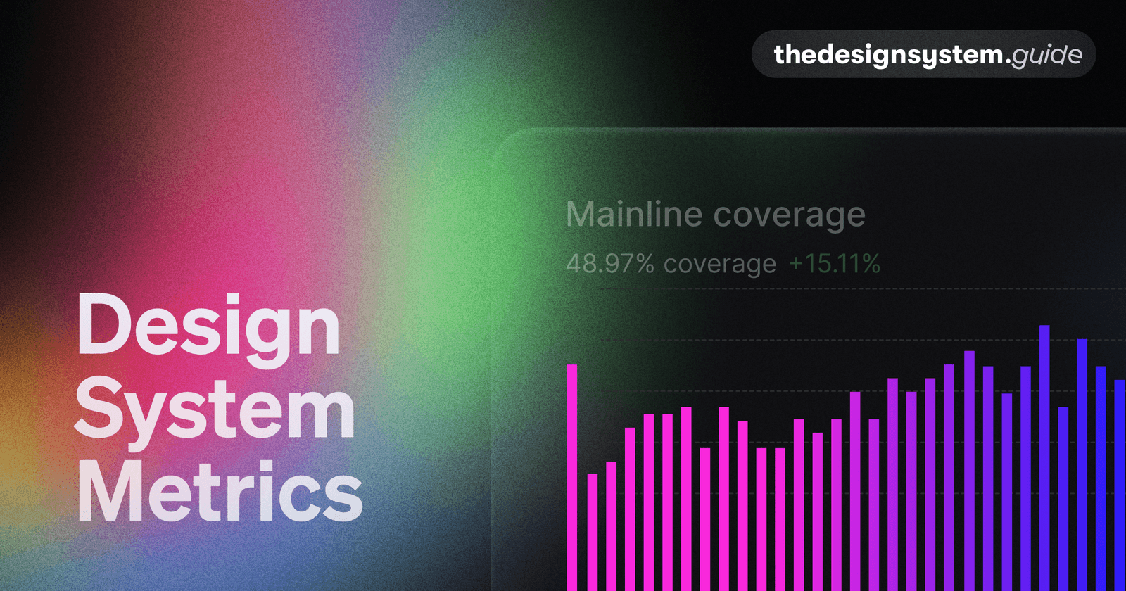
Design System Metrics: Proving Its Worth
Prove your design system's value with data, showing it's a force multiplier, not just a library. Track metrics like component adoption and faster time-to-market to justify budget and guide your roadmap. The footgun: avoid vanity metrics like component count.
Architectural Decision Records (ADRs): Documenting 'Why'
An ADR is a short text file capturing the 'why' behind a key engineering choice. Use it for big decisions like choosing a library or defining a core pattern.
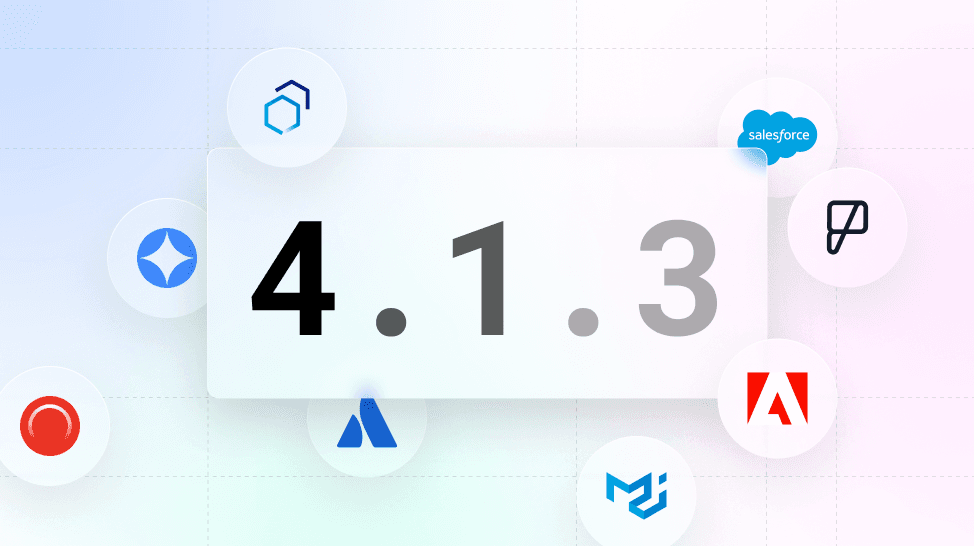
Versioning Design Systems: Holistic vs. Incremental
Versioning a design system is about communicating change. Use Semantic Versioning (MAJOR.MINOR.PATCH) to signal update impact. This prevents teams from using outdated components, ensuring consistency.

Design System Governance: Preventing UI Chaos
A design system governance model defines the rules for evolving your UI library, preventing a free-for-all of conflicting changes. It dictates how new components are proposed and approved.

Atomic Design: Building UIs from the Smallest Parts
Atomic Design treats UIs as thoughtful hierarchies, building interfaces from the smallest parts up. This methodology helps create robust design systems for rolling out consistent UIs faster across countless devices. The footgun is seeing it as a rigid process.
Sass Control Directives: Logic in Your Stylesheets
Sass control directives bring programming logic—if/else, loops—into your CSS preprocessor. Use them to generate component variations or utility classes without repetitive code.

Source Maps: Debug Your Compiled CSS
Source maps are a decoder ring for your browser's dev tools, translating minified CSS back to the original SCSS or LESS files you wrote. This lets you debug styles in your source code, not the unreadable compressed output.
PostCSS Preset Env: Write Future CSS Today
postcss-preset-env is like Babel for CSS, transpiling modern syntax into code older browsers understand. Use it to write features like nesting or color-mix() today. The footgun: it only polyfills Stage 2+ features by default; you must opt-in for more.
Mobile-First Design: Start Small, Then Scale Up
Mobile-first design means building for the smallest screen first, then enhancing for larger ones. This ensures a solid baseline experience on phones, where most users are. The footgun is thinking it's just CSS, not a content-first strategy.
CSS Combinators: Targeting by Relationship
CSS combinators target elements by their DOM relationship, not just class or ID. They let you select an element inside another (div p) or right next to one (h2 + p). This is key for styling nested menus or spacing adjacent items.
CSS Houdini: Extending the CSS Engine
CSS Houdini gives developers low-level access to the browser's rendering engine, letting you write your own CSS features. Use it to polyfill new CSS or define type-safe custom properties with @property, preventing invalid values from being silently ignored.
We are hiring for this. Every open role lists the topics its interview covers, so you can prepare for the real thing rather than guessing.
See open roles