Intermediate everything in Design Systems, page 6
Interactive Component Previews: Docs That Behave
Component previews are live playgrounds: tweak props in docs to see real behavior. Storybook and design system portals use them so developers test variants before adoption. Let preview code drift from production and your docs become lies.
Voice and Tone: One Voice, Many Moods
Voice is your product's personality; tone is its mood in the moment. Guidelines keep every button and error message from feeling written by different teams. The footgun is documenting voice but skipping tone, so a cheerful brand still sends terrifying alerts.
Component Usage Guidelines as Guardrails
Usage guidelines are guardrails, not the component itself. They tell engineers when to pick primary versus secondary buttons, or when a modal becomes a page. Without them, teams reinvent one component for different contexts, fragmenting the system.
Page Templates: The Floor Plan for UI
Page templates are the floor plan, not the furniture: fixed zones where components slot in. Use them for recurring screens like dashboards so teams stop rebuilding skeletons. The footgun is treating them as giant components, forcing brittle overrides later.
Dashboard Layouts: Information Architecture, Not Just Grids
A dashboard layout is an information hierarchy, not grid; it controls what users see in first three seconds. Use it for monitoring and admin panels where users scan for anomalies. Biggest mistake is filling every pixel with widgets, destroying glanceability.
Card Pattern: Self-Contained Content Objects
A card groups related info into a bounded, scannable object you can rearrange like playing cards. Use it for dashboards, product grids, or feeds where items need equal visual weight.
Elevation System: Height as a Token
Elevation is spatial height, not just shadows: it maps every surface to a specific z-height. Use it for modals, dropdowns, and draggable cards. The footgun is tuning shadows without locking z-index, so visually higher elements still get buried.
Motion Tokens Turn Timing into a System
Motion tokens standardize animation like color tokens standardize palettes. A team can retime an entire product from one file. The footgun is naming tokens after CSS curves instead of intent, locking implementation details into your design language.

Design Token Transformation: One Source for All Platforms
A design token standard is a universal adapter for your style. It defines properties like color in a standard JSON format, which tools then transform into platform-specific code for iOS, Android, and web. The footgun is building bespoke transformation logic.
Figma's Library Analytics API: Quantify Your Design System's Impact
Figma's Library Analytics API lets you quantify your design system's impact by tracking component usage. Use it to find adoption trends or get a snapshot of where components are used. The footgun: data for files you can't access is obfuscated, not omitted.

Reduce Time-to-Market with a Design System
A design system is a shared toolkit of pre-built UI components, not just a style guide. It lets teams build interfaces from a library of pre-coded parts, drastically cutting repetitive work. The footgun is treating it as a static document, not a living system.

A Design System Newsletter: Make Invisible Work Visible
A design system newsletter makes your team's invisible infrastructure work visible. Use it to announce component updates and share challenges, keeping stakeholders engaged.
Design System Steering Committee: Governance in Practice
A steering committee is the board of directors for a design system, ensuring its long-term stability and direction. They set technical standards, manage releases, and resolve conflicts. The footgun is becoming a bottleneck if not diverse and well-chartered.
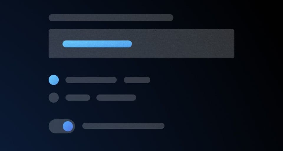
Form Layout Best Practices
Guide users with a clear visual path, not a maze. A single-column layout with consistent spacing creates a streamlined data entry experience. Use it for everything from contact forms to complex UIs.
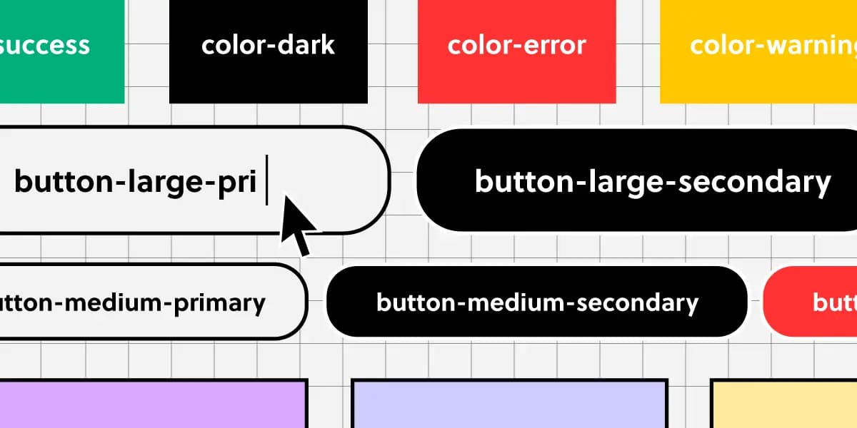
Component Naming: A Shared Language for UI
Think of naming conventions as a shared dictionary for your team. A name like ButtonPrimary should mean the same thing in Figma and in code, ensuring consistency.

Conversational Component Model: Building Blocks for Voice UI
Think of conversational components as LEGO bricks for dialogue. You assemble standard pieces like questions, confirmations, and apologies to build a natural flow for voice assistants or chatbots.
Versioning Your Design System Documentation
Think of it like Git for your design system: you create immutable snapshots (versions) of your docs and components. This lets product teams build against a stable spec, even as the design system evolves. The footgun is poor versioning discipline.
Design System Migration: A Campaign, Not a Mandate
Migrating to a new design system is a campaign to win over teams, not just a technical refactor. Use strategies like piggybacking on features (Trojan Horse) or starting with willing teams to build momentum and avoid getting stalled by resistance.

Design System Pilots: Test Your System Before You Ship It
A design system pilot is like a TV pilot: you test your system's core ideas on a real product before a full v1 launch. Use it to battle-test components and find the 20% of work that solves 80% of problems.

Measuring Design System Adoption: From Vanity to Value
Measuring design system adoption means tracking real usage in code, not just documentation views. It's key for justifying budget and prioritizing work. The main footgun is mistaking site traffic for actual implementation in production.
We are hiring for this. Every open role lists the topics its interview covers, so you can prepare for the real thing rather than guessing.
See open roles