Intermediate everything in Design Systems, page 9

CSS clamp(): Fluid Sizing Without Media Queries
CSS clamp() sets guardrails for a value, letting it scale fluidly but never going outside a min/max bound. It's ideal for responsive typography, allowing font-size to grow with the viewport. The footgun: the preferred value is ignored at extreme screen sizes.

Vertical Rhythm: A Formula for Consistent Spacing
Vertical rhythm is a system for consistent spacing derived from your body text's line height. Use this calculated unit between all elements—paragraphs, lists, and after headings—to create harmony.
WCAG Color Contrast: The 4.5:1 Rule for Readability
WCAG contrast ratios ensure text is readable for people with low vision by measuring relative luminance, not just color. Standard text needs a 4.5:1 ratio against its background.

Theming: One Design System, Many Visual Styles
Theming lets one component library wear many visual styles, like skins on a character. You can support multiple brands or dark/light modes by swapping design tokens instead of rebuilding components.
Design Systems: Your UI's Single Source of Truth
A design system is the single source of truth for UI, giving designers and developers a shared toolkit of reusable components and standards. It ensures consistency and efficiency across projects.
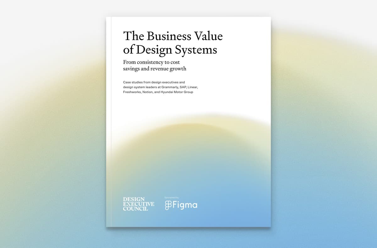
Design Systems: From UI Kits to Business Infrastructure
A design system is business infrastructure, not just a UI kit. It translates brand consistency into measurable ROI by reducing costs and accelerating delivery.

Atomic Design: Building UIs Like Chemistry
Atomic Design is like chemistry for UIs: you build complex screens from simple, indivisible 'atoms' like buttons and inputs. It's used to create consistent design systems. The footgun is treating it as a rigid, linear process instead of a mental model.
We are hiring for this. Every open role lists the topics its interview covers, so you can prepare for the real thing rather than guessing.
See open roles