Intermediate concepts in Design & UX, page 16
NPS for Design Systems: Smoke Alarm, Not Scorecard
NPS for design systems is a smoke alarm for team trust, not a feature scorecard. Poll consuming teams quarterly to catch sentiment drops before adoption stalls. Never benchmark against consumer SaaS; internal tools face forced usage and different expectations.
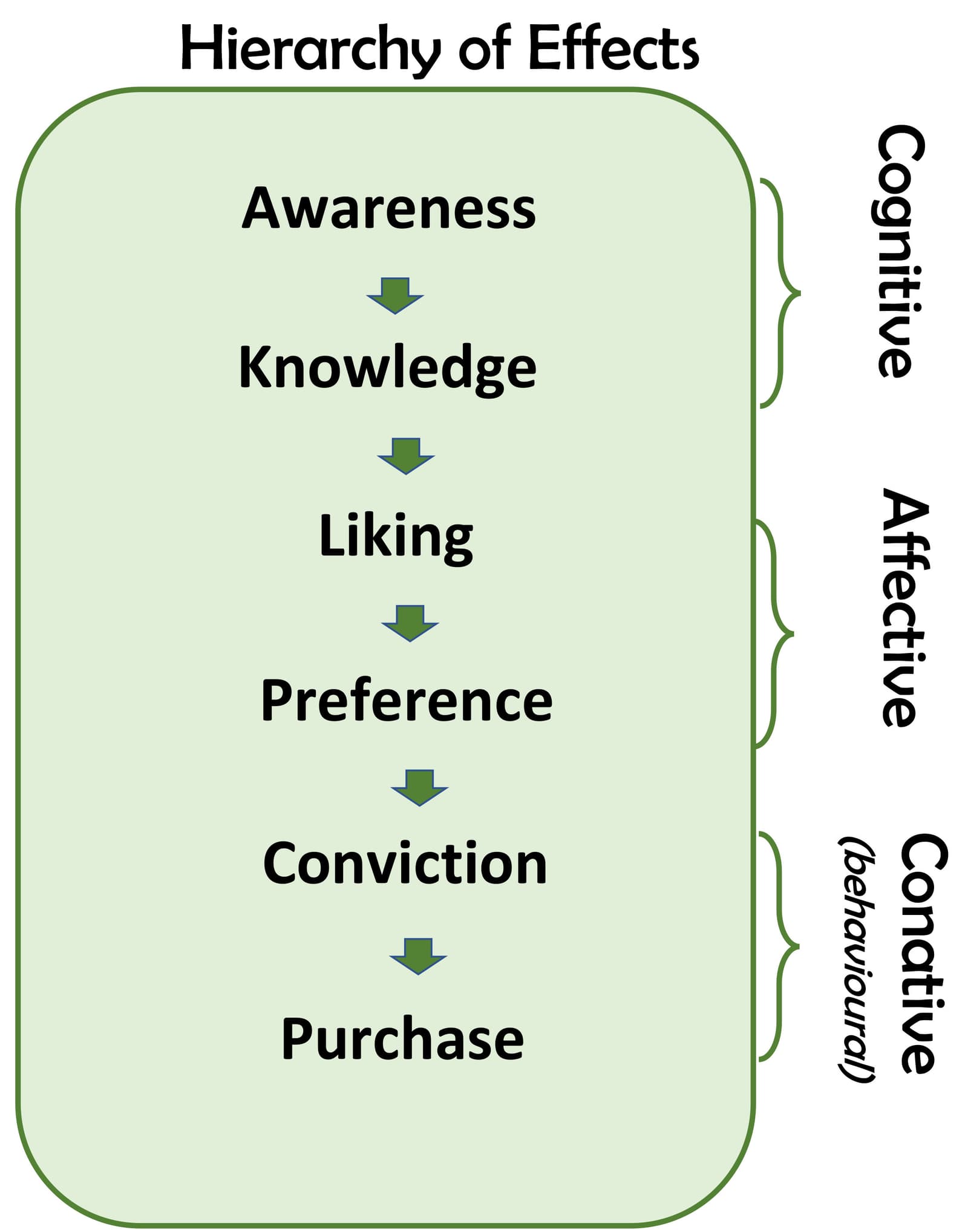
The AIDA Model: A Checklist for Persuasion
The AIDA model is a four-step checklist for persuasive writing: grab Attention, build Interest, create Desire, and call to Action. Use it to structure sales pages or emails to guide a reader from awareness to conversion.
Gamified Prototypes: Test Loops Before Code
A gamified prototype tests motivation loops without code. In Figma, you simulate points and badges with variants and Smart Animate to validate reward timing before engineers build scoring logic.
Quantify UI Debt Before It Compounds
UI debt quantification turns messy interfaces into measurable cost. Teams track component adoption, override rates, and design-dev drift to prioritize refactors. The footgun is treating every inconsistency as debt, ignoring the business value of shipping fast.
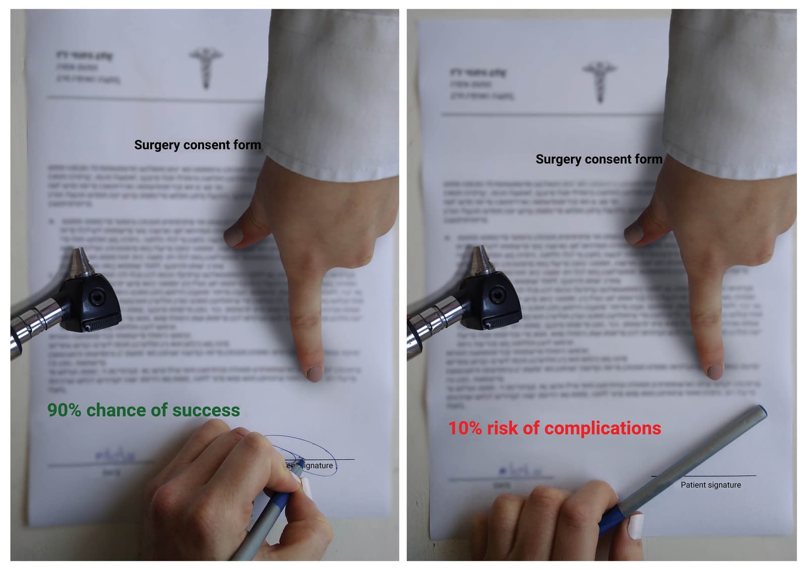
The Framing Effect: How Presentation Changes Decisions
The way you frame a choice—as a gain or a loss—changes how people decide, even if the options are identical. This is why "80% lean" sells better than "20% fat." The footgun is assuming people are rational; presentation often beats pure logic.
Component Stability Index
A component stability index is a maturity signal that tells consumers how safe a design-system component is to use, from experimental to stable to deprecated, setting expectations about API churn and supporting confident adoption decisions.
Figma Command Palette: A Universal Remote
Figma's Command Palette is a searchable speed dial: press Cmd/Ctrl + P to jump pages, run plugins, or tweak layers without the mouse. It rescues you from nested submenus mid-flow. The footgun is memorizing shortcuts you could simply type to find.

Content Repurposing: Create Less, Impact More
Treat your content like a base ingredient, not a finished meal. Repurposing recycles one strong piece into multiple formats, like turning a blog post into a video script or social media carousel.
Multi-Edit: Type Once, Update Everywhere
Multi-edit lets you type into several text layers at once, like a keyboard wired to multiple screens. Use it to rename buttons across a flow or update labels before componentizing. It is a one-off bulk edit, not a persistent link, so missed layers stay stale.
Migration Guide: Operational Playbook for Design System Changes
A migration guide is an operational playbook, not just docs: it phases breaking design system changes across production code so teams don't freeze development. Skip the operational plan and you end up with a permanent dual-system mess.
Pillar Pages: The Hub-and-Spoke SEO Model
A pillar page is the "hub" for a topic, with related articles as the "spokes." This structure signals to search engines that you're an authority. It's used to rank for broad keywords by linking many specific articles to one central resource.
Real Data Exposes Design Flaws Early
Real data replaces lorem ipsum to stress-test layouts before code exists. A 60-character German product name breaks your card, or a portrait photo lands in a landscape frame. Designers curate perfect data and miss edge cases real content surfaces.
Automated Deprecation Warnings in Design Systems
Deprecation warnings are a design system's immune system: they flag outdated components in an editor before bad code ships. They matter most when dozens of teams consume the system. The footgun is warning fatigue; silenced errors hide real breaking changes.

Image SEO: Making Your Pictures Discoverable
Treat images as content, not decoration. Good alt text helps search engines and screen readers understand an image's context, while descriptive filenames and optimized sizes improve ranking and user experience. Don't just upload IMG_8675.jpg.
Generative AI Plugins in Figma
Figma AI plugins are a junior designer on demand: prompt for UI, copy, or images and get editable layers. Use them to unblock frames. Never ship raw output; generated layers break auto-layout and ignore accessibility, so treat them as scratchpads, not specs.
Design System API Review
A design system API review treats component props as a public contract before code ships. It catches inconsistent naming, prop bloat, and breaking changes that fragment the product. Teams skip it because "it is just UI," creating unmaintainable interfaces.
E-E-A-T: Google's Human Quality Bar for Content
E-E-A-T is how Google's human reviewers judge if content is truly helpful or merely optimized. It matters most for health and finance, where bad advice causes real harm.
Section-Scoped Variable Modes in Figma
A Figma section acts as a local variable mode override, letting you park dark-mode beside light-mode on the same page. Watch out for nested sections: conflicting mode overrides stack silently, and the deepest scope always wins without warning.
Token Aliasing: Theme by Role, Not Value
Token aliasing names a color by its job, not its hex, so you swap the underlying value per theme. One library supports light mode, dark mode, or multiple brands without code changes. The footgun is deep alias chains that hide which primitive value renders.

Call to Action (CTA): Guiding Users to the Next Step
A Call to Action (CTA) is the specific instruction telling a user what to do next, bridging passive consumption and active engagement. You see it in every "Sign Up" or "Download Now" button. The biggest footgun is being vague; if you don't ask, you don't.
We are hiring for this. Every open role lists the topics its interview covers, so you can prepare for the real thing rather than guessing.
See open roles