Concepts in Design & UX
UX Research: Building for Real People, Not Assumptions
UX Research is about watching what people *do*, not just what they *say*, to build products that solve their actual problems. It's used to design everything from websites to medical devices, guiding development with real user feedback.
User-Centered Design: Build for Who, Not What
User-Centered Design (UCD) puts the user's goals, tasks, and environment at the core of development. This process shapes software and websites through user personas and real-world testing.
Single Source of Truth (SSOT): One Place for All UI
A Single Source of Truth (SSOT) is the "don't repeat yourself" principle for UI. Define a component or style once in a central design system, and reference it everywhere. This prevents UI drift across teams.
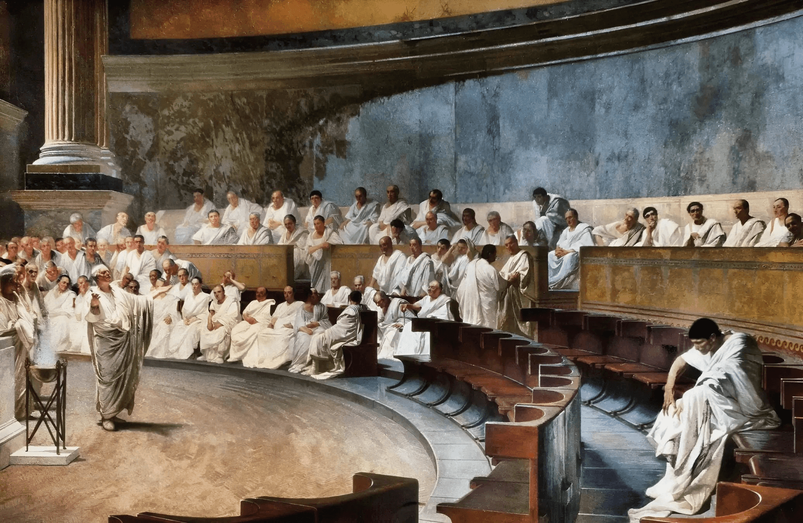
Ethos, Pathos, Logos: The Three Appeals of Persuasion
Persuade anyone by appealing to their head (logos), heart (pathos), or trust in you (ethos). Use this framework in design docs or presentations to make a stronger case.
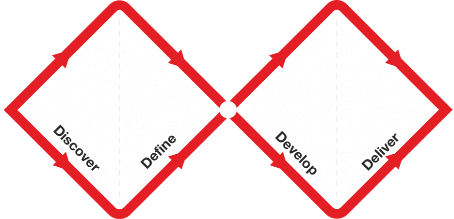
Double Diamond: Explore, Then Focus, Twice
The Double Diamond model prevents building the wrong thing by forcing two cycles of 'go wide, then narrow down.' First, explore the problem space, then define a specific problem. Second, explore solutions, then deliver a tested one.
Nielsen's 10 Heuristics: Rules of Thumb for UI Design
Nielsen's Heuristics are ten rules of thumb for evaluating if a design is user-friendly. Use them to spot usability issues in any interface, from apps to stovetops. The biggest mistake is treating them as strict laws, not flexible guidelines.
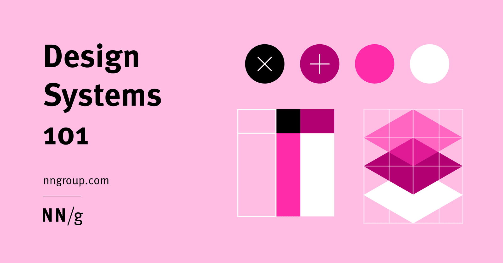
A Design System is a Shared Toolbox, Not Just a Sticker Sheet
A design system is a shared toolbox of reusable UI components and rules, not just a style guide. It ensures consistency and speed when multiple teams build products at scale.

Plain Language Writing: Write for Your Audience, Not Yourself
Plain language isn't dumbing down; it's writing so your audience can understand and act on information the first time. Use it in UI copy and docs to reduce user error. The footgun is assuming your audience shares your jargon and context.
Jobs to Be Done: Sell the Hole, Not the Drill
The Jobs to Be Done framework says customers 'hire' products to get a job done. Instead of selling a drill, sell the quarter-inch hole. This reframes innovation around stable customer needs, not temporary product features.
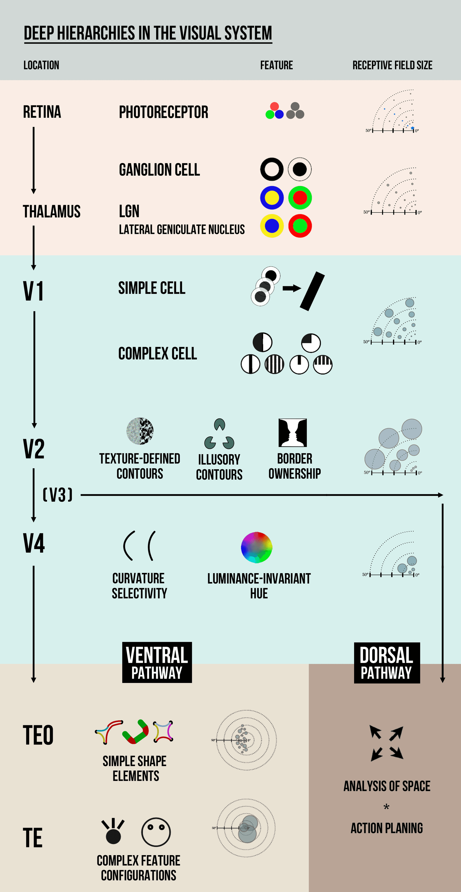
Visual Hierarchy: Guiding the User's Eye
Visual hierarchy guides the user's eye by making important things look important. It uses contrast in size, color, and placement to create a path of importance, like a big headline versus small footer text.
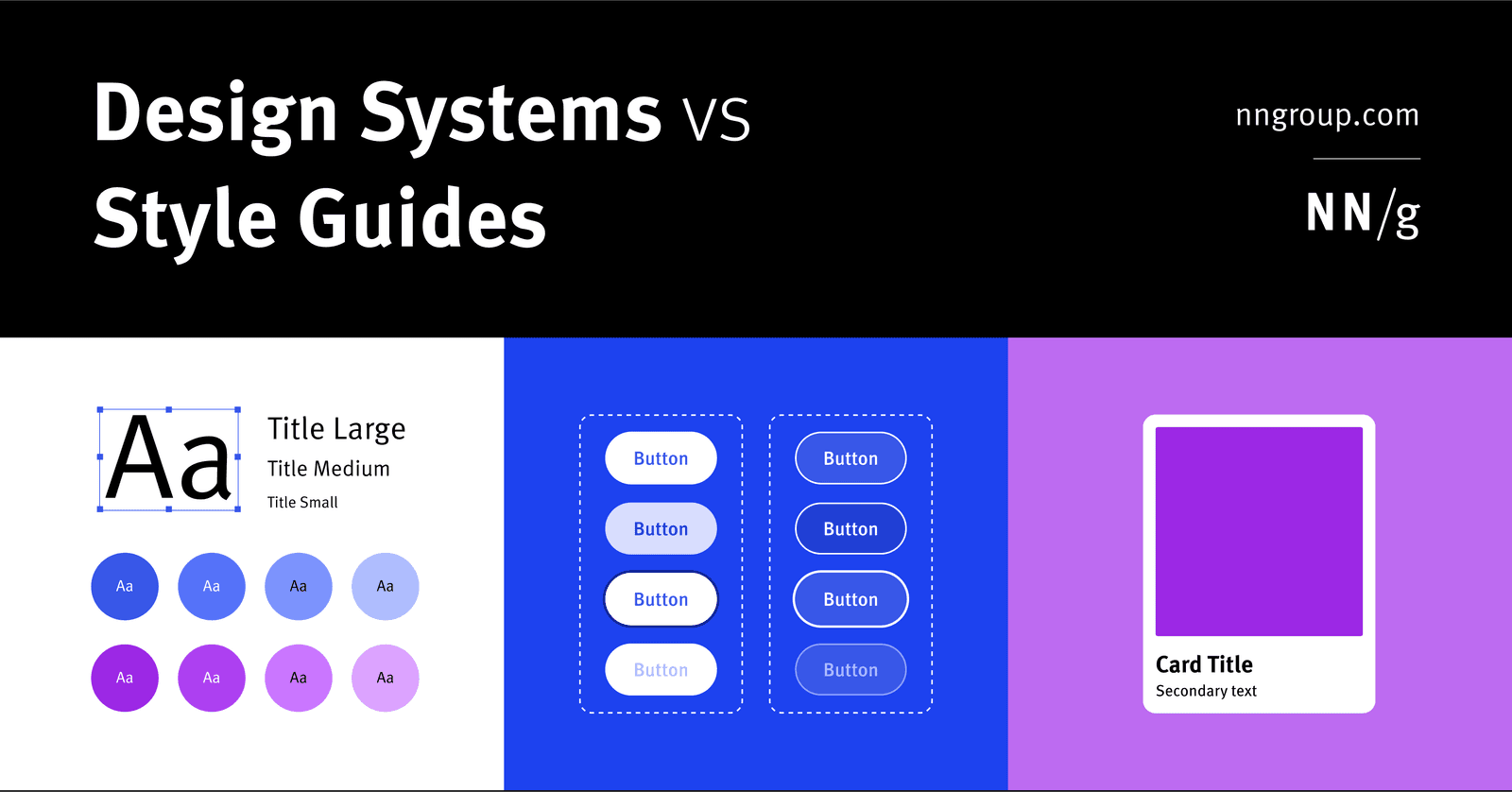
Design System: The Whole vs. Its Parts
A design system is the parent; style guides and component libraries are its children. It's the full toolkit for building consistent products at scale, containing rules, patterns, and ready-to-use code.

The Inverted Pyramid: Lead with the Conclusion
Lead with the conclusion, then add details in decreasing order of importance. This structure ensures readers get the main point even if they stop reading early. It's crucial for news, bug reports, and docs. The footgun is burying the lede in context.
Formative vs. Summative Evaluation: Improve vs. Judge
Formative evaluation improves a design in progress; summative evaluation judges a finished one. Use formative tests to find and fix flaws iteratively. Use summative tests to measure a shipped product against a benchmark, like a prior version or a competitor.
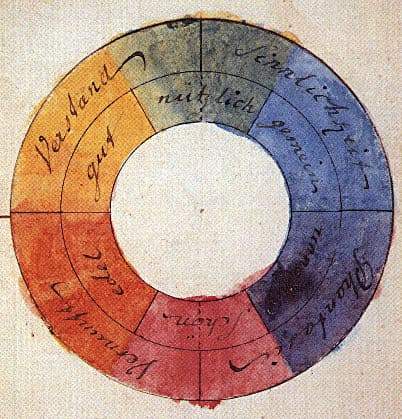
Color Theory: Harmony, Contrast, and Meaning in UI
Color theory is a system for using contrast, harmony, and symbolism to guide user experience. It's applied in UI to create visual hierarchy, evoke brand emotions, and ensure readability.

Atomic Design: Building UIs Like Chemistry
Atomic Design is like chemistry for UIs: you build complex screens from simple, indivisible 'atoms' like buttons and inputs. It's used to create consistent design systems. The footgun is treating it as a rigid, linear process instead of a mental model.

The PAS Formula: Turn a Reader's Pain into a Purchase
The PAS formula turns pain into a purchase by stating a problem, making it feel worse (agitating), then offering your product as the solution. It's used in ads and landing pages where you need to be persuasive fast.
UX Ethics: A Professional Code of Conduct
UX ethics formalizes your responsibility to users. It's about centering human well-being, being transparent with data, and actively preventing harm. This guides decisions from research to launch.
UI Typography for Readability
Good typography isn't about fancy fonts; it's about making content effortless to read by controlling size, spacing, and alignment. It's crucial for body copy, headings, and labels. The footgun is using justified text or lines over 90 characters long.
Design Systems: From UI Kits to Business Infrastructure
A design system is business infrastructure, not just a UI kit. It translates brand consistency into measurable ROI by reducing costs and accelerating delivery.

Brand Voice vs. Tone: Personality vs. Mood
Think of voice as your brand's consistent personality and tone as its mood, which adapts to the situation. This distinction guides all copy, from celebratory emails to error messages. The main footgun is forcing one tone, like humor, everywhere.
We are hiring for this. Every open role lists the topics its interview covers, so you can prepare for the real thing rather than guessing.
See open roles