Advanced everything in Design & UX, page 9
Figma Video: It's a Fill, Not a Layer
Treat video in Figma as just another fill, not a special layer. Apply it to any shape to prototype video players or motion backgrounds. The footgun is forgetting it requires a paid plan to upload and won't play in the Figma mobile app.
Figma Expressions: Dynamic Prototypes with Logic and Math
Figma expressions are like mini-formulas in your prototype, letting you manipulate variables with math and logic. Use them to build shopping carts that calculate totals or progress bars that fill up.
Figma's Slot Pattern: Flexible Components Without Detaching
Think of a slot as a 'bring your own content' area within a Figma component. It lets you customize instances with unique layouts, like in a card or modal, without detaching them from the main component and breaking your design system.
Auto Layout's `border-box`: strokesIncludedInLayout
Figma's strokesIncludedInLayout is the equivalent of CSS box-sizing: border-box. It makes an Auto Layout frame's total dimensions include its stroke, preventing size changes.
Figma REST API: Access Design Files as Structured Data
The Figma REST API treats your design files as structured JSON data, not just images. Use it to automate workflows like exporting assets, syncing design tokens, or posting comments. The main footgun is using the wrong base URL for Government vs.

Baseline Grid: Aligning Text for Vertical Rhythm
A baseline grid is like ruled notebook paper for your UI, forcing all text to sit on common horizontal lines for clean vertical rhythm. Use it in text-heavy layouts to improve readability.
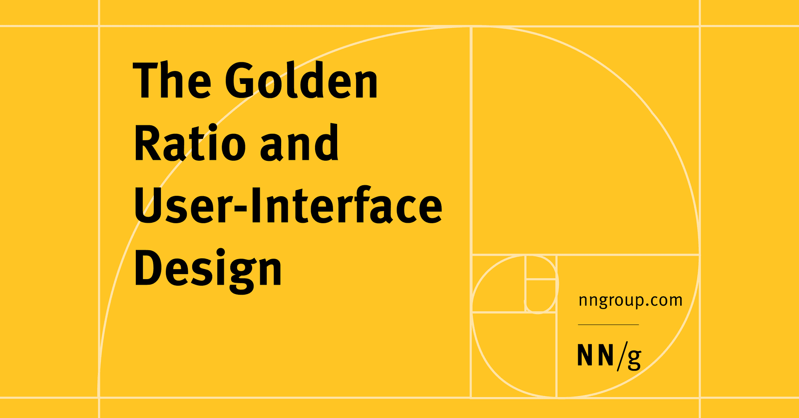
The Golden Ratio in UI Design
The Golden Ratio (1.618) is a proportion from art and nature used to create visually harmonious UI. Apply it to set layout dimensions or create a typographic scale (e.g., a 26px header for 16px body text).
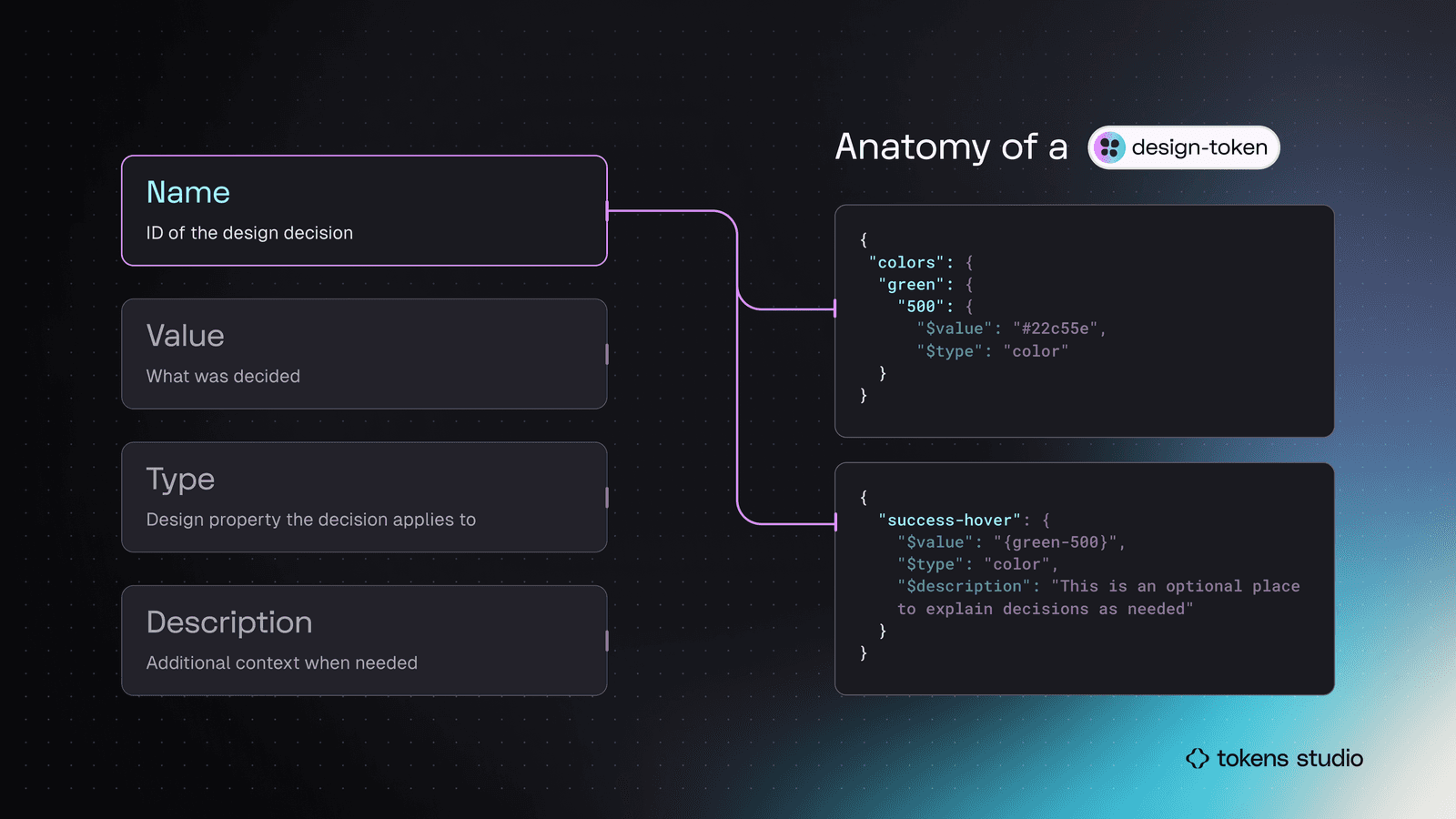
Semantic Naming for Design Tokens
Don't name a token by its value (blue-500); name it by its job (color.action.primary). This decouples design intent from implementation, making systems scalable. It's key for theming and avoiding "lie" variables when designs change.

Kerning, Tracking, and Leading: Spacing in Typography
Kerning adjusts space between two letters, tracking adjusts space across a whole word, and leading controls vertical line spacing. These are used in UI and branding to improve readability. The footgun is confusing kerning (pairs) with tracking (groups).
Cognitive Load: Don't Make Users Think (Too Hard)
Think of a user's brain like a computer with limited RAM; cognitive load is the processing power your UI demands. High load from cluttered interfaces slows users down, causing them to miss details or abandon tasks.
"Miller's Law" is Ambiguous and Often Misused
"Miller's Law" isn't one rule, but a name for four distinct, unrelated principles. This ambiguity causes confusion in fields like psychology and computer science.
Hick's Law: More Choices, Slower Decisions
Hick's Law states that decision time increases logarithmically with the number of choices. It's why complex menus slow users down, forcing them into analysis paralysis.
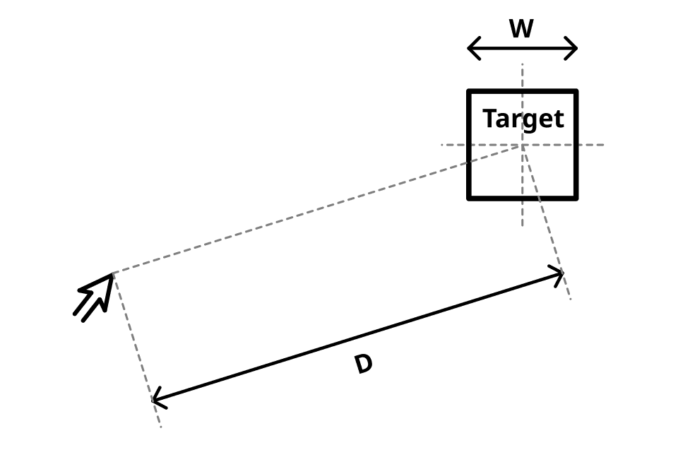
Fitts's Law: Bigger, Closer Targets Are Faster to Hit
Fitts's Law predicts that the time to hit a target depends on its distance and size. This is why mobile buttons are large and context menus appear at your cursor. The footgun is making everything huge, which sacrifices information density and visual hierarchy.

Spatial UI Design Systems
Spatial UI design systems define how interfaces behave in 3D space on devices like Vision Pro: depth-based hierarchy, distance-aware scale, and gaze-and-pinch interaction, replacing the flat, pointer-driven rules of traditional 2D design systems.

Adaptive UI for Foldables: Thinking in Postures
An adaptive UI for foldables thinks in "postures," not just screen sizes, reacting to states like folded or tabletop mode. This is key for apps on devices like the Pixel Fold. The footgun is treating a foldable like a big tablet, ignoring its unique physical.
SwiftUI Theming with the Environment
Treat SwiftUI's Environment as a cascading style sheet for your app. You define design tokens like colors and fonts once at the top, and all child views automatically inherit them. This is key for building design systems or multi-brand apps.
Jetpack Compose Theming for Design Systems
Compose theming uses CompositionLocal to implicitly pass design tokens like colors and fonts down the UI tree. This is key for building a design system where you can swap themes (like light/dark) without rewriting components.

Theming with CSS data-* Attributes
Think of data- attributes as labels for UI state, like data-theme='dark'. CSS uses attribute selectors ([data-theme='dark']) to apply styles directly, avoiding complex class logic.

Design System Versioning: One Package or Many?
Do you version your design system as one big package or as many small ones? The first ensures consistency, the second offers flexibility. This choice impacts how product teams consume updates.
Long-Term Support (LTS): Stability Over New Features
LTS is a promise of stability for a specific software version, trading new features for long-term bug fixes and security patches. It's crucial for production systems like Node.js or Ubuntu. The footgun is assuming all bugs get fixed, not just critical ones.
We are hiring for this. Every open role lists the topics its interview covers, so you can prepare for the real thing rather than guessing.
See open roles