Everything in Frontend Dev, page 55
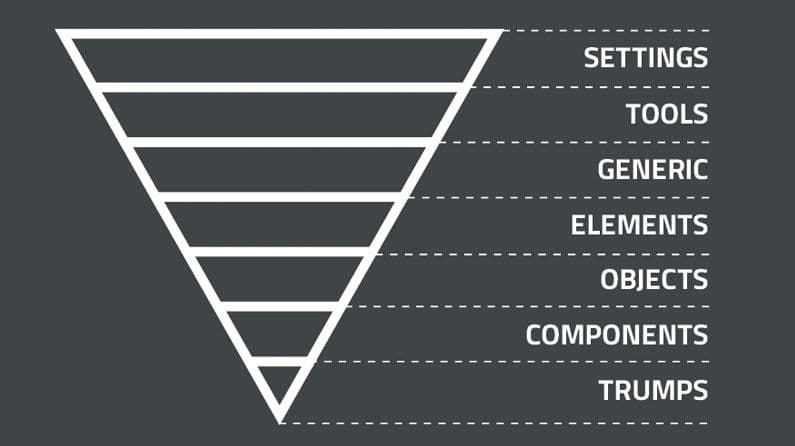
ITCSS: Structuring CSS from General to Specific
ITCSS organizes CSS from generic to specific, like an inverted triangle. It's for large projects to prevent specificity wars and make code predictable. The main footgun is not enforcing the layer order, which leads back to styling chaos and defeats the system.

Scoped CSS: Styling Components Without the Cascade Mess
@scope fences off your CSS, applying styles only within a specific part of the DOM. This lets you style a component without your rules leaking out or clashing with global styles.

Tailwind CSS: Styling Directly in Your HTML
Tailwind CSS lets you build designs by composing utility classes like flex and pt-4 directly in your HTML. This avoids context-switching for rapid UI development. The main footgun is creating verbose, unreadable markup if not managed well.
Styled Components: CSS-in-JS as Components
Think of your styles as React components. Styled Components uses JavaScript template literals to write CSS in your JS, creating components with encapsulated styles. It's ideal for building design systems where styles change based on props.
CSS Modules: Local Scope for Your Styles
CSS Modules treat your styles like local variables. Instead of a global stylesheet, each CSS file is scoped to the component that imports it, preventing name collisions in component-based apps.
SMACSS: A Naming Convention for CSS Scalability
SMACSS organizes CSS into five categories to prevent spaghetti code. It's a naming convention and thought process, not a library you install. It's used in large codebases where teams need a shared vocabulary for styling components.
Utility-First CSS: Style Directly in Your Markup
Utility-first CSS styles elements with many small, single-purpose classes directly in your HTML. It's used for rapid prototyping and component-based systems. The footgun is creating verbose, repetitive markup by not extracting common patterns into components.
CSS Custom Properties: Variables for Your Stylesheet
CSS Custom Properties are variables for your stylesheet. Define a value like --primary-color once on :root and reuse it with var(), making global theme changes easy. The main footgun: they only work for property values, not names or selectors.
OOCSS: Reusable Styles for Maintainable CSS
Treat CSS styles like building blocks. Object-Oriented CSS (OOCSS) separates an element's visual 'skin' (colors, borders) from its 'structure' (width, height). This lets you create reusable classes, reducing duplication for faster, maintainable stylesheets.
Scroll-driven Animations: Animate on Scroll, Not Time
Scroll-driven animations link an animation's progress to a scrollbar's position, not a clock. This is great for progress bars that fill as you scroll or elements that fade in as they enter the viewport. The main pitfall is confusing timeline types.
CSS Motion Path: Animate on a Curve
Think of offset-path as drawing a track for an element to follow. Use it for non-linear UI animations, like an icon following a curve. The footgun: the path itself doesn't cause motion; you must also animate offset-distance to move the element.
CSS transform-style: Let Children Live in 3D Space
The transform-style property decides if an element's children are flattened onto its 2D plane or share a 3D space. Use preserve-3d to create nested 3D objects. Beware: properties like opacity < 1 or overflow will break the 3D context and flatten it.
Hardware Acceleration: Getting Smooth CSS Animations
Use the GPU for smooth CSS animations by sticking to transform and opacity. This avoids costly CPU work like layout recalculations, keeping frame rates high. The footgun is animating properties like width or left, which cause jank.
CSS `will-change`: A Performance Hint, Not a Magic Wand
will-change tells the browser which properties you'll animate, letting it optimize rendering ahead of time. Use it to fix jank in complex transitions, but never apply it preemptively—overuse wastes memory and can make performance worse.
CSS `perspective`: Creating 3D Depth
The CSS perspective property sets a 'camera' distance for 3D-transformed children, creating a sense of depth. Use it on a container to make elements appear to recede into the screen. The main footgun: a smaller value creates a *more* dramatic effect.
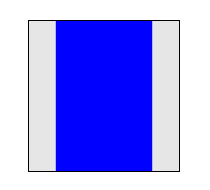
CSS 3D Transforms: Adding Depth to the DOM
CSS 3D transforms treat flat elements like objects in a 3D space, adding depth with properties like rotateY and translateZ. Use them for card-flip animations or product carousels. The footgun: forgetting to set perspective on a parent makes 3D look flat.
animation-fill-mode: Hold Styles Before and After Animation
The animation-fill-mode property prevents the jarring "snap" back to an element's original state after a CSS animation. Use forwards to hold the final state or backwards to apply the start state during a delay.
CSS Cubic-Bezier: The Art of Animation Pacing
A cubic-bezier function defines an animation's speed curve, controlling its acceleration and deceleration. It's used in CSS to make UI motion feel natural. The footgun is mistaking presets: ease accelerates more sharply than the symmetrical ease-in-out.
CSS Keyframe Animations: Multi-Step Motion Control
Think of CSS keyframes as a flipbook for your UI. You define styles at specific moments, and the browser animates between them. It's for multi-stage sequences, like loading spinners, where simple transitions fall short.
pointer-events: Making Elements Click-Through
The pointer-events property makes elements invisible to clicks and hovers, letting events pass through to what's underneath. Use it for decorative overlays on clickable content or to temporarily disable buttons.
We are hiring for this. Every open role lists the topics its interview covers, so you can prepare for the real thing rather than guessing.
See open roles