Everything in Frontend Dev, page 53
Accessible Name Computation: The UI Naming Algorithm
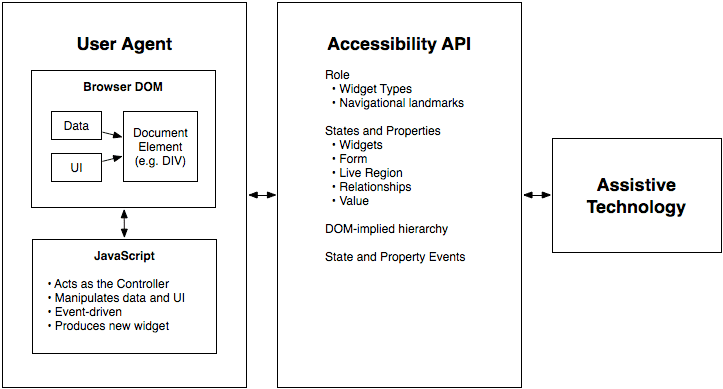
Browsers follow a strict algorithm to find a name for UI elements to announce to screen readers. It runs on every interactive element, creating the data source for assistive tech.
WAI-ARIA Roles: Semantics for Custom Components
WAI-ARIA roles are job titles for HTML elements, telling assistive tech what a generic <div> is meant to be, like a tab or button. Use them for custom UI components that lack a native HTML equivalent.

tabindex: Control Element Focus and Tab Order
The tabindex attribute lets you control an element's keyboard focus. Use tabindex="0" to make custom components tabbable in document order, or tabindex="-1" to make an element focusable only by script, like for a modal.
Build Accessible Animations with `prefers-reduced-motion`
prefers-reduced-motion lets you respect a user's system-wide request to minimize animations. Use this CSS media query to replace potentially jarring effects like zooms or parallax with simpler fades, preventing discomfort for users with vestibular disorders.

Semantic HTML: Describe Meaning, Not Just Looks
Semantic HTML uses tags that describe the content's role (e.g., <article>), not just its appearance. This helps screen readers and search engines understand your page, improving accessibility and SEO. The footgun is using <div> for everything.
ElementInternals: Making Custom Elements Form-Friendly
ElementInternals lets your custom elements act like native form inputs, integrating with validation, submission, and labels. Use it for custom inputs in a design system. The footgun: forgetting to call setFormValue() means its state won't be submitted.

Constructable Stylesheets: Share Styles, Not Bloat
Create and share CSS in JavaScript without duplication. Constructable Stylesheets are ideal for theming multiple Shadow DOM components from a single source; updates to the sheet propagate to all consumers. A key footgun: @import rules are ignored.
Form-Associated Custom Elements: Your Own Inputs
Make your custom elements behave like native inputs within a <form>. This lets them carry a value, be validated, and submit with the form. Use it for custom widgets like tag inputs. The footgun: its state won't submit if you don't call setFormValue().

Storybook: A Workshop for UI Components
Storybook is a workshop for UI components, letting you build and test them in isolation without running your entire app. It's used to develop component libraries, document design systems, and test hard-to-reach states.
CSS ::part(): Style Inside a Web Component's Shadow DOM
The ::part() pseudo-element lets you style specific elements inside a web component's Shadow DOM. It's a contract allowing consumers to theme designated "parts" of a component without breaking encapsulation. The main footgun: it only styles one level deep.
::slotted(): Style Content Passed into Web Components
The ::slotted() pseudo-element lets a Web Component style external content passed into its slots. It's how a component's internal CSS can style the "light DOM" elements it receives.
CSS :host: Style a Web Component from Within
The :host pseudo-class lets a web component style itself from the inside out. Use it inside a shadow DOM to apply styles to the host custom element, making components self-contained. The key footgun: it only works inside a shadow DOM; it has no effect in.
Shadow DOM: A Private Bubble for Your Components
Shadow DOM gives a component a private bubble, keeping its styles and structure isolated from the main page. This is key for building reusable Web Components and microfrontends.
CustomEvent: Sending Custom Data with Events
CustomEvent lets components communicate without direct coupling by firing custom-named events. It's like a private broadcast system for your app. Use it for a child component to signal a parent, passing data in the detail property. Don't forget detail!
HTML Slots: Making Web Components Customizable
The <slot> element is a placeholder inside a Web Component, letting you inject your own markup. It makes components flexible, like a card with customizable header and body sections. The footgun: content without a slot attribute goes to the default slot.
The HTML <template> Element: Inert, Reusable Markup
Think of <template> as a blueprint for HTML. It holds markup that's invisible and inactive until you need it, perfect for creating reusable chunks like list items that you can stamp out with JavaScript.
Custom Elements: Create Your Own HTML Tags
Think of Custom Elements as creating your own Lego bricks for the web, defining new HTML tags with custom logic. Use them to build reusable components like a <product-card>. Be wary of extending built-in elements, as Safari does not support this.
Design Tokens: Automating UI with a Build Pipeline
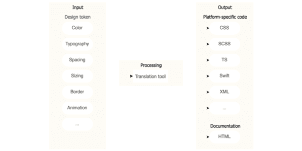
Think of design tokens as design decisions stored as data. A build pipeline consumes this data to auto-generate code for multiple platforms, ensuring consistency. The footgun is exposing all raw 'option' tokens instead of curated 'decision' tokens.
W3C Design Tokens: A JSON Standard for Design Systems
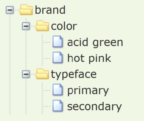
The W3C Design Tokens format is a universal translator for your design system's variables. It's a standard JSON structure that lets design tools and codebases speak the same language for colors and spacing.
Composite Design Tokens: Bundling Style Properties
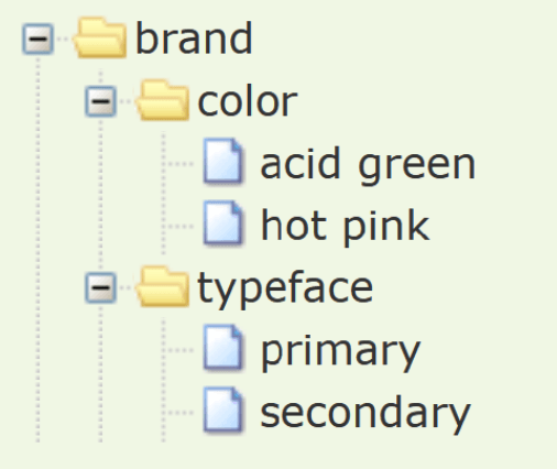
A composite design token bundles multiple style values into a single, semantic unit, like a "style kit" for shadows or typography. Use them to apply complex, multi-property styles like borders or text styles with one reference.
We are hiring for this. Every open role lists the topics its interview covers, so you can prepare for the real thing rather than guessing.
See open roles