Concepts in UI Design & Figma, page 2
White Space: Designing with Nothing
White space isn't just empty background; it's an active tool for grouping related elements and separating unrelated ones. Use it to improve readability and create focus. The footgun is seeing it as leftover space to be filled, which creates visual clutter.
Figma's Auto Layout Grid
Figma's Auto Layout Grid arranges items in a true 2D grid of rows and columns. Use it for complex, responsive layouts like dashboards or bento boxes. The footgun is expecting items to auto-wrap; it's a structured grid, not a flowing container.

Focal Point: You Can't Emphasize Everything
A focal point guides the user's eye by making one element dominant. To make something stand out, other elements must fade into the background. Use it to draw attention to a call-to-action or headline. The footgun is trying to emphasize everything at once.
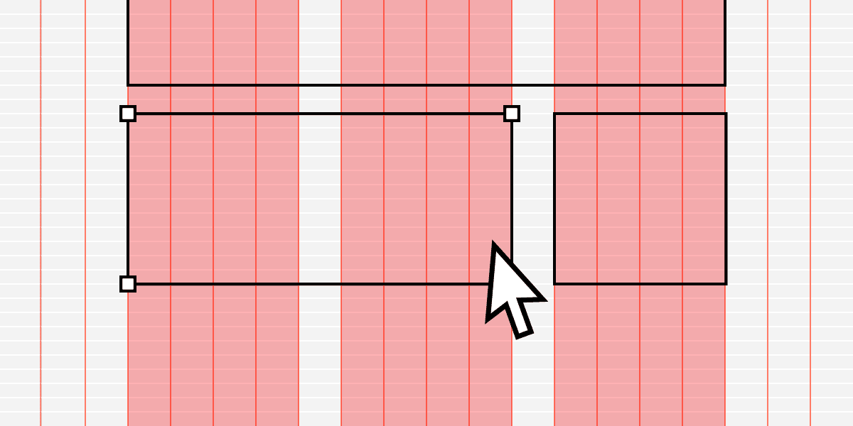
Modular Grid: Organizing UI with Cells, Not Just Columns
Think of a modular grid as spreadsheet cells for your UI. It extends a column grid with horizontal rows, creating a matrix of modules. It's ideal for repeating items like product cards or dashboard widgets.
Rhythm and Repetition in UI Layouts
Rhythm turns random elements into scannable patterns by repeating spatial intervals, not just shapes. Use it in lists, dashboards, and card grids where users hunt for information.
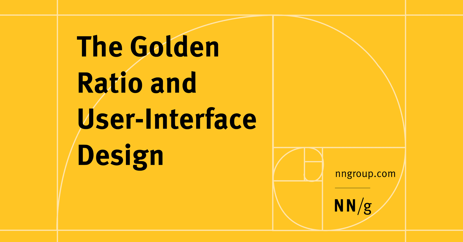
The Golden Ratio in UI Design
The Golden Ratio (1.618) is a proportion from art and nature used to create visually harmonious UI. Apply it to set layout dimensions or create a typographic scale (e.g., a 26px header for 16px body text).

Baseline Grid: Aligning Text for Vertical Rhythm
A baseline grid is like ruled notebook paper for your UI, forcing all text to sit on common horizontal lines for clean vertical rhythm. Use it in text-heavy layouts to improve readability.
Figma: Frames vs. Groups
A Frame is a container with its own size, like an artboard; a Group's size just shrinks to fit its contents. Use Frames for UI components with fixed dimensions and clipping, and Groups for simple collections.
Figma Shape Tools: Your Design Building Blocks
Figma's shape tools are the building blocks for any design. Use them to create everything from buttons and icons to dividers. The footgun: forgetting to hold Shift for perfect squares/circles or Option/Alt to resize from the center, slowing you down.
Figma Color Profiles: sRGB vs. Display P3
Figma's color profiles ensure consistent color across screens. Use sRGB for web standard compatibility or Display P3 for more vibrant colors on modern displays.
Figma REST API: Access Design Files as Structured Data
The Figma REST API treats your design files as structured JSON data, not just images. Use it to automate workflows like exporting assets, syncing design tokens, or posting comments. The main footgun is using the wrong base URL for Government vs.
Auto Layout's `border-box`: strokesIncludedInLayout
Figma's strokesIncludedInLayout is the equivalent of CSS box-sizing: border-box. It makes an Auto Layout frame's total dimensions include its stroke, preventing size changes.
Figma Components: Main vs. Instance
Think of a main component as a cookie cutter and instances as the cookies. The main component defines the master design (e.g., a button's shape). Instances are linked copies you use everywhere.
Nesting Components: Building Systems, Not Just Screens
Nesting components is like building with Lego: you combine small, reusable pieces (icons, buttons) into larger structures (cards). This is key for scalable design systems, where a card might contain nested icon and button instances.
Figma Text Properties: Beyond Font and Size
Text properties are your toolkit for precise typographic control, managing readability and hierarchy beyond just font and size. Use them to adjust line height for paragraphs, letter spacing for headings, and alignment for layout consistency.
Instance Swap Properties: Control Nested Components
An instance swap property is like a designated parking spot for a nested component. It tells designers 'you can swap this part out' and provides recommended replacements, like swapping an icon in a button.
Figma Libraries: Your Team's Single Source of Truth
A Figma library is your team's shared toolbox, ensuring everyone uses the same approved components. Use it to distribute your design system across files. The footgun is forgetting to publish updates, leaving teammates with outdated, inconsistent designs.
Breaking the Link: Detaching Figma Instances
Detaching an instance in Figma permanently breaks its link to the main component, converting it into a standard frame. Use this to make changes overrides can't handle or to create a new component variation.
Figma's Slot Pattern: Flexible Components Without Detaching
Think of a slot as a 'bring your own content' area within a Figma component. It lets you customize instances with unique layouts, like in a card or modal, without detaching them from the main component and breaking your design system.
Figma Prototype Scrolling: Simulating Overflow
Think of a frame as a window onto your content. To make it scroll, the content must be larger than the window. Use this for long pages, image carousels, or to fix navbars. The biggest footgun: if content doesn't extend beyond the frame, there's nothing.
We are hiring for this. Every open role lists the topics its interview covers, so you can prepare for the real thing rather than guessing.
See open roles