Concepts in UI Design & Figma, page 3
Figma Interactive Components: Prototype Smarter
Interactive Components build prototype logic directly into your component variants. Instead of wiring up hundreds of frames for a form, you define interactions like 'On Click' or 'Hover' once, and every instance inherits them.
Preserve Scroll Position: Seamless Figma Prototypes
Preserve scroll position makes Figma prototypes feel real by remembering where a user scrolled, even after navigating away. It's essential for long lists or maps. The footgun: if scrollable layers aren't identically named and structured, the position resets.
Figma Expressions: Dynamic Prototypes with Logic and Math
Figma expressions are like mini-formulas in your prototype, letting you manipulate variables with math and logic. Use them to build shopping carts that calculate totals or progress bars that fill up.
Figma Video: It's a Fill, Not a Layer
Treat video in Figma as just another fill, not a special layer. Apply it to any shape to prototype video players or motion backgrounds. The footgun is forgetting it requires a paid plan to upload and won't play in the Figma mobile app.
Figma: Stacking Multiple Interactions on One Object
Stack multiple interactions on a single Figma object by treating each as a separate event listener, like onClick and onHover. This is essential for components with hover states that also need to navigate.
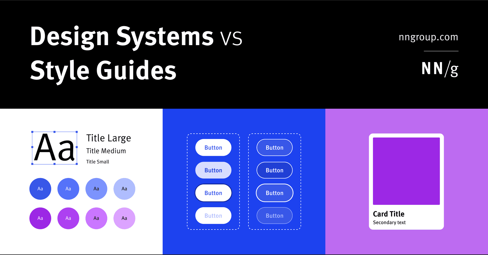
Design System vs. Style Guide: The Parent and the Child
A Design System is the parent; a Style Guide is just one child. The system is a complete toolkit for building products, containing reusable components and code, used by large teams to maintain consistency.
Measuring Design System ROI: From Cost to Investment
Frame a design system not as a cost but as a force multiplier for your team's time. Calculate its ROI to show management how much money reusable components and clear standards will save.
POUR: The Four Pillars of Web Accessibility
POUR is a mental model for web accessibility. It asks: can users Perceive content, Operate the interface, Understand the information, and use it with Robust tools? It applies to all UI design.

Alt Text: Giving Images a Voice for Everyone
Alt text gives an image a voice when it can't be seen. It's read by screen readers for accessibility and displayed if an image breaks. The footgun is writing "image of..." or leaving it blank; instead, describe the image's content and purpose.
Focus Order: The Keyboard's Path Through Your UI
Focus order is the path a user takes through your UI using only a keyboard. It's crucial for accessibility, letting users navigate forms and menus without a mouse.
Semantic HTML: Use the Right Element for the Job
Think of HTML tags as pre-built components, not just style containers. Using <button> instead of a styled <div> gives you keyboard navigation and screen reader support for free. The biggest mistake is using generic <div>s for interactive elements.

Accessible Form Design: A Conversation, Not an Interrogation
Think of a form not as a data bucket, but a structured conversation. Every field is a question needing a clear prompt. This is vital for logins and checkouts, especially for users with screen readers. The footgun: using placeholder text as a label.
Touch Target Size: Bigger is Better, Spacing is Key
A button's clickable area is more than its visible pixels; it includes the space to avoid fat-fingering neighbors. WCAG requires targets to be at least 24x24 CSS pixels for users with motor impairments.
Screen Readers: Designing for a Non-Visual UI
A screen reader navigates your UI's invisible DOM structure, not its visual layout. Think of it as a text adventure where headings are rooms and links are doors. This is essential for all web UIs, checked via alt text and keyboard focus.
Designing for Reduced Motion
Treat UI animations as an enhancement some users must disable for comfort. The prefers-reduced-motion media query lets you respect system-level accessibility settings, preventing vestibular triggers.
Figma Accessibility Annotations: Spec for Developers
Accessibility annotations embed a11y specs directly into your Figma file, translating visual design into build instructions. They're used during handoff to specify screen reader order and roles. The footgun is inconsistency; use a plugin or a system.
Figma Dev Mode: The Developer's View of Design Files
Figma's Dev Mode is a developer-focused lens for design files, translating visuals into code specs. Developers use it to inspect properties, grab code snippets, and track changes. The footgun is building from designs not explicitly marked 'Ready for dev'.
Figma: Exporting Assets for Handoff and Sharing
Exporting is Figma's shipping department, packaging designs into standard files like PNGs or SVGs. Use it to hand off assets to developers or share mockups with stakeholders. Footgun: If you can't see the Export panel, the file owner likely restricted it.
From Design to Code: Inspecting in Figma
Inspection translates a design into code-ready specs. It's the "view source" for a design file, showing exact colors, sizes, and spacing. Developers use it to build UIs; designers use it to verify consistency. Don't blindly copy auto-generated code.
Figma Dev Mode: From Design to Code Snippets
Figma's Dev Mode translates designs into code snippets, not just redlines. Select an element to get CSS, Swift, or Android XML with layout and style properties. The footgun is relying on this starter code; use Code Connect to link to your real design system.
We are hiring for this. Every open role lists the topics its interview covers, so you can prepare for the real thing rather than guessing.
See open roles