Easy everything in UI Design & Figma, page 2
Explain UI feedback and implement immediate feedback for API calls
Define feedback as real-time state communication; describe optimistic UI or spinners resolving to success or error after the API call.
What is a design system's purpose and how does it enforce consistency?
This tests if you see a design system as a single source of truth for design, not just a UI kit. A strong answer cites components and style guides that standardize output. Calling it only a Figma file without developer adoption is a red flag.
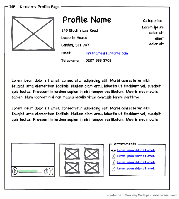
Wireframing: The Blueprint for Your UI
A wireframe is a UI blueprint that shows a screen's structure, not its visual design. Use it early to agree on layout and function before getting lost in colors and fonts. The footgun is adding too much detail, which distracts from its core purpose.
Information Architecture: The Blueprint for Your App
Think of Information Architecture (IA) as the blueprint for an app, defining its structure before visual design begins. It dictates navigation and content organization to make things findable.
Figma String Variables: Manage UI Text in One Place
A string variable is a single source of truth for UI text. Instead of typing text directly, you apply a variable. This is key for managing translations or different component states, like a button label changing from 'Submit' to 'Submitting...'.
From Design to Code: Inspecting in Figma
Inspection translates a design into code-ready specs. It's the "view source" for a design file, showing exact colors, sizes, and spacing. Developers use it to build UIs; designers use it to verify consistency. Don't blindly copy auto-generated code.
Figma: Exporting Assets for Handoff and Sharing
Exporting is Figma's shipping department, packaging designs into standard files like PNGs or SVGs. Use it to hand off assets to developers or share mockups with stakeholders. Footgun: If you can't see the Export panel, the file owner likely restricted it.
Figma Dev Mode: The Developer's View of Design Files
Figma's Dev Mode is a developer-focused lens for design files, translating visuals into code specs. Developers use it to inspect properties, grab code snippets, and track changes. The footgun is building from designs not explicitly marked 'Ready for dev'.

Alt Text: Giving Images a Voice for Everyone
Alt text gives an image a voice when it can't be seen. It's read by screen readers for accessibility and displayed if an image breaks. The footgun is writing "image of..." or leaving it blank; instead, describe the image's content and purpose.
POUR: The Four Pillars of Web Accessibility
POUR is a mental model for web accessibility. It asks: can users Perceive content, Operate the interface, Understand the information, and use it with Robust tools? It applies to all UI design.
Figma Prototype Scrolling: Simulating Overflow
Think of a frame as a window onto your content. To make it scroll, the content must be larger than the window. Use this for long pages, image carousels, or to fix navbars. The biggest footgun: if content doesn't extend beyond the frame, there's nothing.
Figma Components: Main vs. Instance
Think of a main component as a cookie cutter and instances as the cookies. The main component defines the master design (e.g., a button's shape). Instances are linked copies you use everywhere.
Figma Shape Tools: Your Design Building Blocks
Figma's shape tools are the building blocks for any design. Use them to create everything from buttons and icons to dividers. The footgun: forgetting to hold Shift for perfect squares/circles or Option/Alt to resize from the center, slowing you down.
Figma: Frames vs. Groups
A Frame is a container with its own size, like an artboard; a Group's size just shrinks to fit its contents. Use Frames for UI components with fixed dimensions and clipping, and Groups for simple collections.

Focal Point: You Can't Emphasize Everything
A focal point guides the user's eye by making one element dominant. To make something stand out, other elements must fade into the background. Use it to draw attention to a call-to-action or headline. The footgun is trying to emphasize everything at once.
Figma's Auto Layout Grid
Figma's Auto Layout Grid arranges items in a true 2D grid of rows and columns. Use it for complex, responsive layouts like dashboards or bento boxes. The footgun is expecting items to auto-wrap; it's a structured grid, not a flowing container.
White Space: Designing with Nothing
White space isn't just empty background; it's an active tool for grouping related elements and separating unrelated ones. Use it to improve readability and create focus. The footgun is seeing it as leftover space to be filled, which creates visual clutter.

Rule of Thirds: Guide the Eye, Don't Just Center
Don't center your subject; place key elements along the lines or intersections of a 3x3 grid. This creates a more dynamic, visually interesting composition in photos and UI layouts. The footgun is treating it as a rigid law; sometimes centering is better.
RGB vs. HSL: Two Ways to Tell a Computer 'Color'
RGB tells a computer how to mix light (Red, Green, Blue), while HSL describes color how humans perceive it (Hue, Saturation, Lightness). Use RGB for brand colors and HSL for intuitive variations. The footgun is creating low-contrast UIs that are unreadable.
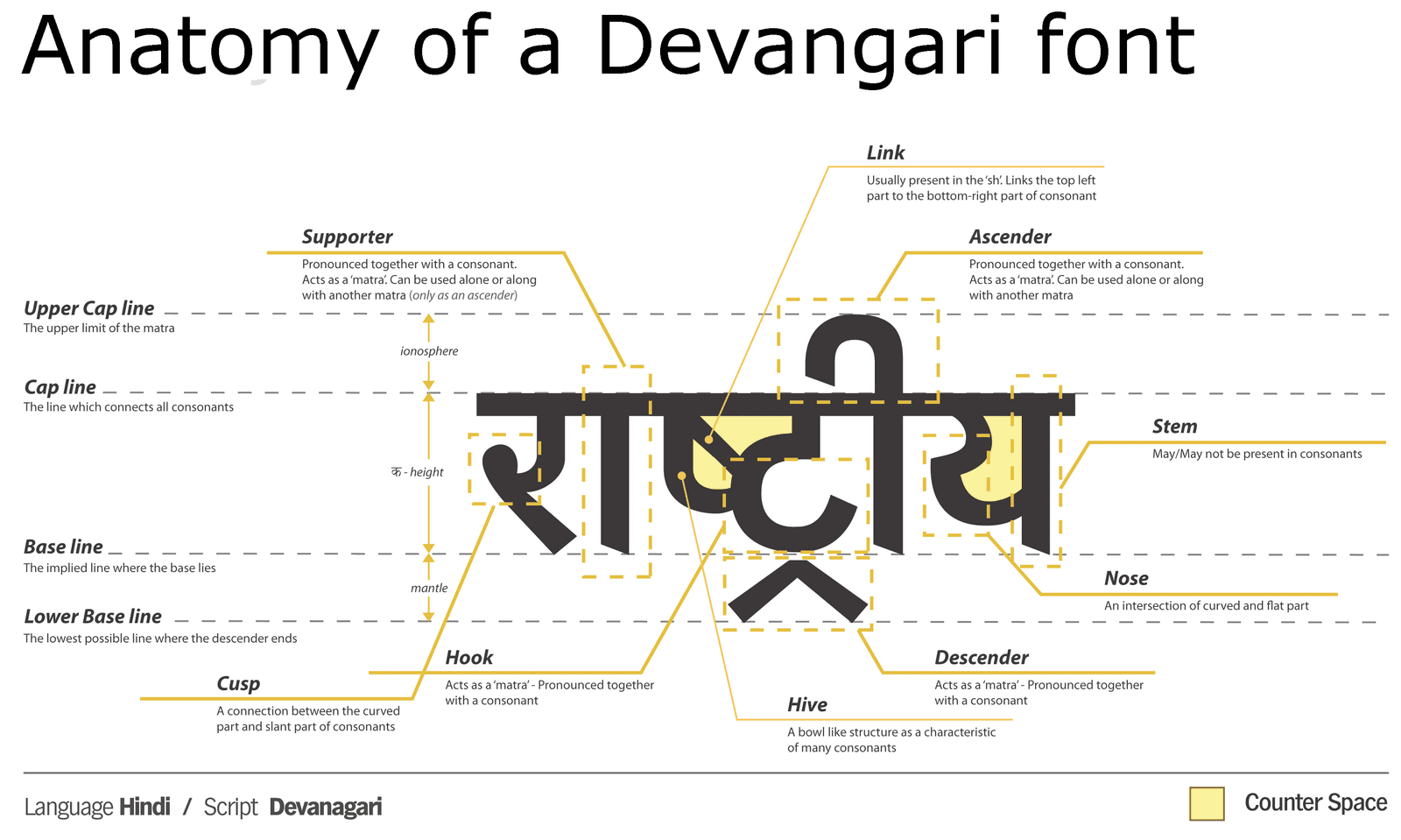
Anatomy of a Typeface: Why Letters Lie to Your Eyes
Typeface anatomy is a system of optical illusions. Letters are drawn with inconsistent dimensions to appear uniform. This is why a circle must be taller than a square to look the same size. The footgun is trusting bounding boxes over your eyes for alignment.
We are hiring for this. Every open role lists the topics its interview covers, so you can prepare for the real thing rather than guessing.
See open roles