All bites
The whole library, newest first. Filter by what you are here for, or pick a topic if you already know.
4330 bites
Page 147
Fixing brand color contrast at the system level
Build a tonal palette with known contrast steps, define semantic text-on-surface token pairs that pass AA, and enforce with automated contrast checks.
Brand color as a token and CSS custom property
Define a typed color token in JSON, generate a custom property like --color-brand-primary, then reference it with var().
CSS Grid versus Flexbox fundamentals
Flexbox is one-dimensional (a single row or column), Grid is two-dimensional (rows and columns together); use Grid for page layout, Flexbox for a toolbar of items.
CSS transition versus animation
Transitions interpolate between two states triggered by a change; animations use keyframes for multi-step, looping, autonomous motion.
Core tokens versus alias semantic tokens
Core tokens are raw values like blue-500; alias tokens reference cores with intent like color-action; semantic aliasing decouples meaning from raw value.
Component variants with BEM modifier classes
A base block class holds shared styles, modifier classes (block--primary, block--destructive) layer only the differences, and you combine base plus one modifier.
Monorepo tradeoffs for a design system
Monorepos give atomic cross-package changes, shared tooling, and easy local linking; drawbacks include build complexity, CI scaling, and tighter coupling.
Multi-theme infrastructure for a component library
Style components against semantic tokens exposed as CSS custom properties, define per-theme token values, and switch at runtime via a data-theme attribute or class.
What is a design system and its primary engineering components?
Tests if you treat design systems as engineering infrastructure, not just UI kits. Strong answers cite reusable coded components, design tokens, documentation, and governance as the core. Red flag: calling it just a component library or style guide.
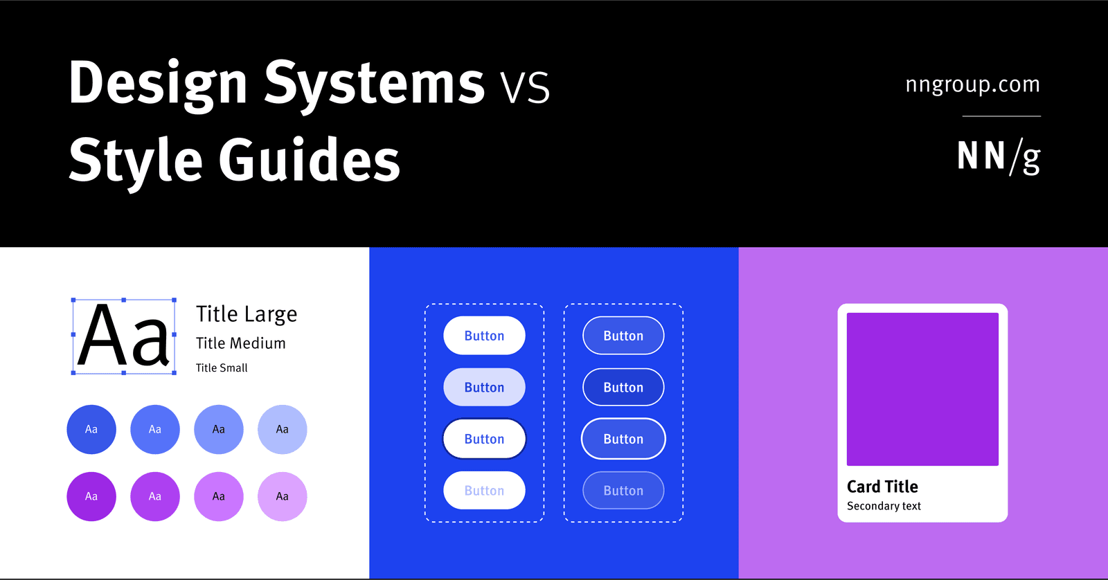
Component library vs style guide vs design system
A design system is holistic parent for scale; a style guide is a narrow visual/content child; a component library is a coded child of reusable UI elements.
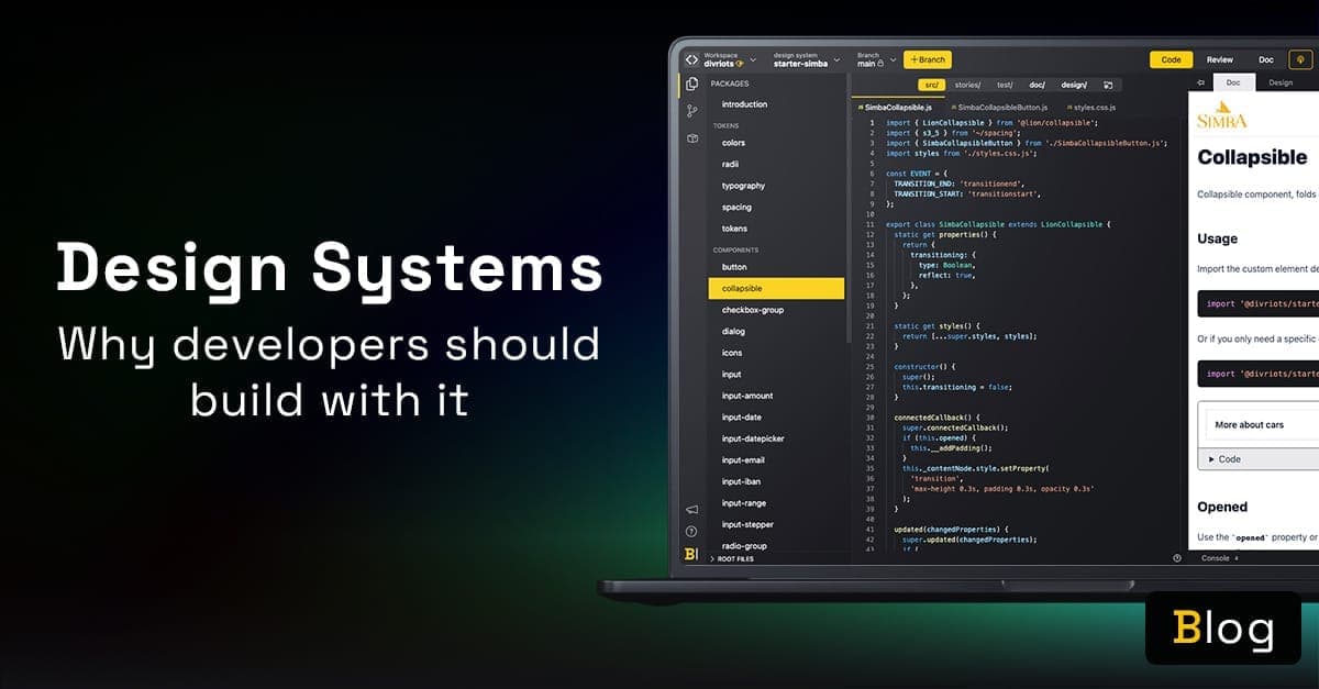
What are the main benefits of consuming a design system?
Cite tokens for theming, isolated components, live docs, and designer collaboration.

How would you build a design system business case for leadership?
Audit inefficiencies with metrics, map the pitch to stakeholder priorities like ROI and velocity, and contrast build cost with projected savings.
What are design tokens and why standardize them?
Tests whether you treat tokens as API contracts between design and engineering. Strong answers define platform-agnostic decisions, cite W3C DTCG spec for cross-platform codegen, and note aliasing prevents drift.

What metrics measure design system success and adoption?
Tests if you connect design system health to delivery speed and consistency. Strong answers hit adoption rate, component usage, design-to-code parity, and accessibility compliance tied to team behavior.

What governance model would you propose for a centralized design system?
Tests balancing standardization with autonomy across legacy silos. A strong answer proposes a hybrid model with a core team and contribution rules, weighing consistency against migration cost.
How do you handle a product team requesting a custom Button?
This tests governance discipline. A strong answer asks context questions to separate misuse from a real gap, uses a decision tree for actions and CTAs, and extends the system with a documented variant. A red flag is instantly greenlighting a custom fork.
.avif&w=1600&q=75)
How does a mature design system change cross-functional collaboration?
Tests whether you view maturity as a collaborative operating framework, not just components. Strong answers hit shared definitions of done, living documentation, code/design parity, and trust-based adoption. Red flag: calling it a docs or enforcement problem.
What is a design token versus a CSS or Sass variable?
Whether you understand abstraction layers in design systems and cross-platform interoperability. Define tokens as vendor-neutral design decisions that generate platform-specific code; contrast with CSS variables (runtime, web-only) and Sass (compile-time…

Implement a typographic scale using design tokens and accessible properties
Token-driven typography and accessibility. Start with base size (14-16px) and ratio token, compute sizes, then bundle font-size with line-height, letter-spacing, weight, and family in composite tokens. Red flag: ignoring line-height, spacing, or composites.
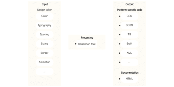
Design token pipeline serving Web, iOS, and Android
This tests cross-platform design system architecture and governance. A strong answer uses W3C JSON tokens in option, decision, component layers, with Style Dictionary generating Web, iOS, and Android outputs. Red flag: using Figma or CSS as source of truth.