All bites
The whole library, newest first. Filter by what you are here for, or pick a topic if you already know.
8668 bites
Page 179
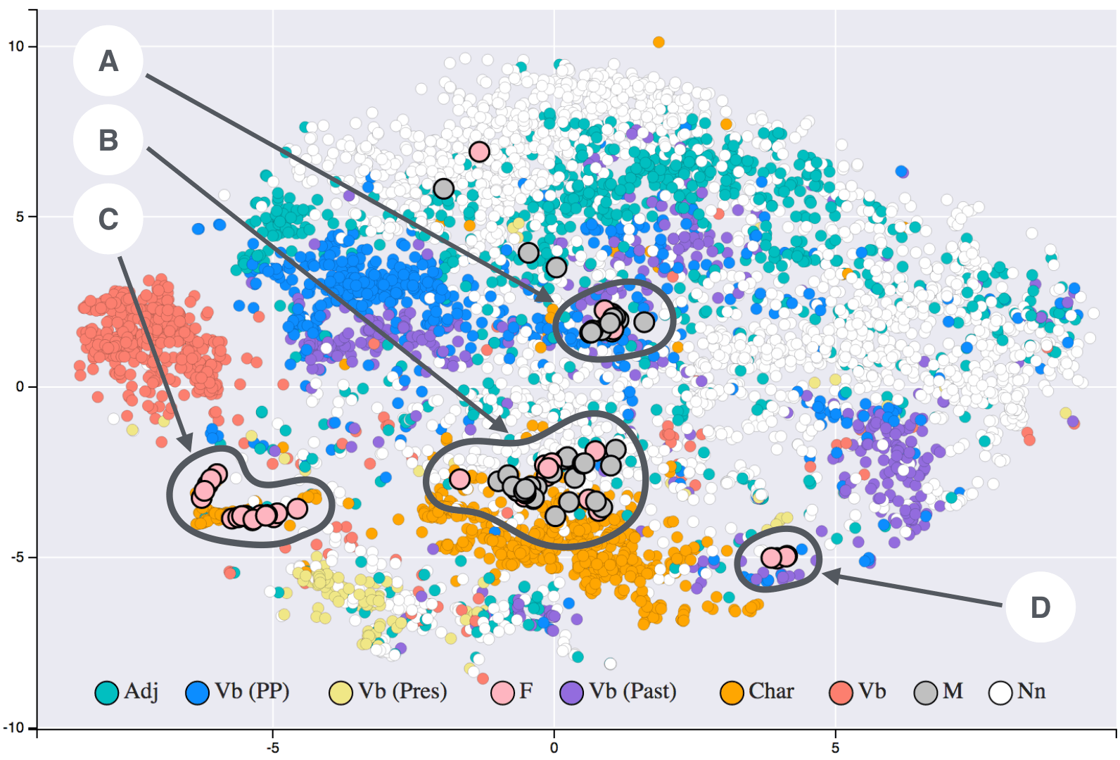
t-SNE: Map High-Dimensional Similarity to 2D
t-SNE turns high-dimensional similarity into 2D or 3D distance: similar points cluster and dissimilar points separate. Use it to visualize complex datasets on a flat map. Do not read exact distances from the plot; it preserves local probability, not geometry.

ETL: The Three-Phase Data Pipeline
ETL is a three-phase pipeline: extract from sources, transform, and load into containers. It supports many sources and destinations and runs as automated software, manual jobs, or scheduled batches. The footgun is manual execution of recurring jobs.

SVD: Eigendecomposition for Any Matrix
SVD treats any matrix as rotation, then scaling, then rotation. It generalizes eigendecomposition beyond square normal matrices to any real or complex matrix.
MLE: Find the Parameters That Make Data Likely
MLE tunes your model until observed data looks inevitable. Use it to fit distributions to logs, traffic, or errors. The footgun: it assumes your distribution family is correct; under a wrong model, it finds the best-fitting wrong answer with high confidence.
How do you structure and tokenize animation and transition values?
This tests semantic token architecture for motion. Structure duration and easing into tiered tokens: primitive values, semantic aliases like feedback or navigation, and component bindings. Avoid hardcoding values or using only raw milliseconds without meaning.

How should you adapt animations for prefers-reduced-motion?
Scope motion to no-preference, swap scaling for opacity or instant cuts, keep functional changes visible.
How do you programmatically sync CSS animation progress to scroll?
This tests scroll-driven APIs beyond legacy scroll listeners. A strong answer names CSS animation-timeline and scroll-timeline declaratively, plus the Web Animations API with ScrollTimeline in JS. A red flag is using only requestAnimationFrame style mutations.
CSS will-change: purpose, appropriate use, and overuse consequences
Tests whether you know will-change is a last-resort hint, not a default. Strong answers: hint imminent changes, toggle via script, and warn that overuse wastes memory. Red flag: leaving it in CSS permanently or applying it preemptively to many elements.
Create a staggered list fade-in using only CSS
Tests CSS animation orchestration via keyframes and delay strategies. Great answers use :nth-child or --index variables for scalable staggering, set fill-mode forwards, and honor prefers-reduced-motion.
Why is animating transform preferred over top or margin-left?
Grasp of the rendering pipeline and frame rate. A strong answer says transform skips layout and runs on the compositor, while top and margin-left force layout and drop frames.
How do you trigger a CSS transition? Provide two methods.
Set transition on the element, then change a property via :hover or by toggling a class with JavaScript.
Using CSS Grid, how do repeat, auto-fit, and minmax create responsive columns?
Tests intrinsic sizing and responsive tracks without media queries. A strong answer gives repeat(auto-fit, minmax(250px, 1fr)), noting repeat generates tracks, auto-fit collapses empties, and minmax sets a floor with fractional growth.
Implement fluid typography from 16px to 24px across 400px–1200px in one declaration?
This tests clamp() fluency for viewport-relative type scaling without media queries. A strong answer states clamp(16px, calc(16px + 8 * (100vw - 400px) / 800), 24px) and explains the slope math. A red flag is multiple media queries or calc() without clamp().
What are CSS container queries and what problem do they solve?
This tests component-level responsive awareness. A strong answer states container queries style elements based on their container size, letting components adapt regardless of viewport. Red flag: believing media queries alone solve component context adaptation.
Explain advantages of rem and em over px in responsive design
This tests cascading font scaling and accessibility. Strong answers mention user zoom, root-level rem control, component em scaling, and avoiding px fragmentation. Red flag: claiming px handles all user preferences automatically.
How would you use srcset and sizes for responsive image performance?
This tests responsive image selection in the browser. A strong answer covers srcset with w or x descriptors, sizes for layout width hints, and the browser picking before CSS loads. Red flag: suggesting JS detection or CSS backgrounds instead.
Build a responsive 3-column layout with Flexbox and Grid
Tests whether you pick right tool for responsive layouts. Good answers use flex-wrap and flex-basis for Flexbox, repeat() or grid-template-areas for Grid, in min-width 768px query. Red flag: desktop-first max-width queries or claiming Grid replaces Flexbox.
Key differences between responsive and adaptive design, and when to choose adaptive
It tests layout strategy trade-offs beyond media queries. A strong answer contrasts responsive fluid grids with adaptive device-specific layouts. Red flag: claiming they are identical or that adaptive means more breakpoints.
Make an image scale fluidly without exceeding its original size
Tests intrinsic sizing awareness. Good answer: max-width: 100% scales the image down with its container but never stretches it beyond intrinsic size; add height: auto to preserve aspect ratio. Red flag: width: 100% or omitting height, causing distortion.
Explain the mobile-first approach and how it differs from desktop-first
Mobile-first starts small, layers up with min-width; desktop-first starts large, overrides down with max-width.