All bites
The whole library, newest first. Filter by what you are here for, or pick a topic if you already know.
8668 bites
Page 180

What is the viewport meta tag and what does width=device-width, initial-scale=1.0 do?
This tests mobile viewport behavior and CSS pixels. The tag instructs browsers how to size the viewport; width=device-width sets width to screen CSS pixels; initial-scale=1.0 sets a 1:1 zoom ratio. A red flag is confusing viewport width with physical pixels.

How can CSS aspect-ratio and modern layout properties prevent CLS?
Set width/height attributes, use CSS aspect-ratio for responsive scaling, and reserve container space with min-height.
How do min-content, max-content, and fit-content work in CSS Grid?
It tests intrinsic track sizing. A strong answer defines min-content as the smallest no-overflow width, max-content as widest no-wrap width, and fit-content as clamped max-content; then shows labels hugging longest word.
What problem does subgrid solve? Give a concrete example.
This tests whether you know nested grids create track contexts breaking cross-level alignment. A strong answer explains subgrid inherits parent tracks, using a card whose internals align to a global page grid.
Implement a fixed-width sidebar with Flexbox and CSS Grid
This tests Flexbox as one-dimensional versus Grid as 2-dimensional. A strong answer covers Flexbox with flex: 1 on main and flex: none on sidebar, and Grid with grid-template-columns: 250px 1fr. Red flag: claiming Grid is always superior or ignoring overflow.
Explicit vs implicit grid: how do you control implicit tracks?
Explicit tracks use grid-template; implicit tracks appear on overflow. Control via grid-auto-rows/columns and grid-auto-flow.
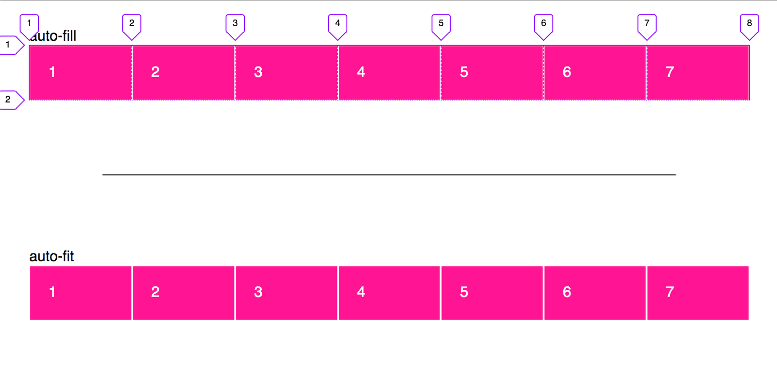
Create a responsive card grid without media queries
This tests CSS Grid intrinsic sizing. Answer: grid-template-columns with repeat(auto-fit, minmax(min, 1fr)), leveraging repeat, minmax, and auto-fit for fluid wrapping. Red flag: defaulting to Flexbox or media queries instead of intrinsic grid behavior.
Explain flex-grow, flex-shrink, flex-basis and their interaction
Tests deep understanding of flexbox sizing beyond keywords. A strong answer defines grow and shrink as ratios for distributing leftover or overflow space, basis as the starting size, and explains the two-step calculation.
CSS Grid: difference between 1fr and auto column sizing?
Tests fractional vs intrinsic sizing. 1fr divides leftover space; auto shrinks to content. Note that 1fr minimums default to auto, causing overflow with unbreakable content, unlike auto tracks. Red flag: claiming they are identical or auto always fills space.
How does color-scheme interact with user-agent stylesheets and prefers-color-scheme?
This tests the boundary between author CSS and browser chrome. color-scheme lets the UA recolor native UI like scrollbars and form controls automatically, while prefers-color-scheme styles custom components.
How do you create gradient text in CSS?
Set a gradient background-image, use background-clip: text to clip to glyphs, and color: transparent to reveal it.
How do CSS Custom Properties manage a design system color palette?
Define --color-primary on :root, use var() for buttons and headings, mention fallbacks.
What is font-display and how do swap and block differ?
This tests knowledge of the font display timeline. Swap shows fallback immediately then swaps in custom font, while block hides text for a short block period before fallback. A red flag is claiming swap prevents layout shift or that block is superior.
Create a vertical black gradient overlay on a background image
Use linear-gradient with rgba black stops, layer it over the image via stacked backgrounds or a pseudo-element.
Which CSS background properties make a hero image cover its container?
Tests background-size keywords and aspect-ratio behavior. Lead with cover, note it fills the container by cropping while preserving ratio, unlike contain. Red flag: recommending 100% 100% or explicit lengths, which stretch and distort the image.
Explain em, rem, px and why rem is preferred for font sizing
This tests CSS unit semantics and accessibility. px is absolute; em compounds against its parent; rem is root-relative and predictable. rem respects user browser font settings without nesting issues.
How do you declare a custom font and apply it to headings?
This tests @font-face usage for custom web fonts. A good answer declares a font-family name and src URL inside @font-face, then applies that family to heading selectors.
Set paragraph text blue and background light grey, compare HEX, RGB, HSL
Set color and background-color; HEX is compact, RGB is explicit, HSL is intuitive for lightness/hue.
Explain :is() vs :where() specificity and when to pick :where()
Tests whether you treat specificity as architecture, not just syntax. :where() has zero specificity; :is() adopts the most specific argument's weight. Choose :where() for base resets or utility classes designed to be overridden. Red flag: calling them equal.
How is CSS specificity calculated for a complex selector?
This tests ID-CLASS-TYPE algorithm fluency. A strong answer gives the three-column tally, counts IDs, classes or attributes, and types in order, and notes combinators add zero. A red flag is counting combinators or mixing inline styles into selector scores.