Concepts in AI & ML
pandas DataFrame: A Spreadsheet in Code
Think of a pandas DataFrame as a powerful spreadsheet you control with code. It's the workhorse for loading, cleaning, and analyzing tabular data in Python, like sales figures from a CSV.
NumPy ndarray: Fast, Typed, Multidimensional Grids
A NumPy ndarray is a fast, memory-efficient grid for numbers of a single type. It's the backbone for scientific computing, used for image data to ML model weights. The main footgun: slicing often creates a view, not a copy, so edits can alter the original.
JSON: The Lingua Franca of Web APIs
JSON is a universal translator for data, using human-readable text to describe objects and lists. It's the default for web APIs sending data to browsers. The footgun is treating it as a JavaScript object; JSON is a stricter string format.
Handling Duplicate Data
Finding duplicate records is a key part of data cleansing. It's not just about deleting rows with the same ID; duplicates can be subtle and require careful handling to avoid corrupting your dataset. The footgun is assuming all duplicates are safe to delete.

Histogram: See the Shape in Your Data
A histogram turns a raw list of numbers into a picture of its distribution, like sorting coins into stacks. It's used to see where data clusters and how it's spread out. The main footgun: the story your histogram tells depends entirely on the bin size.
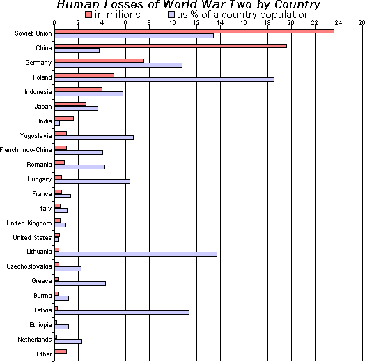
Bar Chart: Compare Categories at a Glance
A bar chart is a lineup of rulers for different categories, making it easy to compare values. It's perfect for showing "how much" for discrete items, like monthly sales or user counts by country. The footgun: don't use it for continuous data—use a line chart.

Scatter Plot: Visualizing Relationships Between Two Variables
A scatter plot visualizes the relationship between two variables as a cloud of data points. It's used to quickly spot trends, like whether increased study time correlates with higher test scores. The key footgun: correlation is not causation.

Box Plot: See a Distribution's Shape at a Glance
A box plot is a cheat sheet for a dataset's distribution, showing the median, the middle 50% of data (the box), and outliers. Use it to quickly compare distributions, like server response times across regions. The footgun: the line is the median, not the mean.

Probability Distributions: Mapping Odds to Outcomes
A probability distribution is a map of all possible outcomes and their chances. It's used to model everything from coin flips to customer churn. The footgun is assuming a simple bell curve when reality is often skewed or unpredictable.
Feature Scaling: Putting Your Data on the Same Yardstick
Feature scaling puts all data on a common scale, preventing features with large values from dominating your model. It's vital for distance-based algorithms (k-NN) and gradient descent. The key footgun is fitting the scaler to your test set, which leaks data.
One-Hot Encoding: Turning Categories into Numbers
One-hot encoding turns categories into on/off switches for algorithms. Instead of one column with "red" or "green", you get separate "is_red" and "is_green" columns. It's essential for machine learning, but avoid it for features with too many unique values.

Logistic Regression: Predicting a Yes or No Outcome
Logistic regression predicts a binary outcome (yes/no, 1/0) by calculating the probability of an event. It's used for classifying things like spam email or fraudulent transactions. The footgun is mistaking its output for certainty instead of a probability.
Decision Tree Learning: A Flowchart for Your Data
Decision tree learning builds a predictive flowchart from your data. It's used for classification (like spam vs. not spam) or regression (like predicting price). The main footgun is overfitting: creating a tree so specific it can't handle new data.
k-Means Clustering: Grouping Data Around Centroids
k-Means automatically groups data into a specified number of clusters (k) by finding the center of each group. It's used for customer segmentation, document categorization, and image compression.
Consuming REST APIs: Speaking to Web Services
Think of consuming a REST API like ordering from a menu. You use standard actions (GET, POST) on specific URLs to request or change data. This is how apps fetch user profiles, get weather data, or submit forms. The footgun: Don't ignore HTTP status codes.

Data Storytelling: Using Narrative to Drive Insight
Structure your data presentation like a story—a journey with rising tension and a clear resolution. This guides stakeholders from a problem to a solution in reports.

MLOps vs. DevOps: More Than Just "DevOps for ML"
Think of MLOps as DevOps extended for machine learning. While DevOps automates code deployment, MLOps also handles the unique lifecycle of data and models, including retraining and monitoring for performance decay.
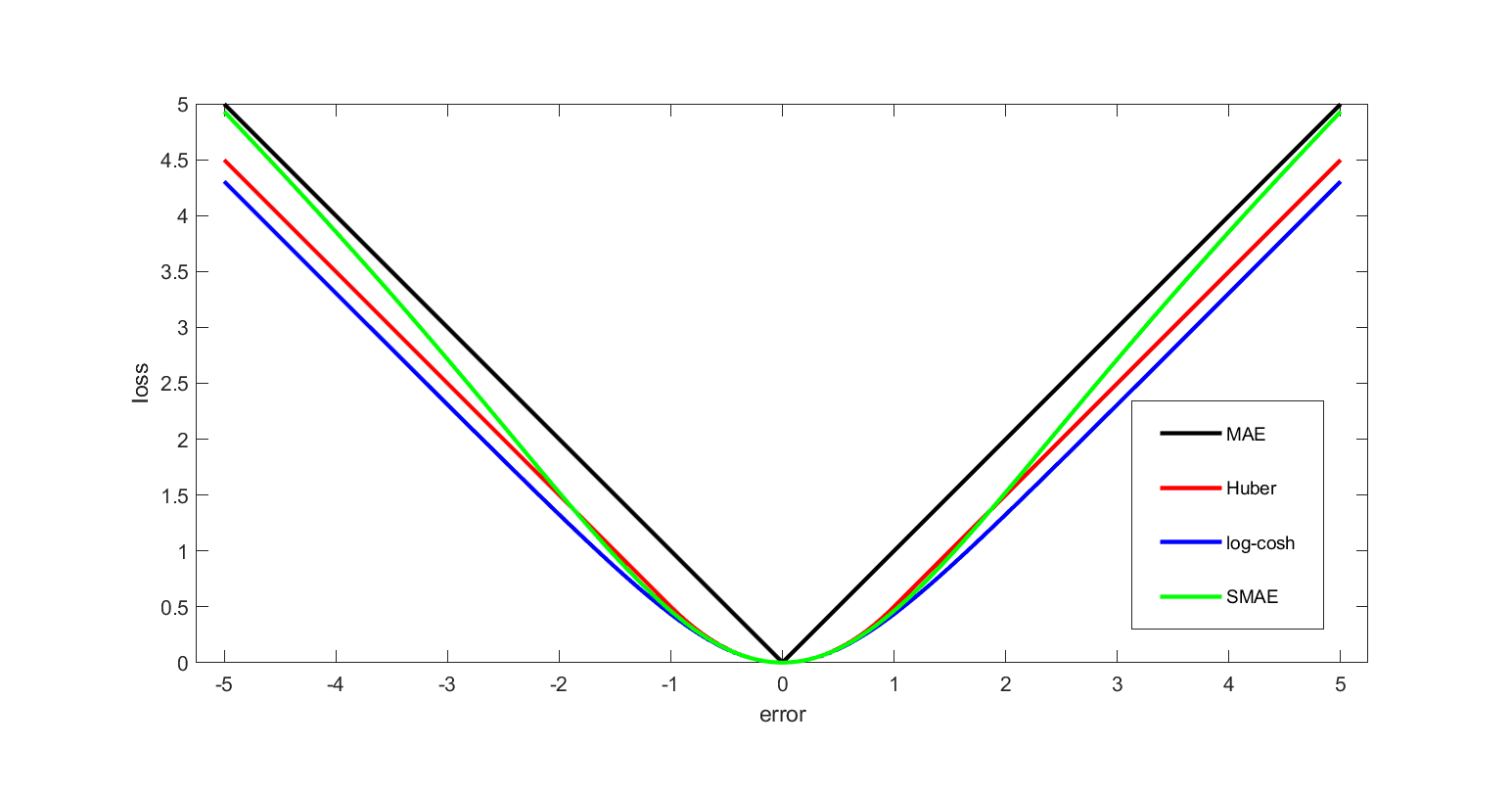
Loss Function: Quantifying 'How Wrong' a Model Is
A loss function is a score that tells a machine learning model how wrong its predictions are. The lower the score, the better. It's the engine of training, guiding the model to adjust its parameters to get closer to the correct answers.
Stakeholder Analysis: Mapping Influence and Interest
Stakeholder analysis maps your project's human landscape, plotting who is affected (interest) and who can affect its outcome (influence). It's used to anticipate needs and align on goals.

Digital Images as Grids of Pixels
Think of a digital image as a mosaic of tiny colored tiles called pixels. This 'raster' method stores the exact color of each point, making it perfect for photos. The footgun: scaling up reveals the grid, causing blurriness or pixelation.
We are hiring for this. Every open role lists the topics its interview covers, so you can prepare for the real thing rather than guessing.
See open roles