Easy interview questions in Design Systems
What is a design system and its primary engineering components?
Tests if you treat design systems as engineering infrastructure, not just UI kits. Strong answers cite reusable coded components, design tokens, documentation, and governance as the core. Red flag: calling it just a component library or style guide.
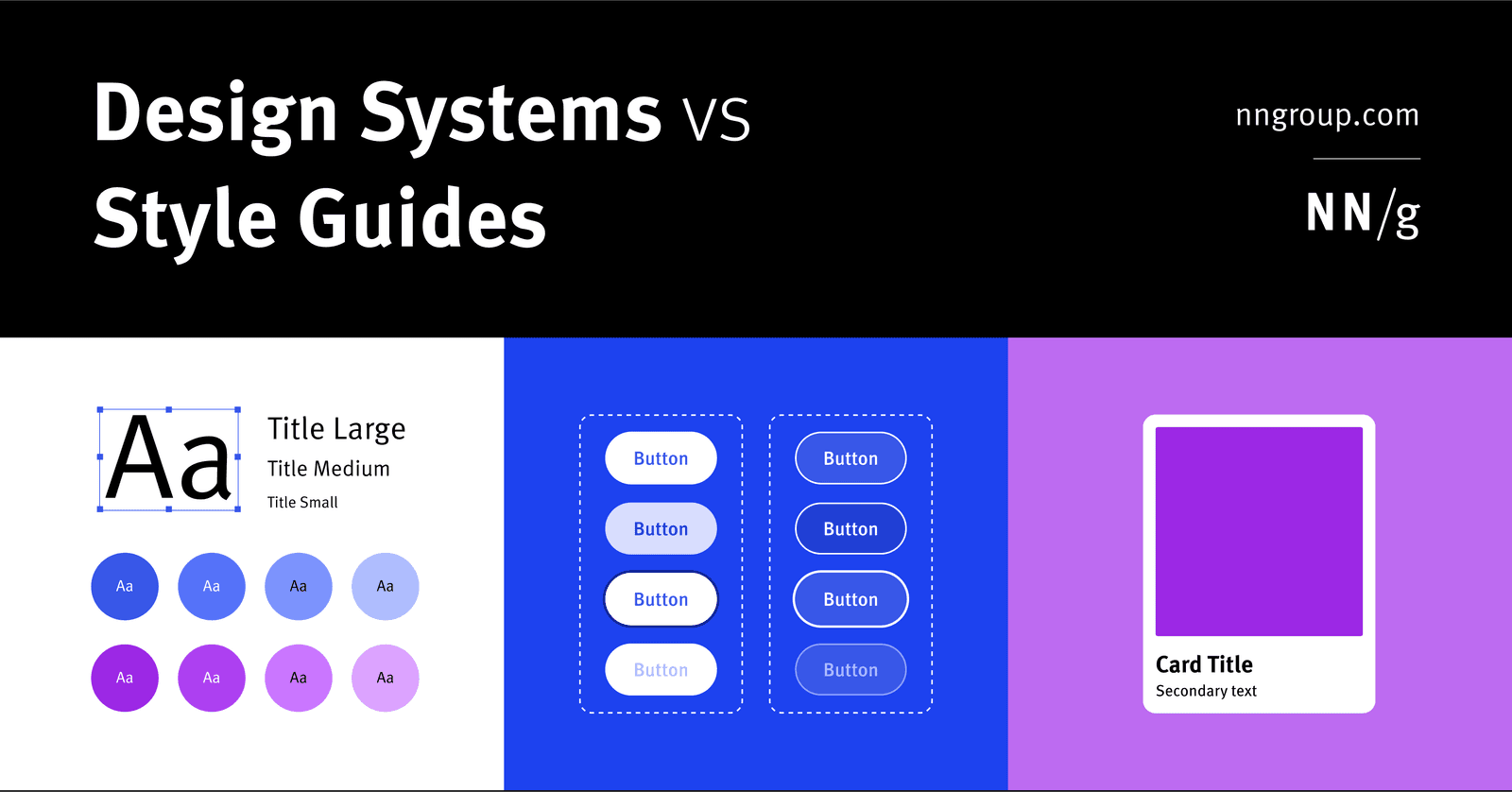
Component library vs style guide vs design system
A design system is holistic parent for scale; a style guide is a narrow visual/content child; a component library is a coded child of reusable UI elements.
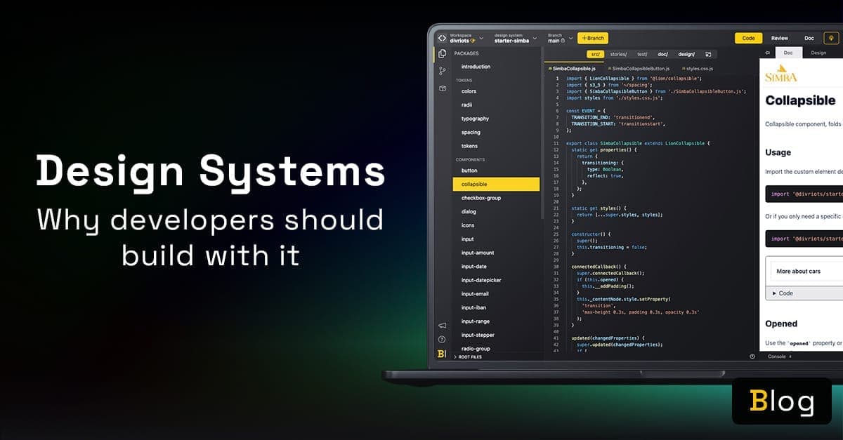
What are the main benefits of consuming a design system?
Cite tokens for theming, isolated components, live docs, and designer collaboration.
What is a design token versus a CSS or Sass variable?
Whether you understand abstraction layers in design systems and cross-platform interoperability. Define tokens as vendor-neutral design decisions that generate platform-specific code; contrast with CSS variables (runtime, web-only) and Sass (compile-time…

Implement a typographic scale using design tokens and accessible properties
Token-driven typography and accessibility. Start with base size (14-16px) and ratio token, compute sizes, then bundle font-size with line-height, letter-spacing, weight, and family in composite tokens. Red flag: ignoring line-height, spacing, or composites.

When should data in a reusable component be a prop or state?
This tests controlled versus uncontrolled patterns. Great answers ask who owns the data: props when parent must drive or observe it, state only for private details.

Two strategies to prevent style leakage in reusable components and their trade-offs
This tests style encapsulation in design systems. A strong answer contrasts Shadow DOM, which fully isolates CSS via a shadow root, with scoped naming like BEM or CSS Modules. Red flag: proposing global resets or !important as a solution.
Composing Input and Button into a SearchForm
Wrap Input and Button in a form, expose value/placeholder props, emit onSearch on submit, keep it controlled.
Building a flexible Card with optional content
Use optional props or named slots for image, title, and text, conditionally render present ones, and prefer composition for ordering.
Designing a responsive Grid with breakpoint props
Accept per-breakpoint column props, map them to CSS Grid and media queries or container queries, expose a gap prop.
Structuring Storybook stories for visual states
One named story per state with explicit args, plus argTypes and controls.
Publishing a component to a private NPM registry
Configure package.json fields and scoped name, build dist, set registry auth, npm publish with access restricted.
Storybook's role in design system infrastructure
Isolated development, living documentation, visual and interaction testing, shared review surface.
CSS-in-JS vs pre-compiled CSS for distribution
Runtime cost and dynamic theming of CSS-in-JS versus cacheability and SSR simplicity of static CSS.
Managing keyboard focus in an accessible Modal
Move focus in on open, trap Tab inside, close on Escape, restore focus to the trigger on close.
Enforcing WCAG color contrast programmatically
Pre-validate token pairs, expose only safe semantic combos, lint and test contrast in CI.
Core roles on a design system team
Name design, engineering, product/PM, and accessibility/docs roles with clear ownership.
Process for adding a new component
Triage need, design and spec, build with a11y and tests, document, version, and release.
Contributor workflow from proposal to merge
Proposal or RFC, design and core alignment, branch and build with tests and docs, review, then merge and release.
Deciding whether a one-off variant belongs in core
Weigh reuse and consistency against maintenance cost, then decide with a shared-need bar and escape hatches for local cases.
We are hiring for this. Every open role lists the topics its interview covers, so you can prepare for the real thing rather than guessing.
See open roles