Easy everything in Design Systems, page 2
Building a flexible Card with optional content
Use optional props or named slots for image, title, and text, conditionally render present ones, and prefer composition for ordering.
Composing Input and Button into a SearchForm
Wrap Input and Button in a form, expose value/placeholder props, emit onSearch on submit, keep it controlled.

Two strategies to prevent style leakage in reusable components and their trade-offs
This tests style encapsulation in design systems. A strong answer contrasts Shadow DOM, which fully isolates CSS via a shadow root, with scoped naming like BEM or CSS Modules. Red flag: proposing global resets or !important as a solution.

When should data in a reusable component be a prop or state?
This tests controlled versus uncontrolled patterns. Great answers ask who owns the data: props when parent must drive or observe it, state only for private details.

Implement a typographic scale using design tokens and accessible properties
Token-driven typography and accessibility. Start with base size (14-16px) and ratio token, compute sizes, then bundle font-size with line-height, letter-spacing, weight, and family in composite tokens. Red flag: ignoring line-height, spacing, or composites.
What is a design token versus a CSS or Sass variable?
Whether you understand abstraction layers in design systems and cross-platform interoperability. Define tokens as vendor-neutral design decisions that generate platform-specific code; contrast with CSS variables (runtime, web-only) and Sass (compile-time…
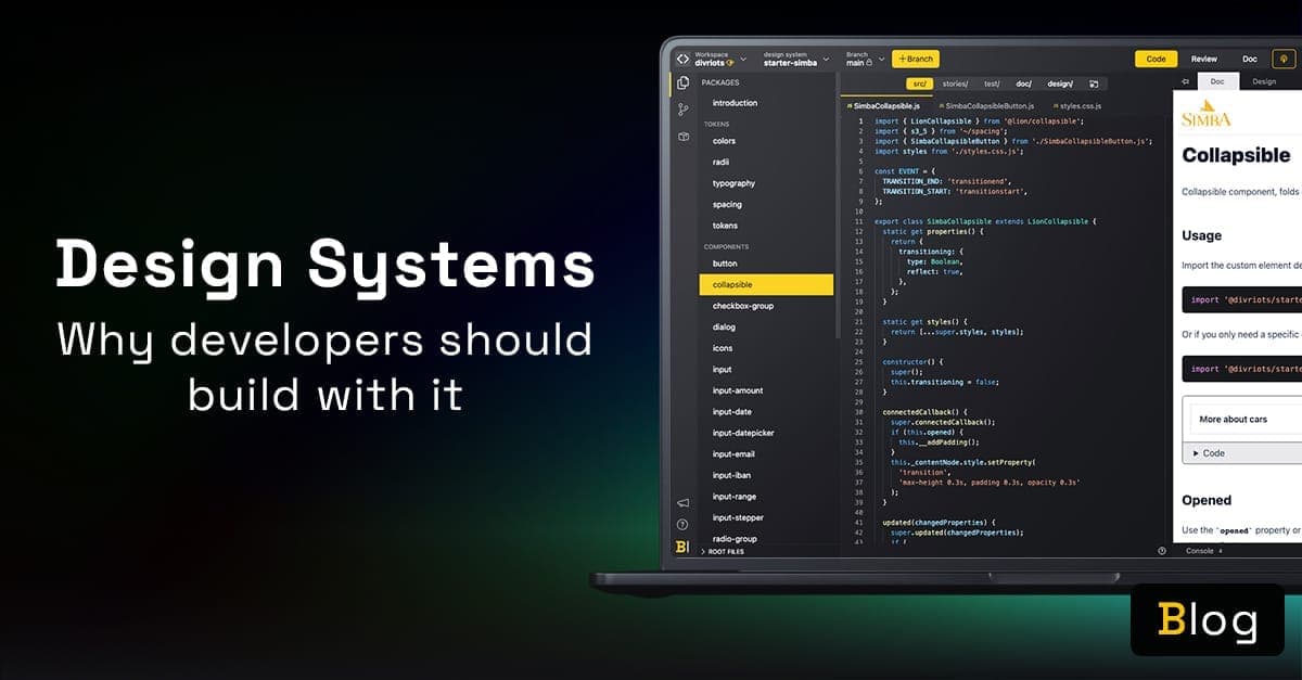
What are the main benefits of consuming a design system?
Cite tokens for theming, isolated components, live docs, and designer collaboration.
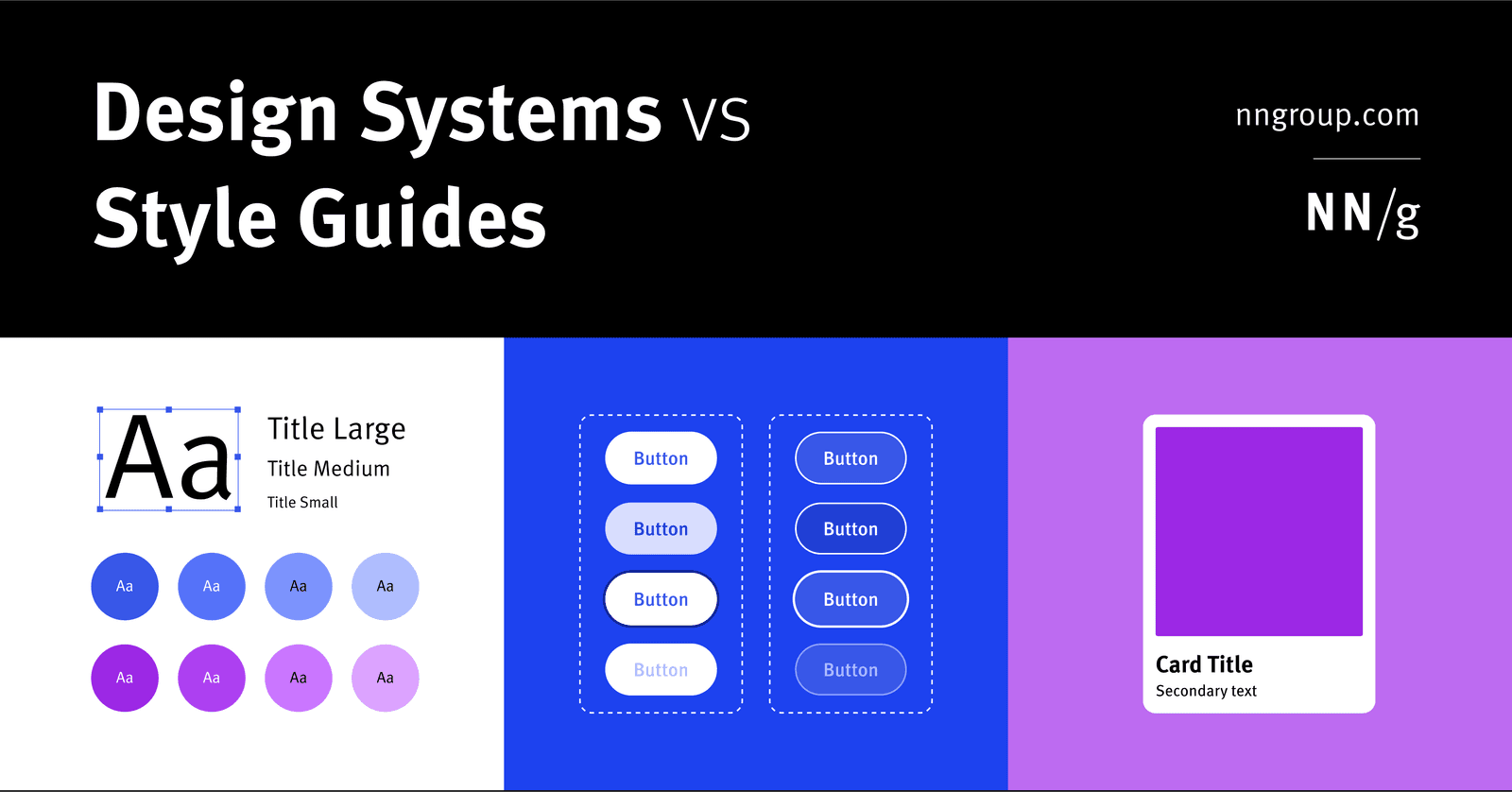
Component library vs style guide vs design system
A design system is holistic parent for scale; a style guide is a narrow visual/content child; a component library is a coded child of reusable UI elements.
What is a design system and its primary engineering components?
Tests if you treat design systems as engineering infrastructure, not just UI kits. Strong answers cite reusable coded components, design tokens, documentation, and governance as the core. Red flag: calling it just a component library or style guide.
Apple HIG Compliance
Apple's HIG is the rulebook for native iOS and macOS apps. Compliance means matching platform conventions for layout and navigation. The footgun is treating it as a visual skin while ignoring interaction patterns, making apps that look right but feel wrong.

Storybook: Design System Documentation
Storybook is a workshop for building UI components in isolation, then auto-publishing docs from those living examples. Teams use it to catalog design systems without maintaining a separate documentation site.

VUI Design: Making Computers Talk Like People
Think of VUI design as scripting a helpful human conversation, not just a command-line interface with a voice. It's key for voice assistants and smart speakers. The footgun is ignoring persona; if you don't design one, you'll get 'boring' by default.
Theme Object: Your Design System's Single Source of Truth
A theme object is a central dictionary for your UI's design tokens, like colors and font sizes. It ensures consistency across components by providing a single, shared source for styling values.
prefers-color-scheme: Respect User Theme Preferences
The prefers-color-scheme media query lets your CSS automatically adapt to a user's system-wide light or dark mode. It's used to create themes that respect user preferences.
CSS Custom Properties: Variables for Your Stylesheet
CSS custom properties are variables for your design system. Define a value like --primary-color once on :root and reuse it everywhere. This is ideal for theming, like switching between light and dark modes.
Theme Provider Pattern: Centralized UI Styling
A Theme Provider acts like a global style guide, injecting design tokens like colors and fonts into all child components. It's used in frameworks like React to ensure a consistent look and feel. The footgun: components outside the provider won't get the theme.
Semantic Versioning: The MAJOR.MINOR.PATCH Contract
Semantic Versioning (MAJOR.MINOR.PATCH) is a contract that tells users if an update will break their code. It's used by package managers to safely resolve dependencies.
System Usability Scale (SUS): A Quick Usability Score
The System Usability Scale (SUS) is a 10-question survey that gives a single 0-100 score for a system's perceived usability. It's a quick, industry-standard way to benchmark usability. The biggest footgun: the score is not a percentage; 68 is average.
Design System Feedback: Start with User Needs
A design system's success depends on feedback from the end-users of the products it builds, not just its internal consumers. Prioritize features and validate designs by continuously testing with real people to ensure the system solves actual user problems.
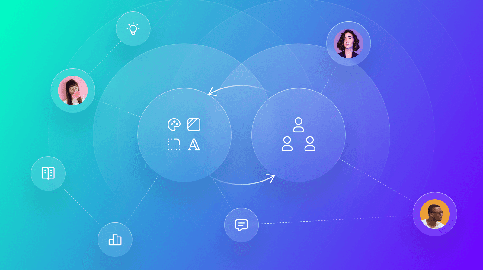
Driving Design System Adoption
A design system's value isn't in its components, but in its use. Drive adoption by creating collaborative feedback loops with users through interactive workshops and dedicated office hours.
We are hiring for this. Every open role lists the topics its interview covers, so you can prepare for the real thing rather than guessing.
See open roles