Concepts in Design & UX, page 19

Theming with CSS data-* Attributes
Think of data- attributes as labels for UI state, like data-theme='dark'. CSS uses attribute selectors ([data-theme='dark']) to apply styles directly, avoiding complex class logic.

Writing for the Ear: Simple Language for Listeners
Write for listeners, not readers. Use short, simple sentences because your audience can't reread a confusing phrase in a podcast or broadcast. The biggest mistake is using complex, print-style writing that forces listeners to tune out.

Apple HIG Compliance
Apple's HIG is the rulebook for native iOS and macOS apps. Compliance means matching platform conventions for layout and navigation. The footgun is treating it as a visual skin while ignoring interaction patterns, making apps that look right but feel wrong.
Heuristic Evaluation: An Expert UI Review on a Budget
Heuristic evaluation is like having an expert proofread your UI against a checklist of common usability flaws. It's a fast, cheap way to catch problems before writing code, but its value depends entirely on the evaluator's skill.

Two-Column Script Format: Aligning Sights and Sounds
A two-column script is a production blueprint, aligning what the audience sees (video) on the left with what they hear (audio) on the right. It's used for ads, live TV, and corporate videos. The main footgun: capitalize everything *except* spoken dialogue.
Research Advocacy in UX Design
Research advocacy means suspending your own priorities to speak with the user's voice in product decisions. It matters when teams must translate raw user frustration into concrete design changes. The footgun is letting personal opinion masquerade as user need.
Slugline: The Screenplay Scene Marker
A slugline is the screenplay element that announces a new scene. It anchors the script's structured format by marking scene changes and setting the stage for the action and dialogue that follow.
Card Sorting: Let Users Design Your Navigation
Card sorting reveals your users' mental models by having them group topics. Use this to design intuitive navigation menus and information architecture. The footgun is testing with internal teams instead of actual users or subject matter experts.

VUI Design: Making Computers Talk Like People
Think of VUI design as scripting a helpful human conversation, not just a command-line interface with a voice. It's key for voice assistants and smart speakers. The footgun is ignoring persona; if you don't design one, you'll get 'boring' by default.

UX Research Staffing: The 1:5:50 Ratio
A 2020 industry survey found the most common UX team structure is one researcher for every five designers and fifty developers. These ratios signal staffing norms but should never replace measuring actual research impact or team maturity.
Layout Grids: Your Blueprint for Consistent UI
Layout grids are visual blueprints for frames, enforcing structure and alignment. Use them to create consistent, responsive layouts for web and mobile. A common footgun is using fixed-width columns instead of 'Stretch' columns, which breaks responsiveness.
Logline: Your Story's Core in One Sentence
A logline is a one-sentence pitch that distills a story to its central conflict and emotional hook. It's used to sell a script or summarize a film in a TV guide. The common mistake is summarizing the plot instead of the core premise that drives.

Executive-Level UX Research Communication
Executives fund outcomes, not observations. Frame research by business risk and revenue, not methods. This applies when you need budget or strategic alignment. The footgun is drowning leaders in process details that bury recommendations and stall action.

The 8-Point Grid: A Shared Language for UI Spacing
The 8-point grid system stops spacing debates by making every dimension and gap a multiple of 8px. It's used in design systems like Google's to create consistent layouts that render cleanly across devices. The biggest mistake is breaking the rule for "feel."
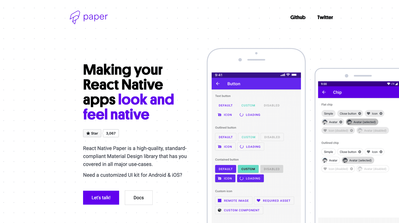
Using Component Libraries in React Native
A component library is a pre-fab UI kit for your app. Instead of building every button from scratch, you get polished, ready-to-use pieces that handle platform-specific animations and accessibility.
Cold Open: Hooking Viewers Before the Titles Roll
A cold open hooks the audience by jumping into the story *before* the opening credits. It's used in TV to prevent channel-surfing during early commercials or to recap past events. The footgun is an opening that confuses viewers instead of captivating them.

Cross-Study Synthesis: The Missing First Step
Research synthesis is the literature review academia requires but industry skips, forcing teams to rediscover what the organization already knows. Use it before primary research when entering new markets or distilling scattered knowledge.
Figma Constraints: Building Responsive Layouts
Constraints are rules for how layers react when their frame is resized. Use them to build responsive designs, like pinning a logo to the top-left or stretching a background. The footgun: Constraints don't work on groups or inside Auto Layout frames.
Systematizing Haptics: Beyond Simple Vibrations
Treat haptics like a design system for touch, not just random vibrations. Use them to confirm actions or signal state changes. The biggest footgun is overuse, which turns meaningful feedback into annoying noise that users will disable.
Scripting B-Roll: Show, Don't Just Tell
Think of B-roll as the visual evidence for your main narrative. It's the supplemental footage that shows what a speaker is talking about, breaking up static shots in interviews or demos.
We are hiring for this. Every open role lists the topics its interview covers, so you can prepare for the real thing rather than guessing.
See open roles