Easy everything in Design & UX, page 5
Create a button component with default, hover, and disabled variants
This tests Figma component variants and prototyping. A good answer: create a component set with a State property, build default, hover, and disabled variants, wire Change to with While hovering. Red flag: separate components instead of one variant set.
Difference between 'Space between' and fixed spacing in Auto Layout
Tests your grasp of distribution logic versus fixed gaps. Fixed spacing sets a constant pixel gap; Space between splits free space to push items to edges. Use fixed spacing for lists, Space between for wide toolbars. Red flag: calling them interchangeable.
How would you use Auto Layout for a button with optional icon?
This tests Figma Auto Layout for responsive components. Answer: apply horizontal auto layout, set fixed padding and spacing, set text to hug contents, and set the frame to hug so it resizes when text changes. Red flag: using fixed widths or manual resizing.
How would you inspect a Figma text element for CSS properties?
Your Figma-to-CSS typography workflow. A good answer selects the layer, opens the Properties tab or Dev Mode, reads font family, weight, size, line height, and letter spacing, and uses Copy as code.
When would you wrap layers in a Frame versus a Group?
Use a Frame when you need Clip content, scroll overflow, or constraints on children.

Line-height vs letter-spacing: impact on readability and values for body vs headings
This tests whether you distinguish vertical rhythm from horizontal glyph spacing. A strong answer sets body line-height to at least 1.5x per WCAG with minimal tracking, while headings use tighter line-height and tighter tracking. Red flag: identical values.
Explain UI feedback and implement immediate feedback for API calls
Define feedback as real-time state communication; describe optimistic UI or spinners resolving to success or error after the API call.
What is a design system's purpose and how does it enforce consistency?
This tests if you see a design system as a single source of truth for design, not just a UI kit. A strong answer cites components and style guides that standardize output. Calling it only a Figma file without developer adoption is a red flag.

Two strategies to prevent style leakage in reusable components and their trade-offs
This tests style encapsulation in design systems. A strong answer contrasts Shadow DOM, which fully isolates CSS via a shadow root, with scoped naming like BEM or CSS Modules. Red flag: proposing global resets or !important as a solution.

When should data in a reusable component be a prop or state?
This tests controlled versus uncontrolled patterns. Great answers ask who owns the data: props when parent must drive or observe it, state only for private details.

Implement a typographic scale using design tokens and accessible properties
Token-driven typography and accessibility. Start with base size (14-16px) and ratio token, compute sizes, then bundle font-size with line-height, letter-spacing, weight, and family in composite tokens. Red flag: ignoring line-height, spacing, or composites.
What is a design token versus a CSS or Sass variable?
Whether you understand abstraction layers in design systems and cross-platform interoperability. Define tokens as vendor-neutral design decisions that generate platform-specific code; contrast with CSS variables (runtime, web-only) and Sass (compile-time…
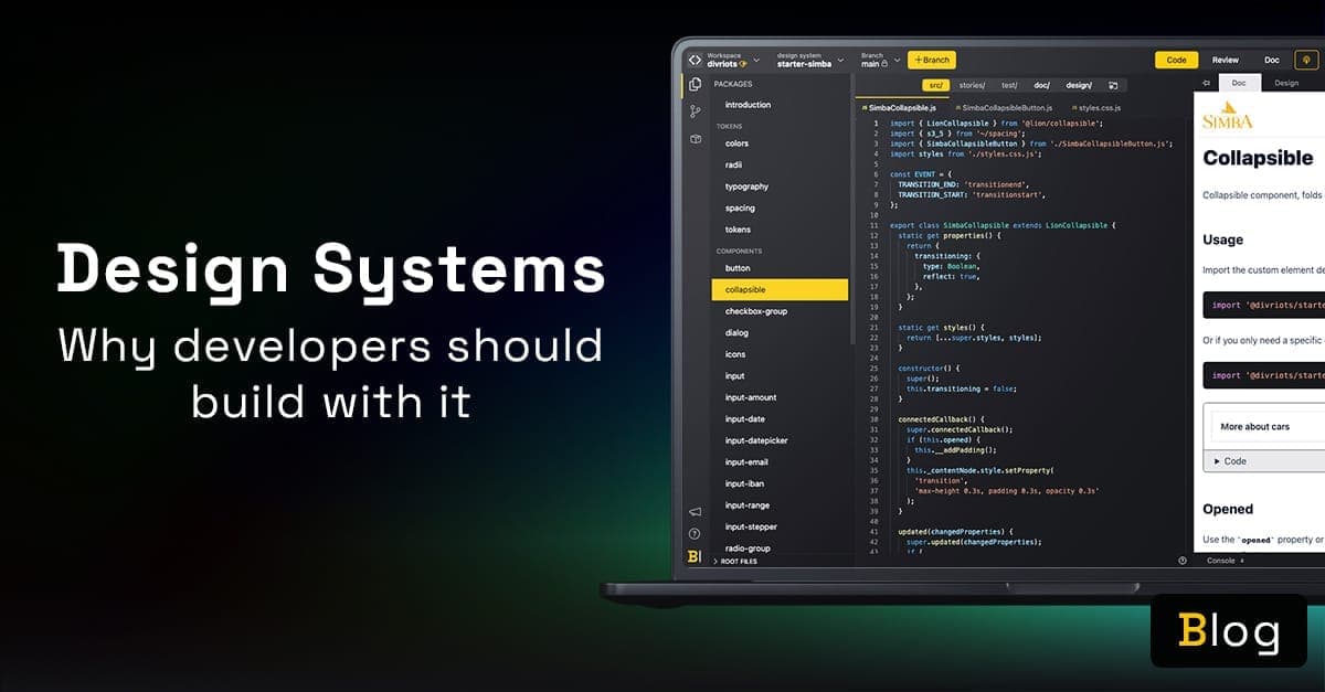
What are the main benefits of consuming a design system?
Cite tokens for theming, isolated components, live docs, and designer collaboration.
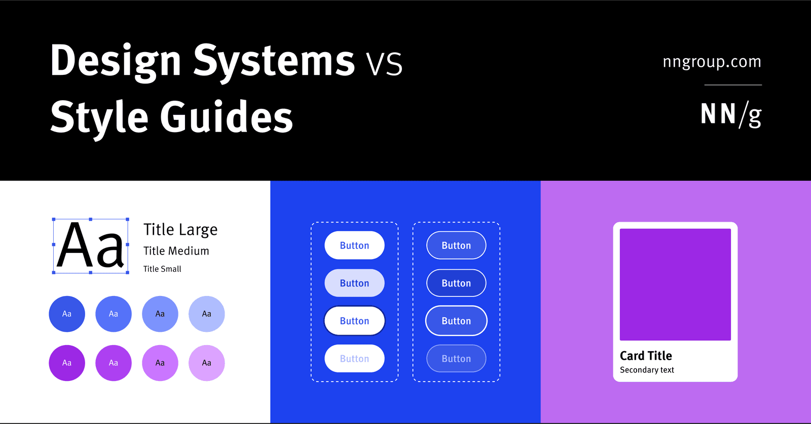
Component library vs style guide vs design system
A design system is holistic parent for scale; a style guide is a narrow visual/content child; a component library is a coded child of reusable UI elements.
What is a design system and its primary engineering components?
Tests if you treat design systems as engineering infrastructure, not just UI kits. Strong answers cite reusable coded components, design tokens, documentation, and governance as the core. Red flag: calling it just a component library or style guide.

Apple HIG Compliance
Apple's HIG is the rulebook for native iOS and macOS apps. Compliance means matching platform conventions for layout and navigation. The footgun is treating it as a visual skin while ignoring interaction patterns, making apps that look right but feel wrong.

Storybook: Design System Documentation
Storybook is a workshop for building UI components in isolation, then auto-publishing docs from those living examples. Teams use it to catalog design systems without maintaining a separate documentation site.
Seven-Figure Copywriter Ditches Eloquence for Customer Research
Seven-figure copywriter Tim Stoddart says clarity beats eloquence. Mine customer pain points from sales calls and Reddit, then mirror that language in copy. Engineers should swap jargon for verified customer vocabulary to increase conversion.

How do you consolidate scattered feedback and track document revisions?
Your ability to turn chaos into a structured approval workflow. A strong answer covers triage into one source of truth, owner assignment per revision, and tracking tools. Red flag: manual consolidation without version control or deadlines.

Describe the technical steps for displaying and enforcing a cookie consent banner.
Tests privacy-first frontend architecture. Outline: check consent record, render banner if absent, classify scripts as essential or non-essential, persist choice, and inject tracking only after explicit opt-in.
We are hiring for this. Every open role lists the topics its interview covers, so you can prepare for the real thing rather than guessing.
See open roles