Advanced everything in Product Management, page 17
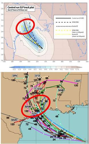
Ensemble Forecasting: Predicting with a Crowd of Models
Instead of one 'best guess,' ensemble methods generate many forecasts to map the range of possibilities. This is crucial for complex systems like weather prediction, where a single model is misleadingly precise.

LSTMs: Giving Neural Networks a Long-Term Memory
LSTMs give neural networks a selective memory, letting them remember important information over long sequences. This is key for language translation or time-series forecasting where old context matters.

Granger Causality: Forecasting, Not Causing
Granger Causality tests if one time series can forecast another, not if it causes it. It's used in econometrics to see if money supply changes predict inflation. The footgun is the name itself: it only shows predictive power, not true cause-and-effect.
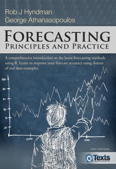
ARIMA: Forecasting by Modeling Autocorrelation
ARIMA models forecast a time series by learning its "memory"—how past values influence the next. It's used for forecasting sales or server load where patterns are driven by internal dynamics.
Propensity Score Matching: Mimicking an A/B Test
Propensity Score Matching (PSM) mimics a randomized trial with observational data by finding a "statistical twin" for each subject. It's used to estimate a feature's impact when a true A/B test isn't possible. The footgun is assuming it removes all bias.
Instrumental Variables: Isolating True Cause and Effect
Instrumental Variables (IV) isolate true causality when a key variable is tainted by hidden factors. An IV is a "clean" substitute that influences your cause without directly touching your effect, letting you measure the true relationship, free from…
Regression Discontinuity Design (RDD)
RDD finds a natural experiment at a cutoff point, like a test score threshold for a scholarship. By comparing people just above and below the score, you can estimate the program's effect. The footgun is assuming this local effect applies to everyone.
Isolating Impact with Difference-in-Differences (DiD)
Difference-in-Differences (DiD) isolates an intervention's true effect by comparing a treatment group's change over time to a control group's. This reveals if a new feature truly boosted engagement, not just rode a general upward trend.

Multi-Armed Bandit: The Explore vs. Exploit Trade-off
A multi-armed bandit algorithm balances exploring new options with exploiting the current winner, like a gambler trying slot machines to find the best payout.

The Multiple Comparisons Problem
Running many statistical tests on one dataset is like buying many lottery tickets; your chance of a "winning" false positive increases with each test. This happens in A/B tests with many metrics.
Bootstrapping: Quantifying Uncertainty with Resampling
Bootstrapping estimates uncertainty by resampling your own data. It's used to find confidence intervals for complex stats like medians where no simple formula exists. The footgun: it can't fix a biased sample, only reveal the uncertainty within it.
Statistical Power: Detecting Real Effects in Your Tests
Think of statistical power as your experiment's sensitivity. It's the probability of detecting a real effect, like a true lift in an A/B test. The main footgun is running a low-power test, which will likely miss a real improvement and lead you to discard good.
ANOVA: Comparing Group Averages by Analyzing Spread
ANOVA checks if group averages are different by comparing the spread *between* groups to the spread *within* them. It's used to see if three ad campaigns yield different click-through rates.
Bayesian Inference: Updating Beliefs with Data
Bayesian inference formalizes learning from experience, updating your belief in a hypothesis as you gather evidence. It's used in A/B testing and medical diagnostics. The footgun is that a poor initial belief (the prior) can skew your conclusions.
Time Series Decomposition: Separating Signal from Noise
Time series decomposition breaks a metric into its core parts: long-term trend, repeating seasonal patterns, and random noise. This helps you understand *why* a metric changed—was it a real shift or just the usual holiday rush?

Principal Component Analysis (PCA)
PCA finds the most informative axes in your data, letting you compress many features into a few "principal components." Use it to visualize high-dimensional datasets or preprocess features for machine learning, but beware: the components are hard to interpret.

Simpson's Paradox: When Averages Mislead
Simpson's Paradox is when a trend seen in separate groups reverses when you combine them. This happens when a hidden variable, like user experience level, skews the results, making a bad feature look good overall. Always segment your data to avoid this trap.

Lie Factor: Quantifying Visual Distortion in Graphs
The Lie Factor measures how much a graph's visuals distort the data's story. It's used to critique charts that exaggerate changes, like with a truncated y-axis.

Choropleth Maps: Coloring Data by Region
A choropleth map colors geographic areas to represent a metric, like shading states red or blue on an election map. It's used to show regional data like population density or sales per territory.
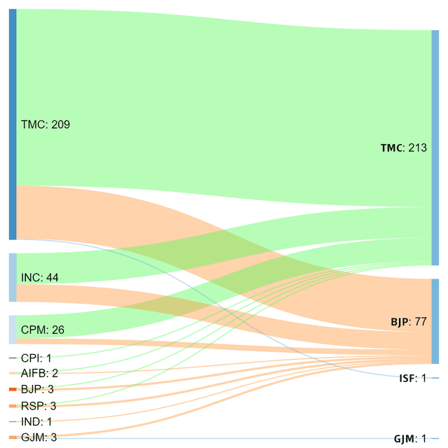
Sankey Diagram: Visualizing Proportional Flow
A Sankey diagram visualizes flow, where the width of each path is proportional to the quantity moving through it. Use it to trace user journeys or track budget allocation.
We are hiring for this. Every open role lists the topics its interview covers, so you can prepare for the real thing rather than guessing.
See open roles