Intermediate concepts in UI Design & Figma
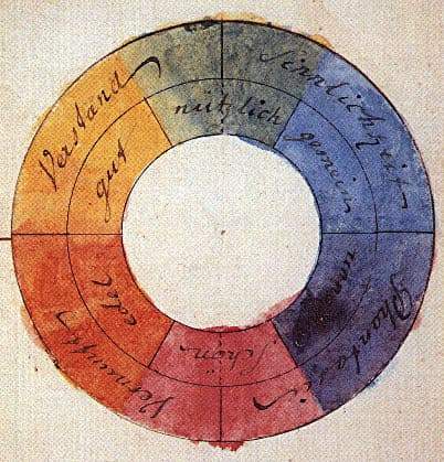
Color Theory: Harmony, Contrast, and Meaning in UI
Color theory is a system for using contrast, harmony, and symbolism to guide user experience. It's applied in UI to create visual hierarchy, evoke brand emotions, and ensure readability.
UI Typography for Readability
Good typography isn't about fancy fonts; it's about making content effortless to read by controlling size, spacing, and alignment. It's crucial for body copy, headings, and labels. The footgun is using justified text or lines over 90 characters long.
Affordances Are Actions, Signifiers Are Clues
An affordance is what's possible (a door can be pushed), while a signifier is the clue telling you how (the flat plate). In UI, a button's styling is a signifier for its click affordance. The footgun is saying 'affordance' when you mean 'signifier'.

Jakob's Law: Don't Reinvent the UI Wheel
Users spend most of their time on other sites, so they expect yours to work like everything else they already know. Leverage familiar patterns for navigation, icons, and workflows.
Color Schemes: The Logic of Color Harmony
A color scheme is a logical combination of colors to achieve a goal, not just a random palette. It's used in UI design for brand consistency, in data viz to encode information, and in safety systems for high visibility.
WCAG Color Contrast: A Readability Score, Not an Opinion
WCAG color contrast is a mathematical ratio ensuring text is readable for people with vision impairments. Use it for all text and UI elements. The footgun is only testing on a good monitor or forgetting that large text has a lower 3:1 requirement.

SVG: Code-Based, Infinitely Scalable Graphics
Think of SVG as HTML for graphics. It's an XML file with drawing instructions, not pixels, so images scale perfectly. It's ideal for logos and icons on responsive sites. The footgun: SVGs can contain JavaScript, posing a security risk (XSS) if not sanitized.
.png&w=1600&q=75)
Icon System Design: Build Once, Use Everywhere
Treat icons as reusable building blocks, not one-off graphics. A systematic setup in Figma ensures consistency and speeds up your entire design process. The footgun is skipping standardization, which creates tedious overrides and visual debt later on.
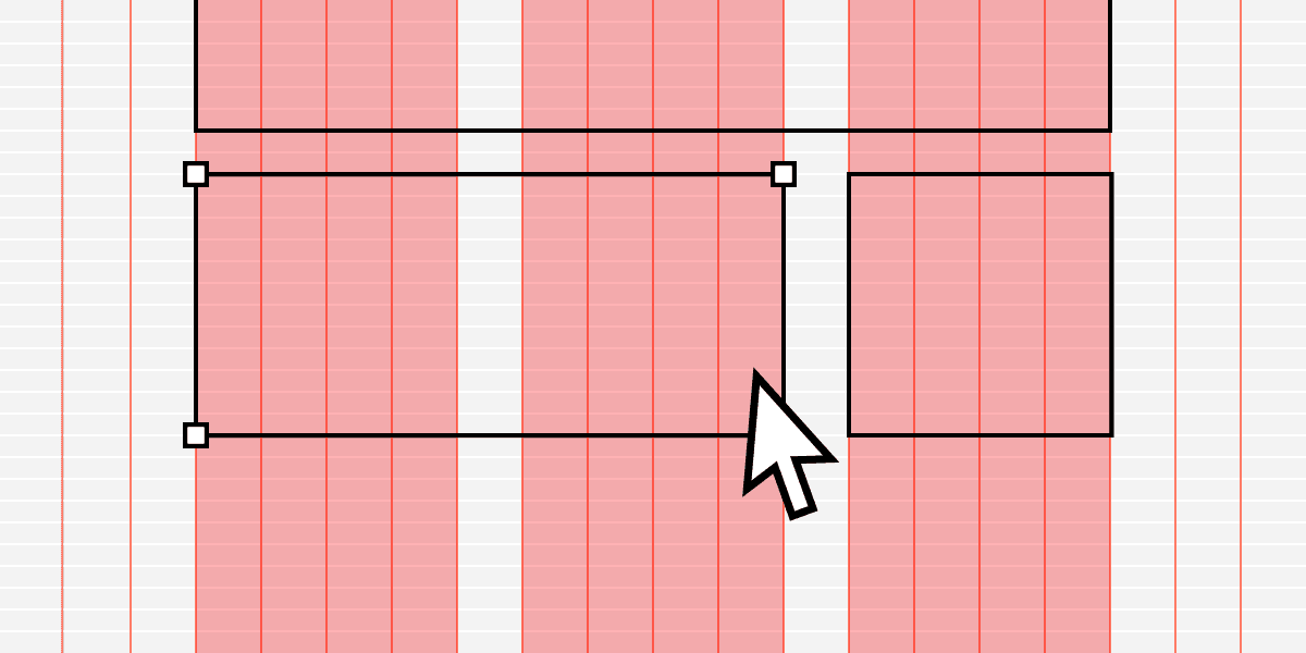
Modular Grid: Organizing UI with Cells, Not Just Columns
Think of a modular grid as spreadsheet cells for your UI. It extends a column grid with horizontal rows, creating a matrix of modules. It's ideal for repeating items like product cards or dashboard widgets.
Rhythm and Repetition in UI Layouts
Rhythm turns random elements into scannable patterns by repeating spatial intervals, not just shapes. Use it in lists, dashboards, and card grids where users hunt for information.
Figma Color Profiles: sRGB vs. Display P3
Figma's color profiles ensure consistent color across screens. Use sRGB for web standard compatibility or Display P3 for more vibrant colors on modern displays.
Nesting Components: Building Systems, Not Just Screens
Nesting components is like building with Lego: you combine small, reusable pieces (icons, buttons) into larger structures (cards). This is key for scalable design systems, where a card might contain nested icon and button instances.
Figma Text Properties: Beyond Font and Size
Text properties are your toolkit for precise typographic control, managing readability and hierarchy beyond just font and size. Use them to adjust line height for paragraphs, letter spacing for headings, and alignment for layout consistency.
Instance Swap Properties: Control Nested Components
An instance swap property is like a designated parking spot for a nested component. It tells designers 'you can swap this part out' and provides recommended replacements, like swapping an icon in a button.
Figma Libraries: Your Team's Single Source of Truth
A Figma library is your team's shared toolbox, ensuring everyone uses the same approved components. Use it to distribute your design system across files. The footgun is forgetting to publish updates, leaving teammates with outdated, inconsistent designs.
Breaking the Link: Detaching Figma Instances
Detaching an instance in Figma permanently breaks its link to the main component, converting it into a standard frame. Use this to make changes overrides can't handle or to create a new component variation.
Figma Interactive Components: Prototype Smarter
Interactive Components build prototype logic directly into your component variants. Instead of wiring up hundreds of frames for a form, you define interactions like 'On Click' or 'Hover' once, and every instance inherits them.
Preserve Scroll Position: Seamless Figma Prototypes
Preserve scroll position makes Figma prototypes feel real by remembering where a user scrolled, even after navigating away. It's essential for long lists or maps. The footgun: if scrollable layers aren't identically named and structured, the position resets.
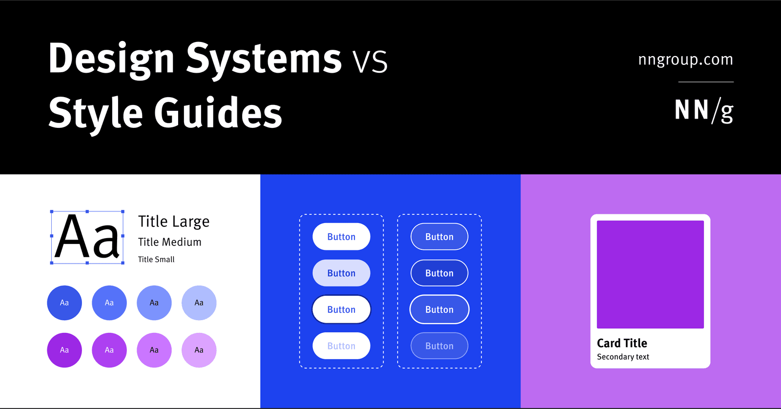
Design System vs. Style Guide: The Parent and the Child
A Design System is the parent; a Style Guide is just one child. The system is a complete toolkit for building products, containing reusable components and code, used by large teams to maintain consistency.
Focus Order: The Keyboard's Path Through Your UI
Focus order is the path a user takes through your UI using only a keyboard. It's crucial for accessibility, letting users navigate forms and menus without a mouse.
We are hiring for this. Every open role lists the topics its interview covers, so you can prepare for the real thing rather than guessing.
See open roles