Intermediate concepts in UI Design & Figma, page 2

Semantic HTML: Use the Right Element for the Job
Think of HTML tags as pre-built components, not just style containers. Using <button> instead of a styled <div> gives you keyboard navigation and screen reader support for free. The biggest mistake is using generic <div>s for interactive elements.

Accessible Form Design: A Conversation, Not an Interrogation
Think of a form not as a data bucket, but a structured conversation. Every field is a question needing a clear prompt. This is vital for logins and checkouts, especially for users with screen readers. The footgun: using placeholder text as a label.
Touch Target Size: Bigger is Better, Spacing is Key
A button's clickable area is more than its visible pixels; it includes the space to avoid fat-fingering neighbors. WCAG requires targets to be at least 24x24 CSS pixels for users with motor impairments.
Figma Dev Mode: From Design to Code Snippets
Figma's Dev Mode translates designs into code snippets, not just redlines. Select an element to get CSS, Swift, or Android XML with layout and style properties. The footgun is relying on this starter code; use Code Connect to link to your real design system.
Figma's Handoff Status: A Traffic Light for Devs
Think of Figma's handoff status as a traffic light for your designs, signaling what's safe to build. Designers mark sections Ready for dev, and Figma automatically flags them as Changed if modified.
Figma for VS Code: Designs Inside Your Editor
Embed a live Figma inspector in your IDE to stop switching contexts. Use it to grab code snippets, check measurements, or reply to comments without leaving VS Code. The footgun: it's for inspection, not editing—you can't change the design itself.
Figma Branching: A Sandbox for Your Design System
Branching in Figma is like Git for designers. It creates a safe copy (a branch) of your main file for experimentation, perfect for trying new ideas or updating components without risk.
Mathematical Expressions in Figma Prototypes
Use variable modes as contexts for math in Figma prototypes. Instead of creating one variable per item, a single number variable with multiple modes lets expressions calculate independent counts, like separate produce counters in a shopping cart.
Automated Design Linting: Your Design System's Spellchecker
Design linting is like a spellchecker for your UI, automatically flagging inconsistencies against your design system. It catches missing styles or wrong colors before handoff, ensuring consistency. The footgun: a 'clean' file isn't necessarily a good design.
Iterative Design: Build, Test, Learn, Repeat
Iterative design is a cycle of building, testing, and refining based on user feedback. It's standard for app development, where you ship a basic version and improve it with data. The footgun is mistaking any change for iteration; it requires real user testing.
Low-Fi vs. High-Fi Prototypes: Test Ideas Fast vs. Polish for Realism
Low-fi prototypes are quick sketches to test core ideas and flows. High-fi prototypes are detailed, interactive mockups that look and feel like the final product. Use low-fi early for brainstorming and high-fi late for usability testing.

Usability Testing: Watch Real Users, Not Just Experts
Usability testing evaluates a product by observing real, first-time users interact with it, revealing flaws that designers often miss. It's used to validate design intuitiveness before launch.
The Design Critique: Improving Work with Focused Feedback
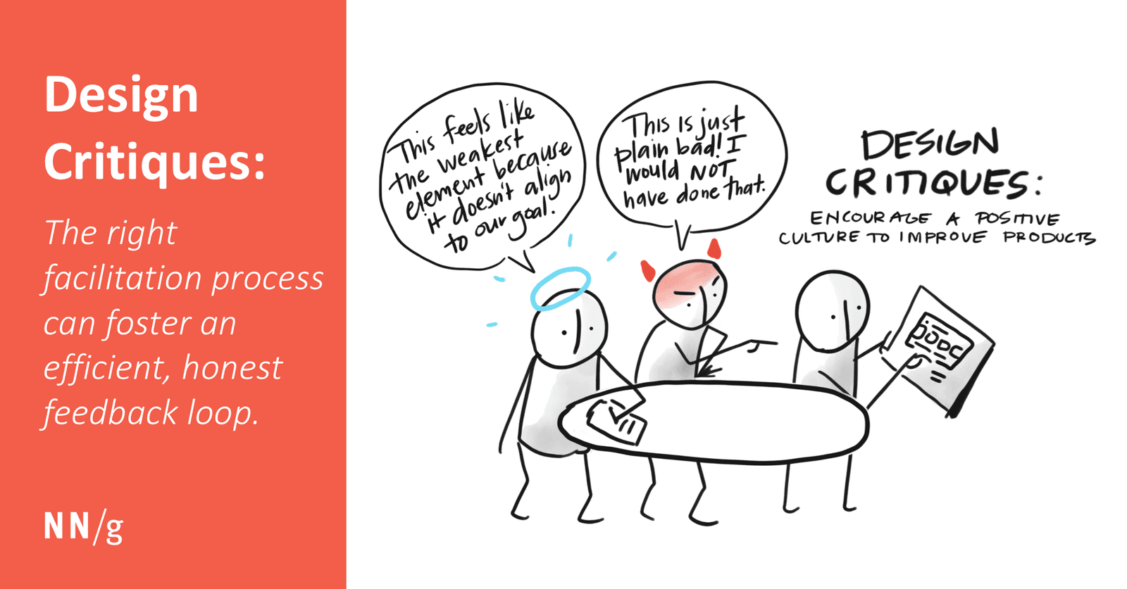
A design critique is a structured conversation to measure a design against its goals, not a session for subjective opinions. It helps get early feedback on feasibility or catch inconsistencies.
Layout Grids: Your Blueprint for Consistent UI
Layout grids are visual blueprints for frames, enforcing structure and alignment. Use them to create consistent, responsive layouts for web and mobile. A common footgun is using fixed-width columns instead of 'Stretch' columns, which breaks responsiveness.
The 8-Point Grid: A Shared Language for UI Spacing
The 8-point grid system stops spacing debates by making every dimension and gap a multiple of 8px. It's used in design systems like Google's to create consistent layouts that render cleanly across devices. The biggest mistake is breaking the rule for "feel."
Figma Constraints: Building Responsive Layouts
Constraints are rules for how layers react when their frame is resized. Use them to build responsive designs, like pinning a logo to the top-left or stretching a background. The footgun: Constraints don't work on groups or inside Auto Layout frames.
Visual Balance: Arranging UI Elements for Stability
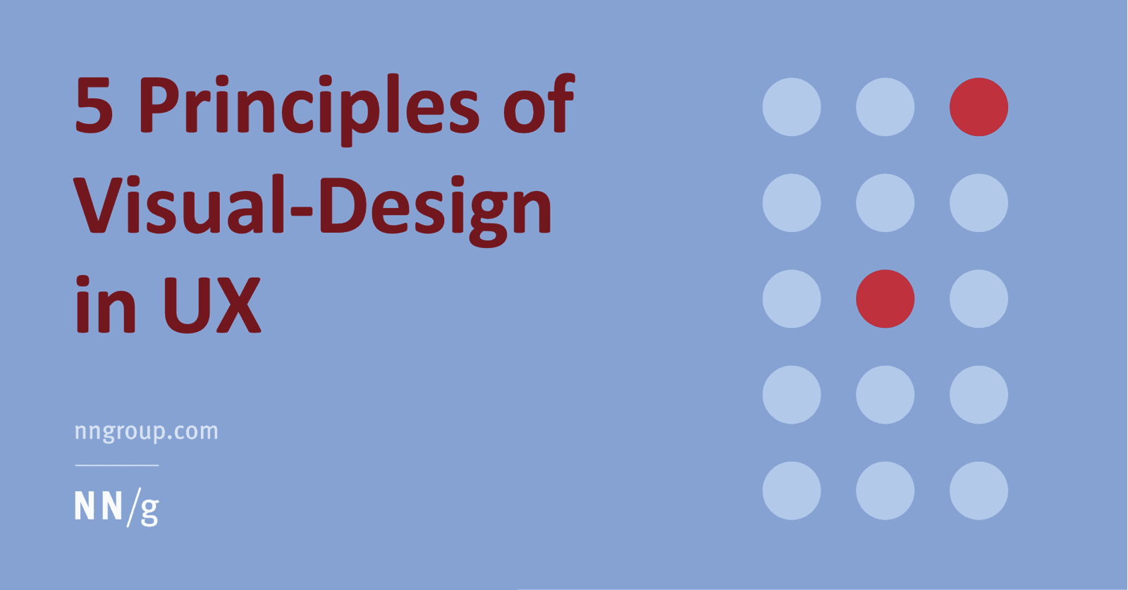
Think of visual balance like a seesaw for your UI. Elements have "visual weight" from their size and color, and a balanced design distributes this weight so the layout feels stable.
The Figma Interface: Your Digital Design Workshop
Figma's interface is a digital workshop: a central canvas for your work, a left sidebar for layers and assets, and a right sidebar for properties. It's the hub for UI/UX design, prototyping, and developer handoff.
Figma Vector Networks: Graphs, Not Just Chains
Vector networks are graphs, not just chains. Unlike traditional paths where a point connects only two lines, a vector network allows multiple lines to meet at a single vertex. This is Figma's engine for complex shapes.
Boolean Operations: Non-Destructive Shape Math
Boolean operations are non-destructive shape math, combining layers into complex forms while keeping the original pieces editable. Use them for icons and illustrations. The footgun: intersecting non-overlapping shapes makes them disappear until they touch.
We are hiring for this. Every open role lists the topics its interview covers, so you can prepare for the real thing rather than guessing.
See open roles