Everything in UI Design & Figma, page 8
Handoff Plugins Bridge Figma to Code
Handoff plugins are automated translators between Figma and code, turning visual specs into tokens or components. They speed up design systems where manual inspection is a bottleneck. The footgun is treating generated output as production-ready without review.
Conditional Logic in Figma Prototypes
Conditional logic turns static click-throughs into state-aware flows. Use it to unlock a button only after form fields are valid, or to branch checkout based on payment method. The footgun is building a brittle fake app instead of a focused testable flow.
Prototype Overlays: Layer Without Duplication
Overlays layer modals and menus above your current screen like a transparency sheet, so you never duplicate frames. Use them for dropdowns, dialogs, and toasts. The footgun is fixing them to the screen edge instead of the trigger, which breaks on resize.
Boolean Component Properties in Figma
Boolean properties in Figma are light switches for layers inside a component. They let you toggle an icon or badge on and off without spawning extra variants. The catch is that hiding a layer can break auto-layout if that layer was anchoring spacing.
Text Resizing in Figma Auto Layout
Text in Auto Layout does not wrap by default. A label set to Auto Width grows forever, while a parent set to Hug follows it. The footgun is leaving text on Auto Width inside a responsive card and expecting it to behave like a paragraph.
Component Properties: Levers Without Variants
Component properties are levers that let you swap text, toggle layers, or change icons without detaching. They shine in buttons with optional icons. The footgun is adding so many toggles that the panel becomes harder to use than a tidy variant grid.
Masking: Hide Pixels Without Deleting Them
A mask is a stencil that hides everything outside its shape without destroying the original image. Use it for circular avatars and rounded photo crops. The hidden portion still exists, so exporting without flattening may bloat the file with invisible pixels.
Components: One Master, Many Instances
A component is a master spawning linked copies; edit it and all copies update instantly. Use them for buttons and cards that repeat so one edit flows everywhere. Detach instances or override everything and you kill reusability, forcing manual fixes.
Alignment: Invisible Lines That Structure Interfaces
Alignment is invisible scaffolding: eyes travel along shared edges instead of hunting anchors. In Figma, left-aligning labels and inputs turns chaos into readable flow. Center-aligning long text is the footgun; ragged invisible edges increase reading friction.
Font Pairing Is Casting, Not Matchmaking
Font pairing is casting: one lead voice, one supporting role that contrasts without competing. A display headline face plus a neutral body sans guides the eye through a dashboard. Using two fonts with similar weights or x-heights creates noise, not hierarchy.
Figma Permissions Cascade Downward
Figma permissions flow downward: team access opens every project and file inside it. Use share links for quick reviews, but direct invites gate specific files. Inviting someone to a team exposes every project, while a file invite keeps the rest hidden.
Mathematical Expressions in Figma Prototypes
Use variable modes as contexts for math in Figma prototypes. Instead of creating one variable per item, a single number variable with multiple modes lets expressions calculate independent counts, like separate produce counters in a shopping cart.
Rhythm and Repetition in UI Layouts
Rhythm turns random elements into scannable patterns by repeating spatial intervals, not just shapes. Use it in lists, dashboards, and card grids where users hunt for information.
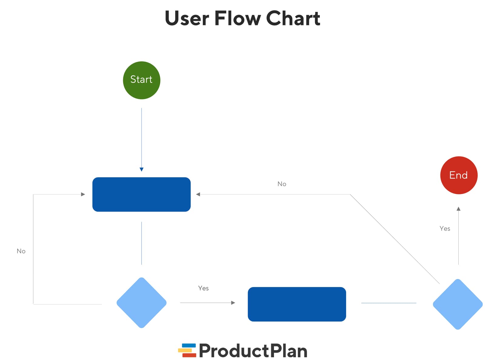
User Flow Diagrams: Mapping the Path to 'Done'
A user flow diagram maps the exact steps a user takes in your app to complete one task. It aligns teams on product goals and gives developers a visual guide, preventing confusion and rework. The footgun: it's not a customer journey, which is far broader.
Realistic UI Motion with Easing Curves
Easing curves control animation acceleration to make UI motion feel natural, not robotic. Use 'Ease Out' for elements entering the screen and 'Ease In' for those leaving. The footgun is overusing one curve; this makes motion feel unnaturally perfect.
Figma Widgets: Live Apps on Your Canvas
Figma Widgets are like mini-apps living on your canvas that everyone interacts with at once, unlike single-user plugins. Use them for collaborative tools like live polls or data tables.
Figma: Local vs. Published Library Assets
Local Figma assets are private drafts; published assets are the team's shared toolkit. Use this to manage a central design system, but remember: if you don't publish your changes, your team will be using outdated components and variables.
Figma Variables: Grouping Primitives with Collections
Think of Figma variables as raw ingredients. A collection is a recipe book ('Spacing') and modes are variations ('Mobile'). This lets you manage design tokens, themes, and responsive layouts.
Figma Pages: The Folders Inside Your Files
Think of Figma pages as folders within a single file. They let you organize complex projects by giving you separate canvases for different design stages, user flows, or component libraries. The main footgun: free plans limit you to only three pages per file.
Figma Comments: Your Team's Built-in Critique Layer
Think of Figma comments as a critique layer on your design. They tie feedback directly to specific elements for asynchronous review, letting you iterate faster without constant meetings. The footgun: Over-mentioning creates notification fatigue.
We are hiring for this. Every open role lists the topics its interview covers, so you can prepare for the real thing rather than guessing.
See open roles