Everything in UI Design & Figma, page 7
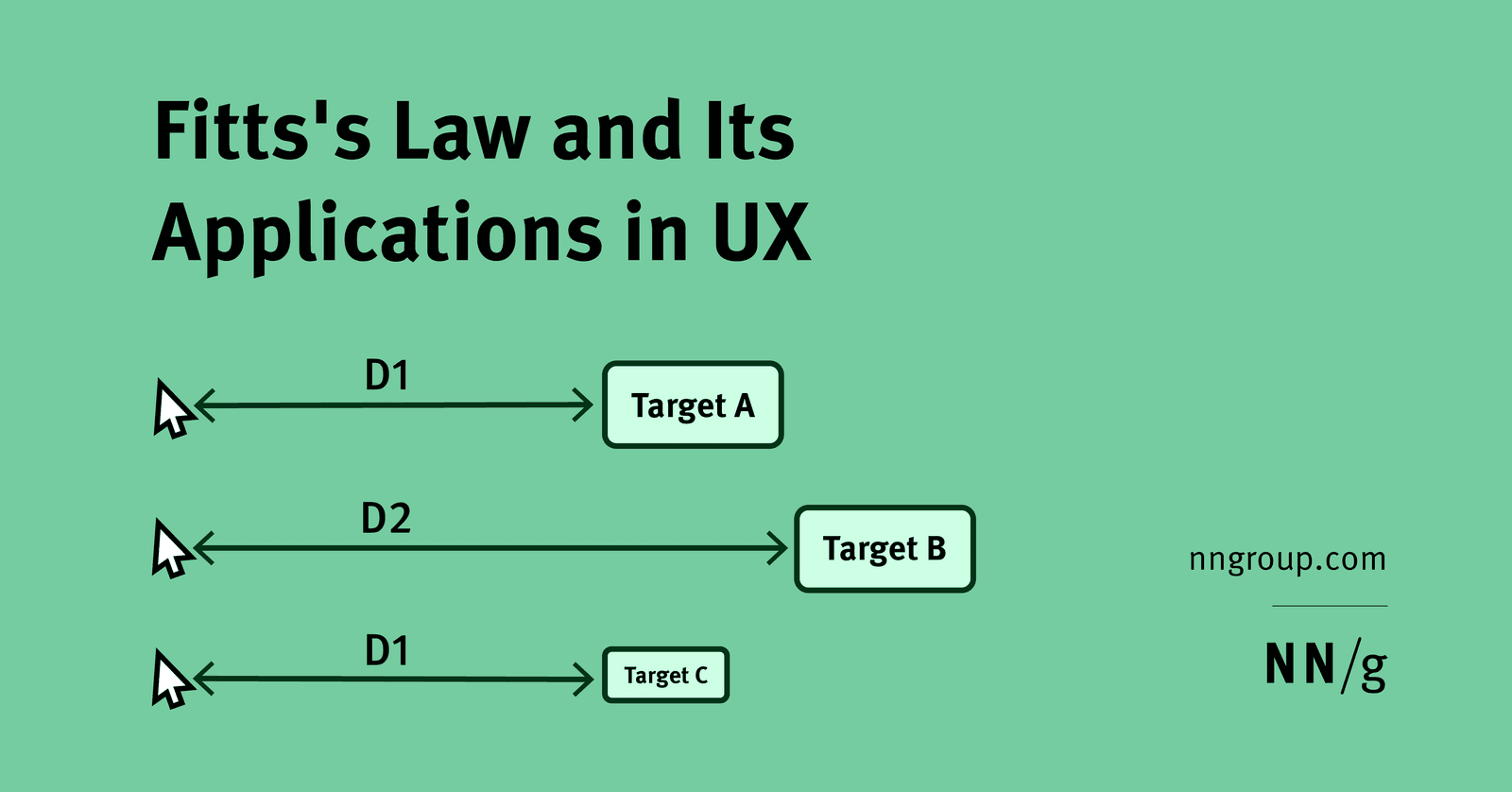
Use Fitts's Law to size and place primary vs secondary mobile actions
Large primary actions in easy thumb zones; secondary actions farther but keep minimum targets.
How do you model and articulate long-term design debt cost to stakeholders?
Estimate refactor hours and support tickets; show fixes cost 3-5x more later; map inconsistency to trust erosion.
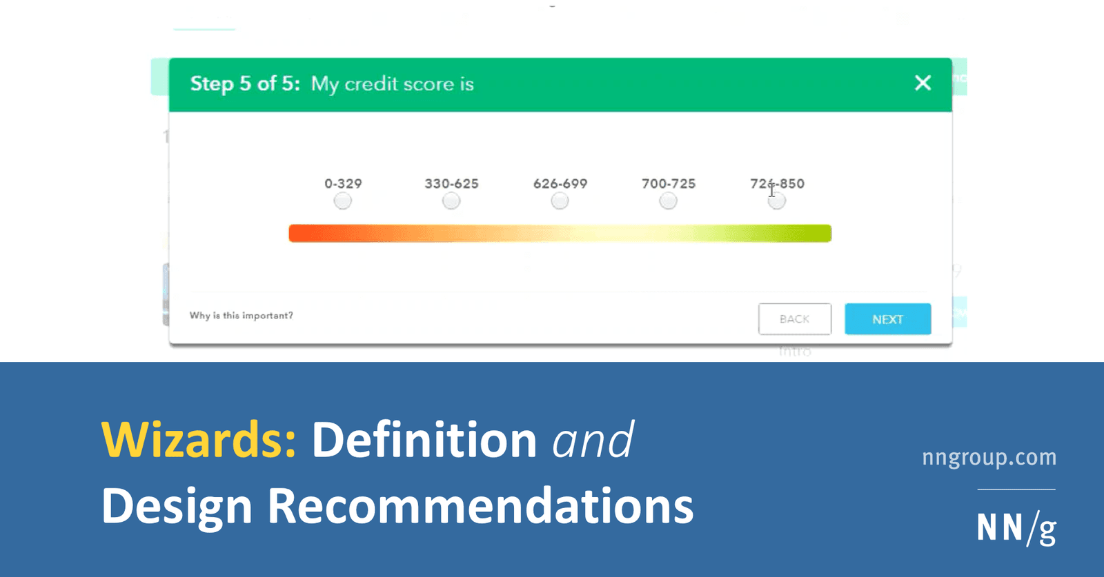
How do you design a low-cognitive-load wizard and implement it technically?
Pairing progressive disclosure with solid architecture. A strong answer hits step validation, URL-synced navigation, and isolated step components.

How does affordance guide choosing a native button over a styled div?
This tests if you see affordance as built-in behavior, not only looks. A strong answer picks the native button for free keyboard, focus, and reader support, noting a div needs tabindex, role, and keydown logic. A red flag is treating it as purely visual.

How do you apply progressive disclosure and hierarchy in complex data tables?
This tests layered UI decomposition. Strong answer: default to essential columns with horizontal dividers; disclose sort and filter on interaction; paginate at 48-56px row height; apply contrast and color cues sparingly.
How would you show system status during a multi-megabyte file upload?
Tests turning Nielsen's heuristic into concrete frontend patterns for uncertain waits. Cover granular progress like percent and bytes, distinct states for upload versus processing, time estimates, and error recovery.
Explain UI feedback and implement immediate feedback for API calls
Define feedback as real-time state communication; describe optimistic UI or spinners resolving to success or error after the API call.
What is a design system's purpose and how does it enforce consistency?
This tests if you see a design system as a single source of truth for design, not just a UI kit. A strong answer cites components and style guides that standardize output. Calling it only a Figma file without developer adoption is a red flag.
Section-Scoped Variable Modes in Figma
A Figma section acts as a local variable mode override, letting you park dark-mode beside light-mode on the same page. Watch out for nested sections: conflicting mode overrides stack silently, and the deepest scope always wins without warning.
Generative AI Plugins in Figma
Figma AI plugins are a junior designer on demand: prompt for UI, copy, or images and get editable layers. Use them to unblock frames. Never ship raw output; generated layers break auto-layout and ignore accessibility, so treat them as scratchpads, not specs.
Real Data Exposes Design Flaws Early
Real data replaces lorem ipsum to stress-test layouts before code exists. A 60-character German product name breaks your card, or a portrait photo lands in a landscape frame. Designers curate perfect data and miss edge cases real content surfaces.
Multi-Edit: Type Once, Update Everywhere
Multi-edit lets you type into several text layers at once, like a keyboard wired to multiple screens. Use it to rename buttons across a flow or update labels before componentizing. It is a one-off bulk edit, not a persistent link, so missed layers stay stale.
Figma Command Palette: A Universal Remote
Figma's Command Palette is a searchable speed dial: press Cmd/Ctrl + P to jump pages, run plugins, or tweak layers without the mouse. It rescues you from nested submenus mid-flow. The footgun is memorizing shortcuts you could simply type to find.
Gamified Prototypes: Test Loops Before Code
A gamified prototype tests motivation loops without code. In Figma, you simulate points and badges with variants and Smart Animate to validate reward timing before engineers build scoring logic.
Simulate Form Validation in Figma
A form prototype is an interactive script, not a picture. You pre-build every state — empty, typing, error, success — and link them so stakeholders feel validation timing before engineers code it. The trap is logic you cannot maintain across design changes.
Figma Variable Modes for Multi-Context Theming
Variable modes let a single token hold different values for different contexts, like light and dark themes. Apply a mode to a frame and every token inside swaps instantly. The footgun is treating modes as component states, which creates a combinatorial mess.
Figma Boolean Variables: State Without Variant Sprawl
A boolean variable is a light switch for your component: one true/false value reveals badges or loaders instantly. Use it for binary states like visibility across a system. The trap is wiring too many switches into one component, making debugging a hunt.
Dynamic Counter: State in Figma
A dynamic counter wires a number variable to a text layer, letting taps change the value. Use it for quantity steppers or pagination in prototypes. The footgun is skipping the text-to-variable binding, so clicks fire but the on-screen number never updates.
Figma Branch Reviews: Merge Gates for Design
A Figma branch review is a merge gate: reviewers diff changes against main and approve before merge. Use it when designers share a system or a lead must sign off. The footgun is rubber-stamping and missing broken component links that corrupt the main file.
Figma File Covers as Status Billboards
A Figma cover page turns your file thumbnail into a status billboard, showing if a design is draft or ready for dev without opening it. Teams with many files use covers as scannable dashboards. Outdated badges send developers hunting for nonexistent specs.
We are hiring for this. Every open role lists the topics its interview covers, so you can prepare for the real thing rather than guessing.
See open roles