All bites
The whole library, newest first. Filter by what you are here for, or pick a topic if you already know.
8664 bites
Page 59
Difference between 'Space between' and fixed spacing in Auto Layout
Tests your grasp of distribution logic versus fixed gaps. Fixed spacing sets a constant pixel gap; Space between splits free space to push items to edges. Use fixed spacing for lists, Space between for wide toolbars. Red flag: calling them interchangeable.
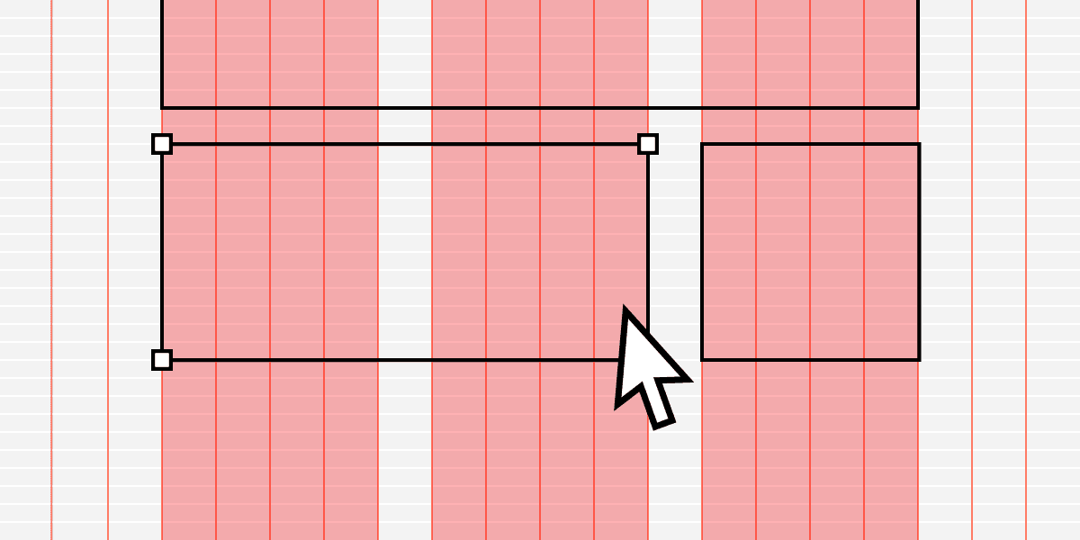
Modular Grid: Organizing UI with Cells, Not Just Columns
Think of a modular grid as spreadsheet cells for your UI. It extends a column grid with horizontal rows, creating a matrix of modules. It's ideal for repeating items like product cards or dashboard widgets.
How do Hug, Fill, and Fixed resizing behaviors interact?
This tests constraint-based size propagation. Define Hug as shrink-wrapping, Fill as stretching to the parent, and Fixed as explicit; note a Hug parent expands for Fixed or Hug children, but Fill needs a defined parent size.
Rhythm and Repetition in UI Layouts
Rhythm turns random elements into scannable patterns by repeating spatial intervals, not just shapes. Use it in lists, dashboards, and card grids where users hunt for information.
Profile card with nested Auto Layout sizing
Outer vertical frame set to fixed width and hug height, an inner horizontal frame for avatar and name, and a bio text set to fill width and auto-height so the card grows down.
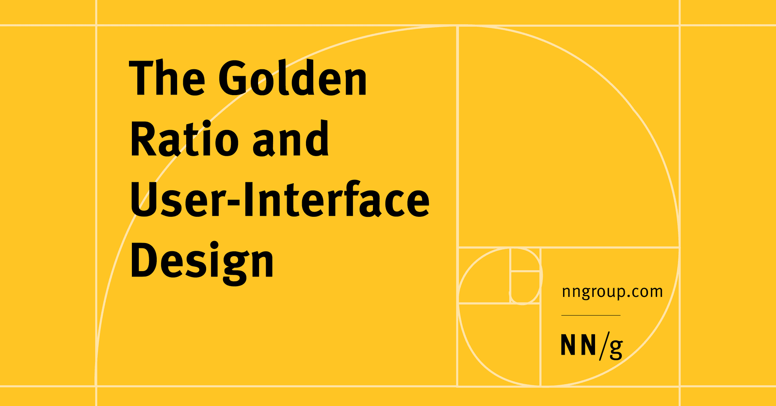
The Golden Ratio in UI Design
The Golden Ratio (1.618) is a proportion from art and nature used to create visually harmonious UI. Apply it to set layout dimensions or create a typographic scale (e.g., a 26px header for 16px body text).
When would you use absolute position in an Auto Layout frame?
Absolute position lets badges float without pushing siblings; standard flow stacks sequentially and prevents overlap.

Baseline Grid: Aligning Text for Vertical Rhythm
A baseline grid is like ruled notebook paper for your UI, forcing all text to sit on common horizontal lines for clean vertical rhythm. Use it in text-heavy layouts to improve readability.
How would you configure a wrapping filter tag container and its properties?
This tests horizontal wrap vs grid and tuning container and child resizing. Set the container to horizontal auto layout with wrap, adjust spacing and padding, and set tags to hug contents. Red flag: confusing wrap with grid or suggesting manual breaks.
Structure a responsive nav bar using variants and Auto Layout
One component set with desktop/mobile variants; horizontal Auto Layout with wrap for links, then hamburger and vertical overlay.
Figma: Frames vs. Groups
A Frame is a container with its own size, like an artboard; a Group's size just shrinks to fit its contents. Use Frames for UI components with fixed dimensions and clipping, and Groups for simple collections.
Build a responsive feature grid with nested Auto Layout and component properties
This tests nested Auto Layout fluency for responsive grids. Strong answer: vertical section frame with wrapping horizontal row, cards with 280 px min widths, and component properties to swap content. Red flag: duplicating static artboards per breakpoint.
Figma Shape Tools: Your Design Building Blocks
Figma's shape tools are the building blocks for any design. Use them to create everything from buttons and icons to dividers. The footgun: forgetting to hold Shift for perfect squares/circles or Option/Alt to resize from the center, slowing you down.
Create a button component with default, hover, and disabled variants
This tests Figma component variants and prototyping. A good answer: create a component set with a State property, build default, hover, and disabled variants, wire Change to with While hovering. Red flag: separate components instead of one variant set.
Figma Color Profiles: sRGB vs. Display P3
Figma's color profiles ensure consistent color across screens. Use sRGB for web standard compatibility or Display P3 for more vibrant colors on modern displays.
What is the most efficient way to update a brand color globally?
This tests Figma variables versus styles for design system maintenance. Store the brand color as a variable, apply it across components, and edit the value once for global propagation. Red flag: manual updates or using a color style for a single raw value.
Figma REST API: Access Design Files as Structured Data
The Figma REST API treats your design files as structured JSON data, not just images. Use it to automate workflows like exporting assets, syncing design tokens, or posting comments. The main footgun is using the wrong base URL for Government vs.

Super button versus composition: discuss trade-offs and scalability
Tests combinatorial explosion and API trade-offs in design systems. Contrast the super button's exponential growth with composition's explicit APIs and linear scalability, noting governance needs. Red flag: absolutism or ignoring type safety and tree-shaking.
Make a Figma button navigate from Frame A to Frame B
Tests hands-on Figma prototype workflow. Good answer: enter Prototype mode, select the Login button, drag the interaction noodle to Frame B, set trigger to On Click and action to Navigate To.
Explain Figma Smart Animate's core principle and layer matching requirements
Tests Figma's layer-matching logic for prototyping. Great answers cover: name-based matching between frames, compatible layer types, and interpolated properties like position and size.