All bites
The whole library, newest first. Filter by what you are here for, or pick a topic if you already know.
8668 bites
Page 172
.avif&w=1600&q=75)
How does a mature design system change cross-functional collaboration?
Tests whether you view maturity as a collaborative operating framework, not just components. Strong answers hit shared definitions of done, living documentation, code/design parity, and trust-based adoption. Red flag: calling it a docs or enforcement problem.
How do you handle a product team requesting a custom Button?
This tests governance discipline. A strong answer asks context questions to separate misuse from a real gap, uses a decision tree for actions and CTAs, and extends the system with a documented variant. A red flag is instantly greenlighting a custom fork.

What governance model would you propose for a centralized design system?
Tests balancing standardization with autonomy across legacy silos. A strong answer proposes a hybrid model with a core team and contribution rules, weighing consistency against migration cost.

What metrics measure design system success and adoption?
Tests if you connect design system health to delivery speed and consistency. Strong answers hit adoption rate, component usage, design-to-code parity, and accessibility compliance tied to team behavior.
What are design tokens and why standardize them?
Tests whether you treat tokens as API contracts between design and engineering. Strong answers define platform-agnostic decisions, cite W3C DTCG spec for cross-platform codegen, and note aliasing prevents drift.

How would you build a design system business case for leadership?
Audit inefficiencies with metrics, map the pitch to stakeholder priorities like ROI and velocity, and contrast build cost with projected savings.
What are the main benefits of consuming a design system?
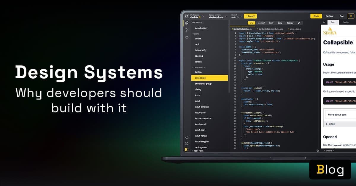
Cite tokens for theming, isolated components, live docs, and designer collaboration.
Component library vs style guide vs design system
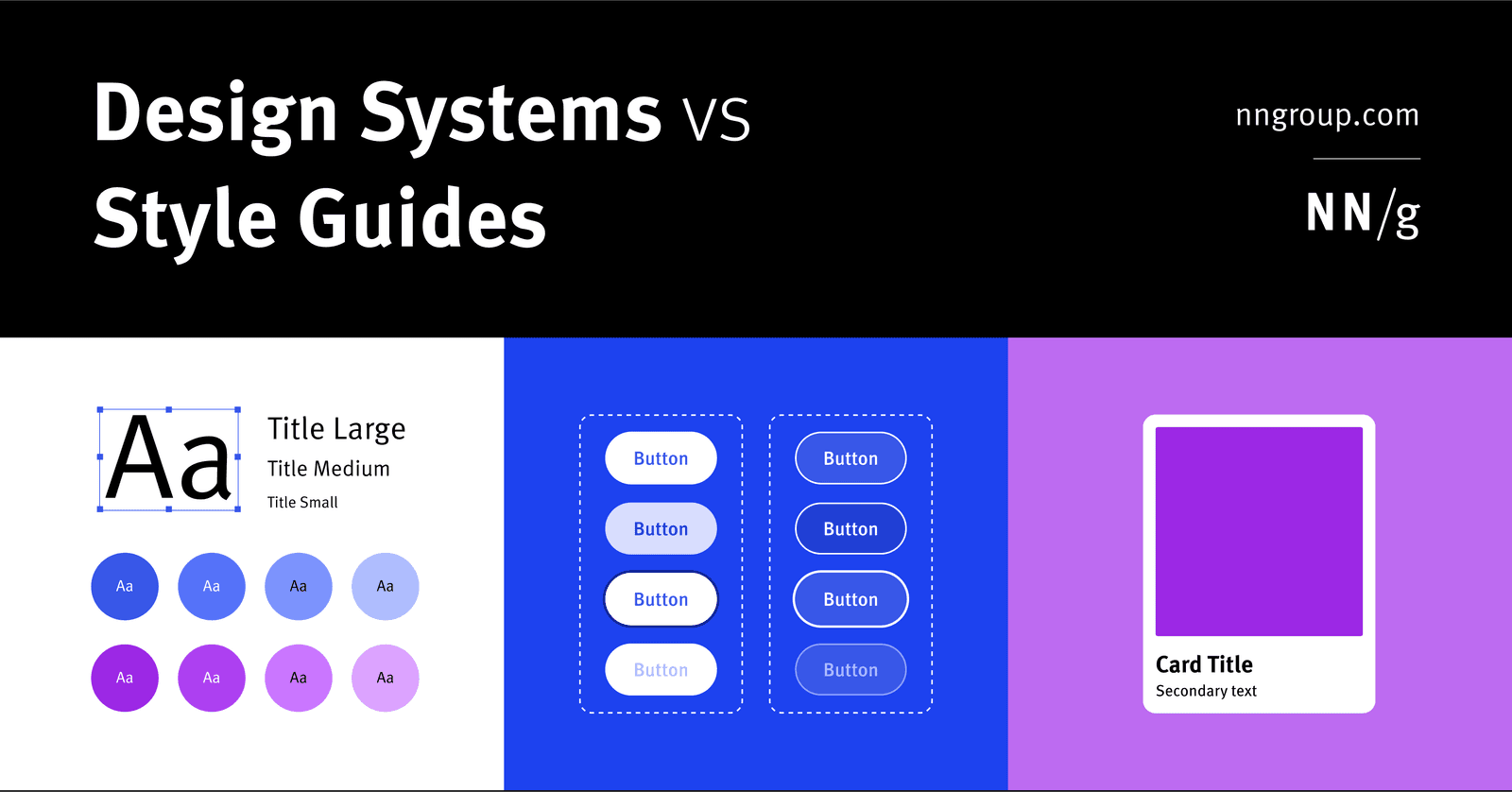
A design system is holistic parent for scale; a style guide is a narrow visual/content child; a component library is a coded child of reusable UI elements.
What is a design system and its primary engineering components?
Tests if you treat design systems as engineering infrastructure, not just UI kits. Strong answers cite reusable coded components, design tokens, documentation, and governance as the core. Red flag: calling it just a component library or style guide.
Map Components to Native Platform Equivalents
Map design system components to native OS equivalents instead of forcing identical custom widgets everywhere. Use this when cross-platform apps must respect platform conventions.
Material Design: Android's Paper Metaphor
Material Design models Android UI as stacked paper with light and elevation. It ships pre-built components like cards and FABs so your app feels native immediately.
Structural vs. Thematic Tokens: Job vs. Value
Structural tokens describe the role, like text-primary; thematic tokens describe the value, like blue-500. Split them so retheming does not require hunting hexes. The footgun is using only thematic tokens, which hardcodes intent and breaks dark mode.
Scoped Theming: Local Overrides Without Global Leaks
Scoped theming is sunglasses for a UI subtree: it swaps tokens for one section without touching the global page. Use it for a dark-mode dashboard or white-label widget inside a light app, but avoid deep nesting or you will fight invisible inheritance chains.
Token Aliasing: Theme by Role, Not Value
Token aliasing names a color by its job, not its hex, so you swap the underlying value per theme. One library supports light mode, dark mode, or multiple brands without code changes. The footgun is deep alias chains that hide which primitive value renders.
Design System API Review
A design system API review treats component props as a public contract before code ships. It catches inconsistent naming, prop bloat, and breaking changes that fragment the product. Teams skip it because "it is just UI," creating unmaintainable interfaces.
Automated Deprecation Warnings in Design Systems
Deprecation warnings are a design system's immune system: they flag outdated components in an editor before bad code ships. They matter most when dozens of teams consume the system. The footgun is warning fatigue; silenced errors hide real breaking changes.
Migration Guide: Operational Playbook for Design System Changes
A migration guide is an operational playbook, not just docs: it phases breaking design system changes across production code so teams don't freeze development. Skip the operational plan and you end up with a permanent dual-system mess.
Quantify UI Debt Before It Compounds
UI debt quantification turns messy interfaces into measurable cost. Teams track component adoption, override rates, and design-dev drift to prioritize refactors. The footgun is treating every inconsistency as debt, ignoring the business value of shipping fast.
NPS for Design Systems: Smoke Alarm, Not Scorecard
NPS for design systems is a smoke alarm for team trust, not a feature scorecard. Poll consuming teams quarterly to catch sentiment drops before adoption stalls. Never benchmark against consumer SaaS; internal tools face forced usage and different expectations.
Pair Programming Drives Design System Adoption
Pair programming with the system team embeds design system knowledge directly into product code. Use it when a squad ships their first feature with new tokens or components. The footgun is treating the session as code review rather than knowledge transfer.