All bites
The whole library, newest first. Filter by what you are here for, or pick a topic if you already know.
8668 bites
Page 203

Explain Simpson's Paradox and construct a user engagement scenario
Tests whether you spot trends reversing when population mixes differ. Good answers define the paradox, give a numerical example with per-segment wins but aggregate loss, and warn against segment-only decisions.
Determine if a 10% DAU drop is statistically significant
Tests signal vs noise in stable metrics. Good answers define a null hypothesis, compute a test statistic from historical variance, compare to a critical value at set alpha, and check seasonality. Red flag: calling a large drop real without baseline variance.
Explain the difference between correlation and causation with a software example.
Tests whether you distinguish association from causation to avoid blaming production issues. A strong answer defines both concepts, names a confounding variable, and gives a software example with a common cause. Red flag: claiming correlation is causation.
A/B test p-value 0.08, PM wants to ship. How do you advise?
Tests statistical rigor versus business pragmatism. A strong answer covers pre-registered thresholds, false positive risk, statistical power, confidence intervals, and the business cost of being wrong. Red flag: shipping without quantifying downside risk.
What does a p-value of 0.03 mean at alpha 0.05?
0.03 means 3% chance of data this extreme if the null (no effect) holds; since 0.03 < 0.05, reject the null.
Mean or median for API response times?
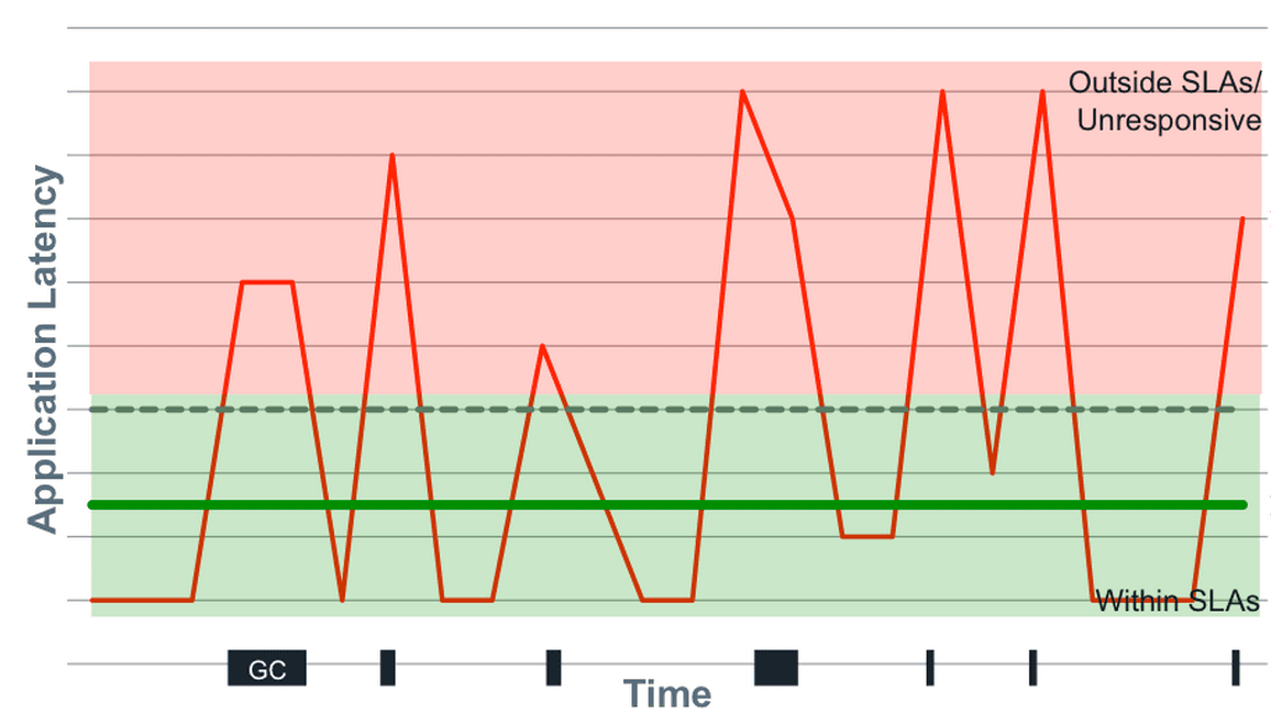
Tests if you know latency is skewed and outlier-sensitive. Pick median over mean because hiccups distort the mean, but note median hides tail latency. Advocate for p95, p99, and max. Red flag: defending mean as representative or ignoring tail behavior.

Describe data architecture for fast multi-dimensional slicing and pre-computation trade-offs
Tests analytical architecture trade-offs between latency and cost. Strong answers propose a hybrid pipeline: columnar warehouse for flexible exploration plus pre-aggregated OLAP cubes for sub-second dashboards.
How would you validate a feature's conversion impact given self-selection bias?
Tests causal inference for opt-in features. Strong answers use quasi-experiments like propensity matching or diff-in-diff to compare similar users and verify pre-trends. Red flag: a raw t-test between adopters and non-adopters ignoring selection bias.
A/B test shows 5% lift with imbalanced mobile traffic. What next?
This tests sample ratio mismatch and Simpson's paradox. A strong answer says the lift is confounded by platform, demands stratified analysis to isolate the true effect, and checks randomization. A red flag is accepting the 5% lift without questioning skew.

Write SQL to generate a monthly cohort retention table from raw events
Tests window functions and date truncation for cohort analysis. A strong answer finds each user's first month, counts returning users per period, and divides by cohort size. Aggregating all users without isolating acquisition month hides new-user churn.

Average latency up 50ms but p99 flat: diagnose the discrepancy
Tests if you know mean reflects full distribution while p99 is a threshold. Strong answers hypothesize body shift like cache misses or traffic mix changes, and demand histograms and segmentation by endpoint. Red flag: blaming outliers, which would raise p99.
How would you determine if Feature X causally drives higher retention?
Tests causal inference intuition for product metrics. Great answers propose a randomized holdback or instrumental variable, control for user intent, and estimate a local average treatment effect.
What user segments do you check first after a 10% DAU drop?
Validate by time, platform, and geography; then slice by new vs returning, channel, and feature usage to isolate the bleeding cohort.

How would you visually represent statistical uncertainty in a chart?
Awareness that plotted points are perceived as exact truths. Replace isolated bars with intervals showing point estimate uncertainty; add hypothetical outcome plots to make values tangible. Offering p-values or raw means without visualizing uncertainty range.
How do you build a performant visualization for millions of time-series points?
Tests end-to-end data reduction: backend bucket downsampling like LTTB preserves visual shape, frontend uses level-of-detail rendering and viewport culling. Red flag: naive every-Nth sampling that drops peaks or sending raw millions to the browser.

Explain pre-attentive attributes and give three examples
This tests whether you know preattentive attributes are decoded in <200ms to guide attention freely. Name three such as color hue, size, and motion; then encode one variable in a dense scatter plot so targets pop out. Never call this decoration or color all.
Stakeholder claims feature usage drives retention. How do you validate?
Probe confounders, reverse causality, selection bias; propose diff-in-diff or propensity scores; plot lagged usage vs retention.

How would you structure a user engagement dashboard for PMs?
Tests narrative sequencing of metrics across abstraction layers. Strong answer: DAU headline for health, retention cohorts for pattern diagnosis, feature adoption funnels for root-cause drill-down.
Compare five companies' market share: bar or line chart?
This tests categorical vs. temporal encoding. Pick a bar chart because companies are discrete categories, not a time series; line charts falsely imply sequence or trend. Calling a line chart acceptable is a red flag.

When is a pie or donut chart appropriate?
Tests judgment of part-to-whole encoding. Answer: use for few categories with clear dominance, cite a share scenario like device traffic, and name angle-comparison difficulty and 3D distortion as pitfalls.