Advanced interview questions in Analytics & Metrics, page 2
How would you debug a critical data quality issue in a pipeline?
Tests your systematic debugging of a distributed system under pressure. A great answer contains the impact, traces data lineage backward from the report to the source, and then proposes preventative tooling.
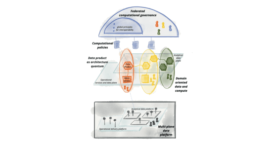
Design a scalable data governance framework balancing autonomy and control
Self-serve platform with domain products, auto-catalog, schema contracts, and policy-as-code access in CI/CD.
Design a Scalable Data Governance Framework
This tests your grasp of decentralized data architectures like Data Mesh. A great answer proposes a federated model with domain ownership, data as a product, and a self-serve platform.
Design a Scalable Data Governance Framework
This tests your grasp of decentralized data governance (Data Mesh). A great answer outlines four principles: domain ownership, data as a product, a self-serve platform, and federated computational governance.
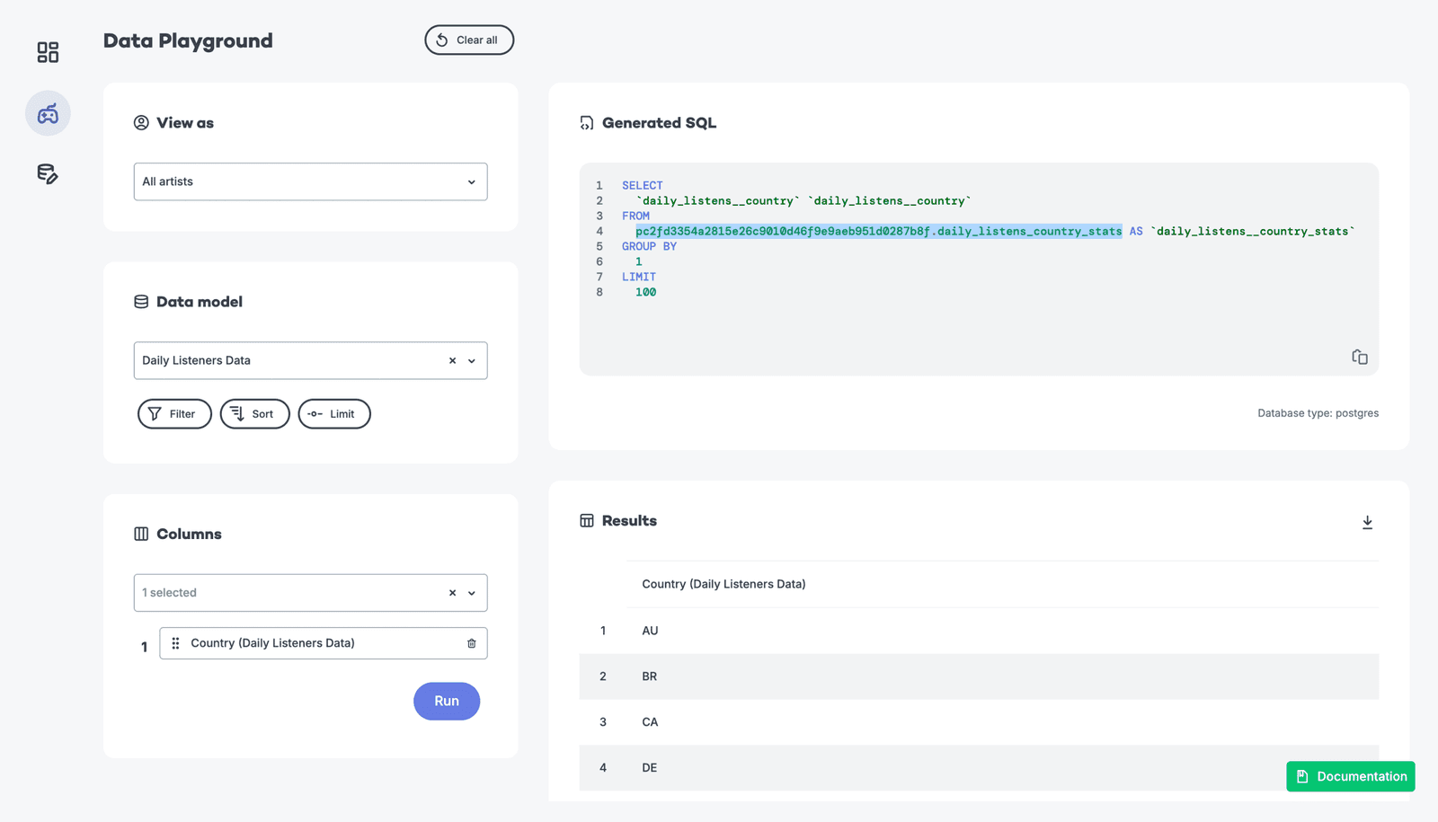
Trade-offs between pre-aggregated and raw event data for dashboards
Pre-aggregations trade freshness for speed; raw queries preserve flexibility but spike cost and latency under load.
Trade-offs: Pre-aggregation vs. Querying Raw Data
Tests your grasp of data system trade-offs. A great answer weighs pre-aggregation (fast, cheap, stale) against querying raw data (slow, costly, fresh, flexible) and proposes a hybrid solution. A red flag is declaring one method universally superior.
Trade-offs: Pre-aggregation vs. querying raw event data
This tests your grasp of data engineering trade-offs for analytics dashboards. A great answer contrasts pre-aggregation (fast, cheap, stale) with on-the-fly queries (slow, costly, fresh) and mentions hybrid solutions.
What are the challenges of grouping by a high-cardinality dimension?
Tests columnar storage internals and query engine scalability. A strong answer covers memory pressure from giant hash tables, destroyed compression ratios, and massive result-set overhead.
Challenges of Grouping by High-Cardinality Dimensions
This tests your grasp of system-level impacts of data shape. A good answer explains how high cardinality strains memory during aggregation, reduces compression, and inflates index size, leading to slow, expensive queries. A red flag is just saying 'it's slow'.
Challenges of Grouping by a High-Cardinality Dimension
This tests your grasp of how data shape impacts system resources. A great answer explains that high cardinality explodes memory usage for aggregation state, increases CPU load, and hurts storage compression.

How do you manage event schema evolution without breaking reports?
Backward-compatible serialization, nullable new fields, raw versus modeled layers, versioned schemas, and consumer alerts.
How do you manage schema evolution in an analytics pipeline?
This tests your grasp of data as a contract. A great answer covers schema registries, backward compatibility, and a phased rollout from producer to warehouse. A red flag is only mentioning an ALTER TABLE command, ignoring the entire data pipeline.
How do you manage an event schema change?
This tests your understanding of data contracts and backward compatibility. A great answer details a phased, backward-compatible rollout (add nullable field), starting with consumers (warehouse) then producers, and mentions using a schema registry for…
How do you build a performant visualization for millions of time-series points?
Tests end-to-end data reduction: backend bucket downsampling like LTTB preserves visual shape, frontend uses level-of-detail rendering and viewport culling. Red flag: naive every-Nth sampling that drops peaks or sending raw millions to the browser.
Strategy for Visualizing Millions of Time-Series Points
Tests your strategy for balancing performance and visual fidelity with large datasets. Propose backend downsampling with an algorithm like LTTB to preserve peaks, then discuss multi-resolution data fetching on the frontend.
Visualize Millions of Time-Series Data Points
Tests your ability to handle large datasets by combining backend downsampling (like LTTB) with frontend multi-resolution fetching and canvas rendering. A red flag is suggesting naive sampling (every Nth point) or focusing only on frontend libraries.
How would you visually represent statistical uncertainty in a chart?
Awareness that plotted points are perceived as exact truths. Replace isolated bars with intervals showing point estimate uncertainty; add hypothetical outcome plots to make values tangible. Offering p-values or raw means without visualizing uncertainty range.
How would you visually represent statistical uncertainty in a chart?
This tests your ability to accurately communicate statistical significance. A great answer discusses error bars (with 95% CIs), then more advanced options like gradient or violin plots, and frames the choice by audience.
How do you visually represent statistical uncertainty in a chart?
This tests your ability to communicate statistical nuance beyond simple averages. A great answer discusses error bars (specifying CI vs. SD), then moves to richer visualizations like graded error bars or violin plots.
How would you validate a feature's conversion impact given self-selection bias?
Tests causal inference for opt-in features. Strong answers use quasi-experiments like propensity matching or diff-in-diff to compare similar users and verify pre-trends. Red flag: a raw t-test between adopters and non-adopters ignoring selection bias.
We are hiring for this. Every open role lists the topics its interview covers, so you can prepare for the real thing rather than guessing.
See open roles