Easy interview questions in Analytics & Metrics, page 2

What is a data schema and why enforce it on ingestion?
This tests your grasp of data governance. Define a schema as a data blueprint. Explain that enforcement on ingestion prevents "garbage in, garbage out" by validating types and formats, ensuring data is usable for analytics.
Why prefer median and p95 over mean for API latency?
This tests statistical intuition for skewed distributions. A strong answer notes that median captures typical experience, p95 captures tail suffering, and mean hides outliers. A red flag is claiming mean alone is sufficient.
Why use median/p95 for API latency instead of the mean?
This tests if you understand how long-tail distributions make averages misleading for user experience. A good answer explains that median (p50) shows the typical user, while p95 captures the worst-case experience.
Why use p50/p95 over mean for API response times?
Tests your grasp of statistical distributions for UX metrics. A good answer explains how outliers skew the mean, while percentiles (p50, p95) better represent typical and worst-case user experiences.

When is a pie or donut chart appropriate?
Tests judgment of part-to-whole encoding. Answer: use for few categories with clear dominance, cite a share scenario like device traffic, and name angle-comparison difficulty and 3D distortion as pitfalls.
When is a pie chart an appropriate visualization?
Tests your grasp of data viz principles for part-to-whole data. A good answer defines this use case (e.g., market share), then lists pitfalls like too many slices or comparing multiple pies. A red flag is defending pie charts for complex data.
When is a pie chart an appropriate choice for visualization?
Tests data viz principles for part-to-whole data. A good answer defines this use case, gives a clear example (market share), and lists pitfalls like too many slices or similar values. A red flag is defending them for complex data or time-series analysis.
Compare five companies' market share: bar or line chart?
This tests categorical vs. temporal encoding. Pick a bar chart because companies are discrete categories, not a time series; line charts falsely imply sequence or trend. Calling a line chart acceptable is a red flag.
Bar Chart vs. Line Chart for Market Share Comparison?
This tests your grasp of visualization fundamentals for categorical vs. time-series data. A bar chart is correct for comparing discrete categories (companies) at one point in time. A line chart wrongly implies a trend. Red flag: justifying a line chart.
Bar Chart vs. Line Chart for Market Share Comparison?
Tests basic chart selection: comparing static categories vs. showing trends. A bar chart is correct for comparing discrete companies at one point in time. A line chart wrongly implies a time-series relationship. Red flag: choosing a line or pie chart.
What user segments do you check first after a 10% DAU drop?
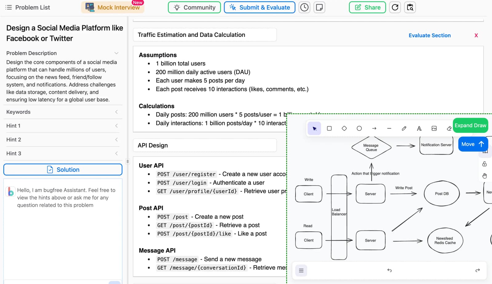
Validate by time, platform, and geography; then slice by new vs returning, channel, and feature usage to isolate the bleeding cohort.
DAU dropped 10%. How do you investigate?
Tests structured problem diagnosis. First, verify the data isn't corrupt. Then, segment the drop by user type (new vs. returning), platform (iOS/Android/Web), and geography to isolate the 'what' before hypothesizing the 'why'.
DAU dropped 10%. What user segments do you investigate first?
Tests your systematic problem-solving. First, clarify the metric and timeline. Then, segment by platform, geography, and user tenure (new vs. returning). A red flag is jumping to external causes before ruling out internal issues like a bad deployment.
How would you determine if Feature X causally drives higher retention?
Tests causal inference intuition for product metrics. Great answers propose a randomized holdback or instrumental variable, control for user intent, and estimate a local average treatment effect.
Is Feature X Causal for 20% Higher Retention?
This tests your ability to separate correlation from causation. A great answer first identifies confounding variables (e.g., power users), then proposes an A/B test to isolate the feature's true effect, and finally suggests quasi-experiments if a test isn't…
Is 20% higher retention from Feature X causal or correlational?
This tests your ability to distinguish correlation from causation. A great answer questions the data, identifies confounding variables (e.g., power users), and proposes a randomized A/B test as the gold standard to prove causality.
Mean or median for API response times?
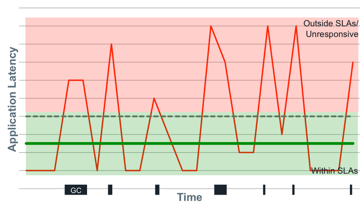
Tests if you know latency is skewed and outlier-sensitive. Pick median over mean because hiccups distort the mean, but note median hides tail latency. Advocate for p95, p99, and max. Red flag: defending mean as representative or ignoring tail behavior.
Mean vs. Median for API Response Times?
Tests your understanding of non-normal distributions like latency. Choose median as it's robust to outliers that skew the mean. Then, state that even median is insufficient; percentiles (p99, max) are crucial for capturing the full user experience.
Mean vs. Median for API Response Times?
Tests if you know latency data has outliers. A good answer chooses median because it's robust to extremes. Explain that mean gets skewed by a few slow requests (e.g., GC pauses), hiding the typical user experience.
What does a p-value of 0.03 mean at alpha 0.05?
0.03 means 3% chance of data this extreme if the null (no effect) holds; since 0.03 < 0.05, reject the null.
We are hiring for this. Every open role lists the topics its interview covers, so you can prepare for the real thing rather than guessing.
See open roles