Intermediate concepts in CSS & Design Systems, page 3

CSS :host: Style a Web Component from Within
The :host pseudo-class lets a web component style itself from the inside out. Use it inside a shadow DOM to apply styles to the host custom element, making components self-contained. The key footgun: it only works inside a shadow DOM; it has no effect in.
::slotted(): Style Content Passed into Web Components
The ::slotted() pseudo-element lets a Web Component style external content passed into its slots. It's how a component's internal CSS can style the "light DOM" elements it receives.
CSS ::part(): Style Inside a Web Component's Shadow DOM
The ::part() pseudo-element lets you style specific elements inside a web component's Shadow DOM. It's a contract allowing consumers to theme designated "parts" of a component without breaking encapsulation. The main footgun: it only styles one level deep.

Storybook: A Workshop for UI Components
Storybook is a workshop for UI components, letting you build and test them in isolation without running your entire app. It's used to develop component libraries, document design systems, and test hard-to-reach states.
tabindex: Control Element Focus and Tab Order
The tabindex attribute lets you control an element's keyboard focus. Use tabindex="0" to make custom components tabbable in document order, or tabindex="-1" to make an element focusable only by script, like for a modal.
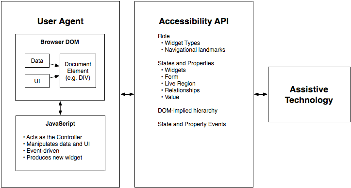
WAI-ARIA Roles: Semantics for Custom Components
WAI-ARIA roles are job titles for HTML elements, telling assistive tech what a generic <div> is meant to be, like a tab or button. Use them for custom UI components that lack a native HTML equivalent.
Accessible Name Computation: The UI Naming Algorithm
Browsers follow a strict algorithm to find a name for UI elements to announce to screen readers. It runs on every interactive element, creating the data source for assistive tech.
CSS :focus-visible: Smart Focus for Accessibility
:focus-visible is a smart focus ring that only appears when needed, like during keyboard navigation. This lets you style accessible focus indicators for keyboard users without showing an outline on every mouse click.
Monorepo: Managing Multiple Projects in One Repository
A monorepo puts multiple projects into one repository, creating a single source of truth. It's great for design systems, allowing atomic updates to shared components and consuming apps.
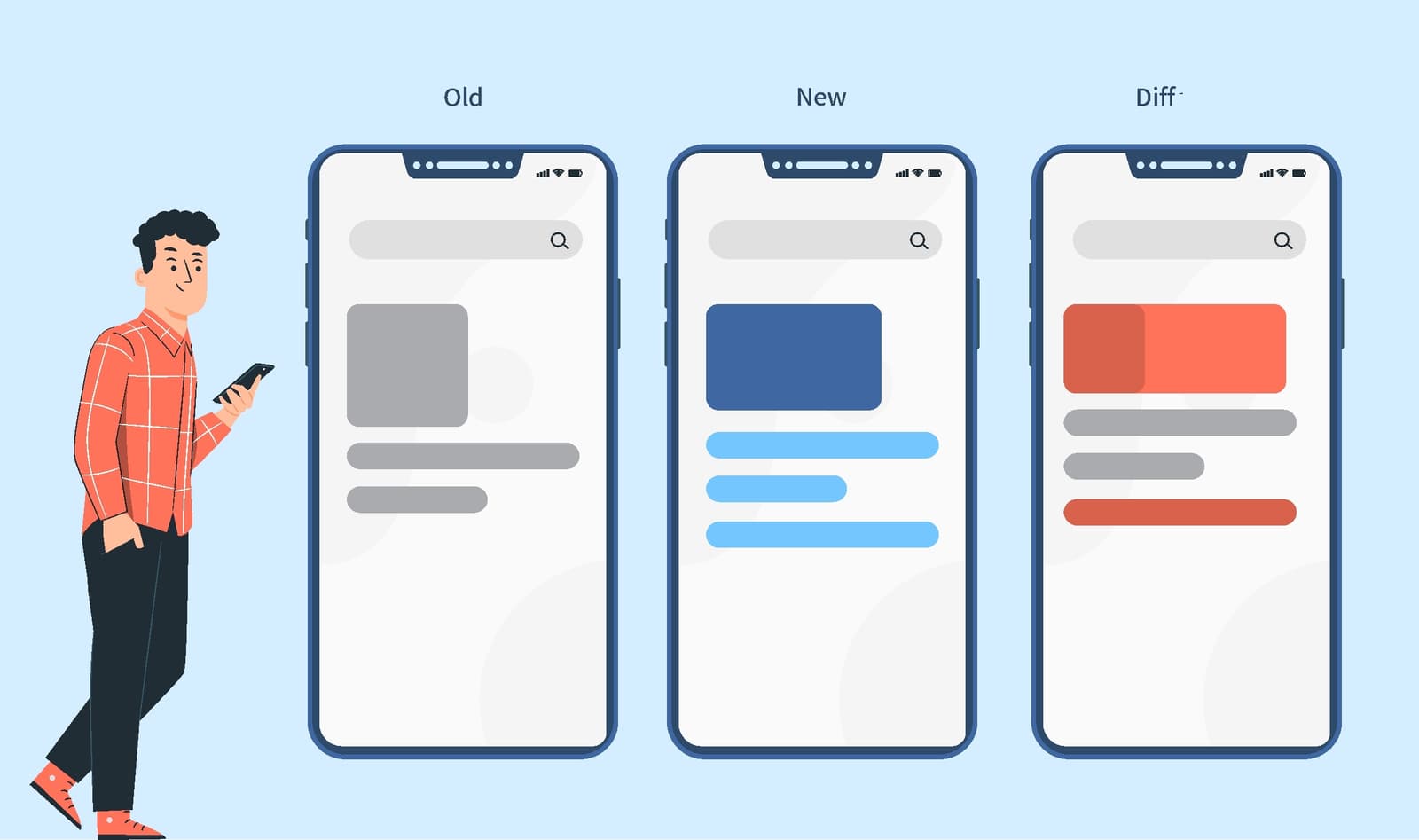
Visual Regression Testing: Spot the Difference for UIs
Visual regression testing is like an automated 'spot the difference' for your UI, catching visual bugs functional tests miss. It's used in CI/CD to compare screenshots before and after a code change.
Design System Build Pipeline: Automating UI Consistency
A design system pipeline treats UI rules like code, syncing design tokens from a single source of truth (like Figma) to your codebase. It prevents drift between design and code, but the biggest footgun is not starting one, leading to manual, error-prone…
Automated Accessibility Testing: Your First Line of Defense
Think of it as a linter for usability, scanning your code for machine-detectable issues like missing alt text or poor color contrast. It's often run in CI pipelines to catch regressions. The footgun is relying on it exclusively, as it misses most issues.

CODEOWNERS: Auto-Assigning PR Reviewers
A CODEOWNERS file maps repo paths to owners, auto-requesting their review on PRs. It ensures experts review changes to their code, like a platform team owning CI configs. The footgun: owners aren't notified for draft PRs and must have write permissions.
CSS :has(): Query Parents and Previous Siblings
CSS :has() styles an element based on its children or later siblings, like highlighting a section with a featured card. Previously this required JavaScript. If unsupported, the whole selector block fails, so wrap it in :is() or use progressive enhancement.
The Popover API: Native Tooltips and Menus
The Popover API creates tooltips and menus with just HTML, placing them in a top layer above all other content without z-index hacks. Use it for action menus or notifications.
CSS Scroll Snap: Guiding User Scrolling
CSS Scroll Snap turns a free-scrolling container into a slideshow, guiding users to land perfectly on predefined points. It's ideal for image carousels or full-page sections where partially visible elements look sloppy.
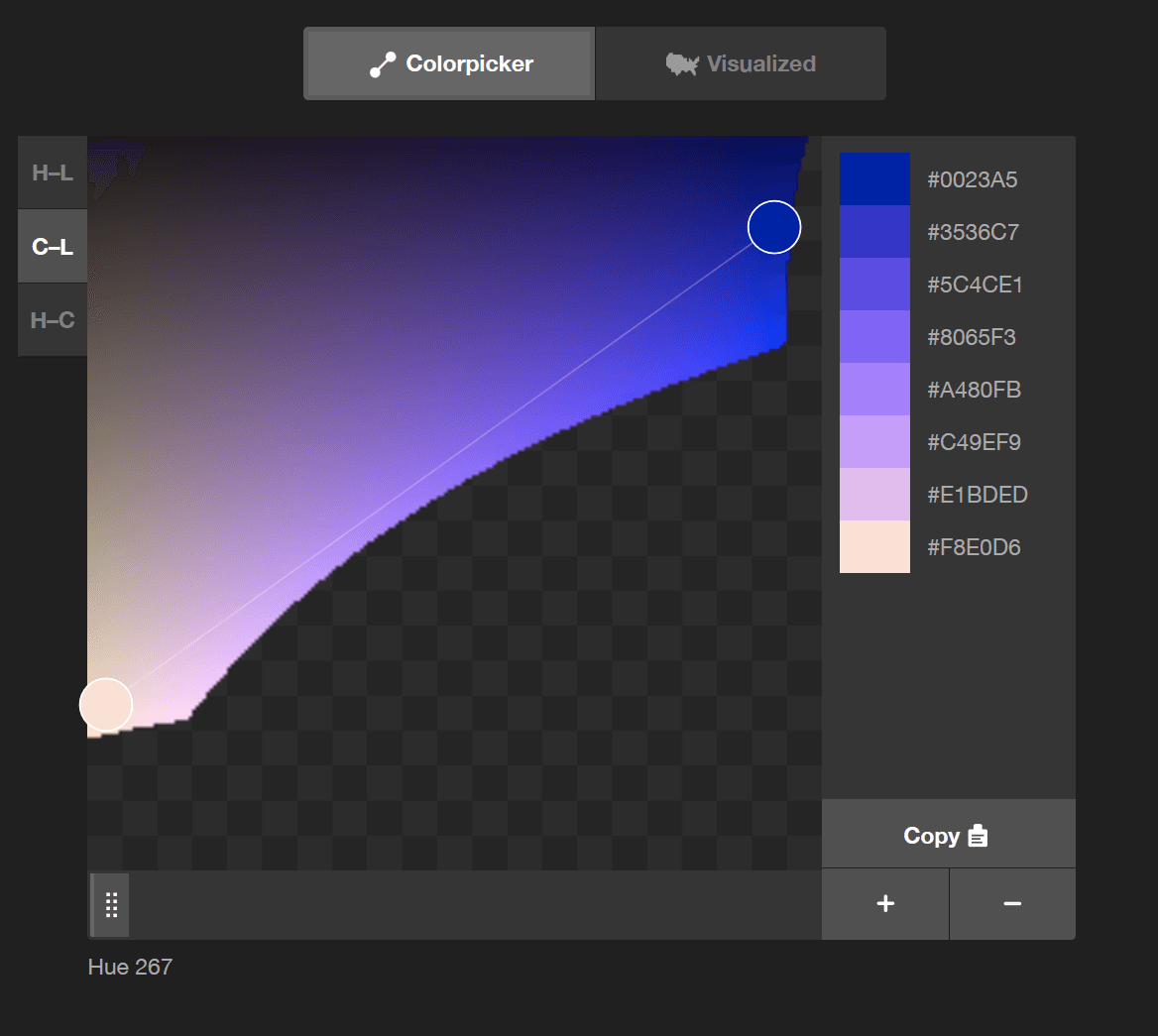
color-mix(): CSS's Native Color Blender
color-mix() lets you blend two colors directly in CSS, like mixing paint. Use it to generate theme variations, like hover states, from a base color. The chosen color space (e.g., srgb, oklch) dramatically changes the result, so always specify it.
CSS Masking: Using Stencils for Web Elements
CSS masking is like a stencil for your elements. You provide a shape, and only the parts of the element under the stencil's cutout are visible. Use it for non-rectangular shapes, like text cutouts.
CSS Combinators: Targeting by Relationship
CSS combinators target elements by their DOM relationship, not just class or ID. They let you select an element inside another (div p) or right next to one (h2 + p). This is key for styling nested menus or spacing adjacent items.
Mobile-First Design: Start Small, Then Scale Up
Mobile-first design means building for the smallest screen first, then enhancing for larger ones. This ensures a solid baseline experience on phones, where most users are. The footgun is thinking it's just CSS, not a content-first strategy.
We are hiring for this. Every open role lists the topics its interview covers, so you can prepare for the real thing rather than guessing.
See open roles