Concepts in CSS & Design Systems, page 5
Autoprefixer: Stop Memorizing CSS Vendor Prefixes
Autoprefixer lets you write modern CSS and automatically adds vendor prefixes like -webkit- during your build. It's a standard part of frontend toolchains, ensuring styles work across browsers.
Sass Mixins: Reusable Style Functions
Think of a Sass mixin as a function for CSS. It bundles style declarations you can reuse, avoiding repetitive code. Use it for common patterns like button styles or clearing floats. The footgun: mixins copy code everywhere, which can bloat your final CSS.
Sass Modules: Using @use for Clean, Scoped Styles
Think of @use as importing a JavaScript module. It loads Sass variables and mixins into a private namespace, preventing global style conflicts. Use it to structure large CSS codebases by breaking styles into logical partials.
Sass @extend: Inherit Styles, Not HTML Classes
@extend lets one selector inherit styles from another, grouping them in the final CSS without adding classes to your HTML. Use it for modifier classes to keep markup clean. The footgun: overusing it can generate long, complex selectors, bloating your CSS.
PostCSS: The 'Babel for CSS' Transformer
PostCSS is like Babel for CSS, transforming styles with JavaScript plugins. Use it to add vendor prefixes, enable future CSS features, or lint styles. The footgun: it's not a preprocessor like Sass, but a tool that enhances CSS, often used alongside it.
Stylelint: Your CSS Guardian for Rules, Not Just Formatting
Stylelint is a linter that guards your CSS logic and conventions, not just its formatting. Use it to catch errors like misspelled properties or enforce team rules. The footgun is confusing it with a formatter; Stylelint enforces rules, Prettier handles style.
Sass Functions: Reusable Logic for Your Styles
Sass functions are like JavaScript functions for your CSS, letting you compute and return a single value. Use them to centralize complex logic, like generating a color palette. The footgun: don't use functions for side-effects; that's what mixins are for.
Sass Built-in Modules: Namespaced Power Tools
Think of Sass built-in modules as namespaced toolkits for color, math, and more. You explicitly import what you need, like using sass:color for theming. The footgun is relying on old global functions, which ties you to legacy Sass implementations.
Design Systems: Stop Reinventing UI Components
A design system is a shared library of reusable UI components and rules, acting as a single source of truth for designers and developers. It ensures a consistent look across apps without rebuilding common elements.
Component Library: Your UI's LEGO Box
A component library is a box of pre-built UI LEGOs. Instead of building a button from scratch, you grab the official one, ensuring consistency and speed. It's essential for scaling design across teams.

UI Patterns: Reusable Recipes for Interfaces
UI patterns are reusable recipes for common interface problems, like tabs or accordions. They create a shared language for building predictable, accessible components. The biggest footgun is creating a component that looks right but lacks accessible behaviors.
Designing Durable Component APIs
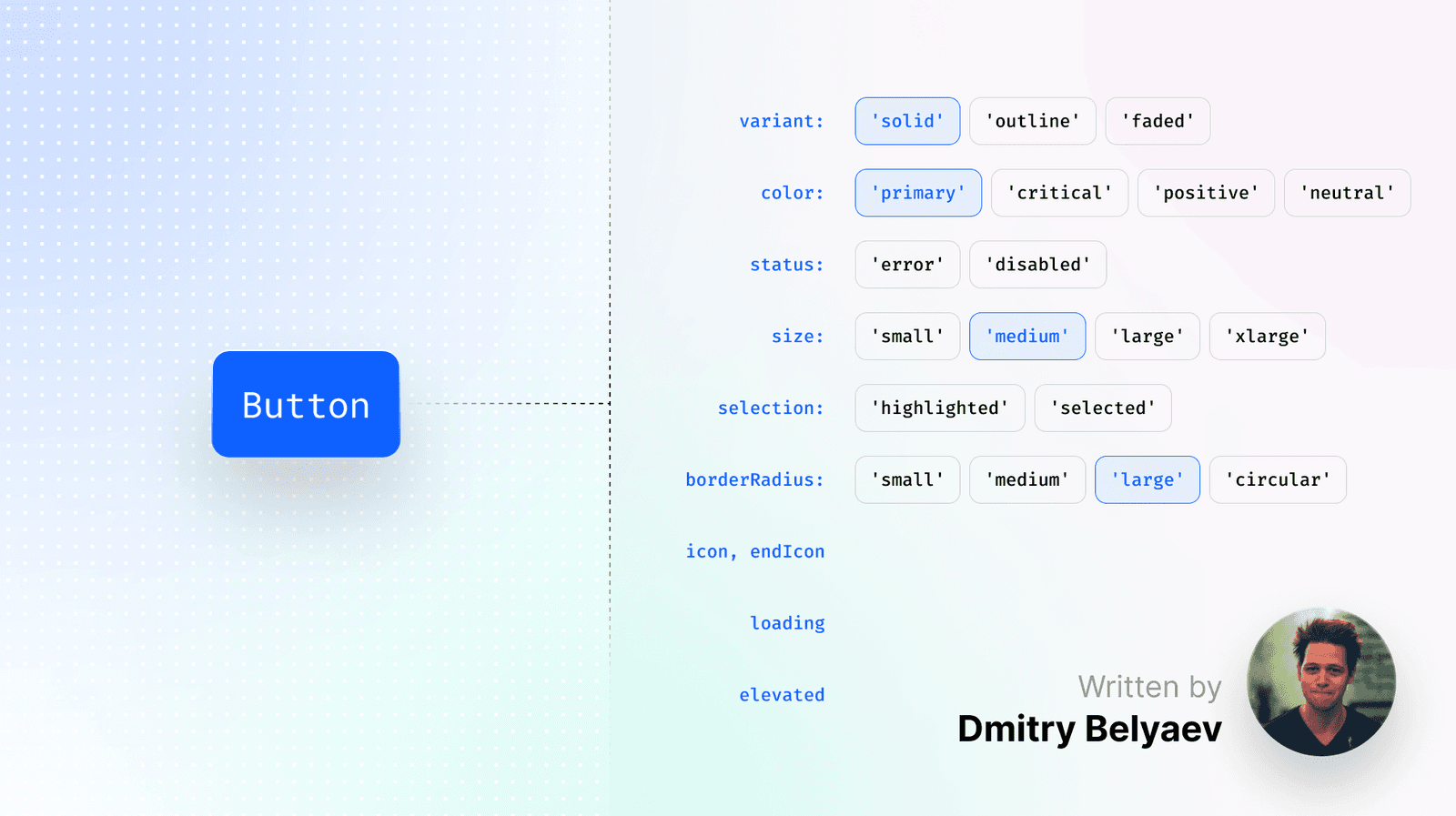
The best component API is often no API. Design from the user's perspective by first writing the ideal usage snippet, a "dream-driven" approach. This ensures intuitive components that boost design system adoption.
W3C Design Tokens: A Standard Format for UI Decisions
A standard design token format is a universal translator for your UI's style, defining colors and spacing in a JSON structure any tool can read. It lets design tools and codebases pull from one source of truth.
Style Dictionary: A Build Tool for Design Tokens
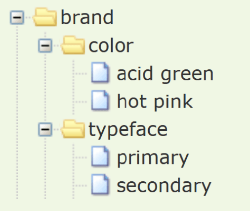
Think of Style Dictionary as a compiler for your design system. It takes abstract design tokens (like brand colors and fonts) and automatically generates platform-specific style files for web, iOS, and Android, ensuring consistency everywhere.
Composite Design Tokens: Bundling Style Properties
A composite design token bundles multiple style values into a single, semantic unit, like a "style kit" for shadows or typography. Use them to apply complex, multi-property styles like borders or text styles with one reference.
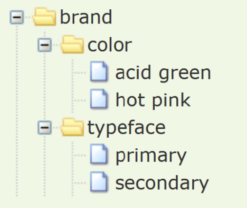
W3C Design Tokens: A JSON Standard for Design Systems
The W3C Design Tokens format is a universal translator for your design system's variables. It's a standard JSON structure that lets design tools and codebases speak the same language for colors and spacing.
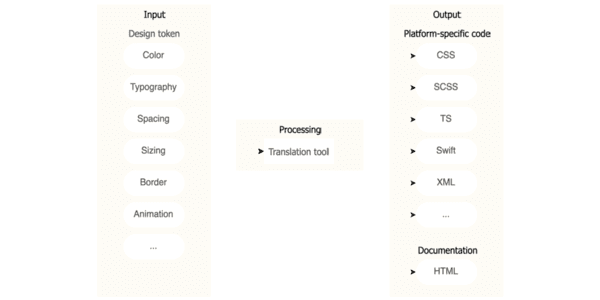
Design Tokens: Automating UI with a Build Pipeline
Think of design tokens as design decisions stored as data. A build pipeline consumes this data to auto-generate code for multiple platforms, ensuring consistency. The footgun is exposing all raw 'option' tokens instead of curated 'decision' tokens.

Custom Elements: Create Your Own HTML Tags
Think of Custom Elements as creating your own Lego bricks for the web, defining new HTML tags with custom logic. Use them to build reusable components like a <product-card>. Be wary of extending built-in elements, as Safari does not support this.
The HTML <template> Element: Inert, Reusable Markup
Think of <template> as a blueprint for HTML. It holds markup that's invisible and inactive until you need it, perfect for creating reusable chunks like list items that you can stamp out with JavaScript.
HTML Slots: Making Web Components Customizable
The <slot> element is a placeholder inside a Web Component, letting you inject your own markup. It makes components flexible, like a card with customizable header and body sections. The footgun: content without a slot attribute goes to the default slot.
We are hiring for this. Every open role lists the topics its interview covers, so you can prepare for the real thing rather than guessing.
See open roles