Easy everything in Data Science & Analytics, page 3
Audience Analysis: Translate Data for Your Listener
Don't just show data; translate it for your audience. Audience analysis means tailoring communication to who's listening, based on their knowledge and needs. The biggest mistake is assuming your audience shares your context and jargon—they rarely do.

Data Storytelling: Using Narrative to Drive Insight
Structure your data presentation like a story—a journey with rising tension and a clear resolution. This guides stakeholders from a problem to a solution in reports.
HDFS: Store Big Data on Cheap, Unreliable Hardware
HDFS stores huge files across many cheap computers by assuming they will fail. It achieves reliability by replicating data, not by using expensive hardware. Use it for batch processing, but avoid it for low-latency access or many small files.
Hadoop: Processing Big Data on Cheap Hardware
Hadoop processes massive datasets by distributing work across many cheap computers, assuming some will fail. It's used for large-scale batch processing, not real-time queries. The footgun is treating it like a database instead of a batch processing framework.

Transfer Learning: Don't Train Models from Scratch
Transfer learning means not training a model from zero. You start with a model pre-trained on a large, general dataset, then fine-tune it for your specific task. This is common in image recognition, using a general model to learn a niche classification.
Convolutional Neural Networks: Finding Patterns with Filters
A CNN learns to spot features by sliding optimized filters over data like images, audio, or text. It's the go-to for computer vision, but a common mistake is thinking it's the only modern tool, as transformers sometimes replace it.

Word Embeddings: Turning Words into Math
Word embeddings turn words into vectors, where distance equals a difference in meaning. They power features like search relevance and text classification by letting algorithms 'understand' context.

Artificial Neural Networks: Learning from Examples
Think of an ANN as a digital brain that learns from examples, not explicit code. It's a network of simple nodes that adjust their connections to spot patterns. They power image recognition and language translation, but are only as good as their training data.
Statistical Power: Is Your Test Strong Enough to Find a Real Effect?
Statistical power is your experiment's ability to detect a real effect. A low-power test is like a fishing net with holes too big—the fish swims right through. This is critical for A/B tests. The footgun is concluding "no effect" from a weak test.
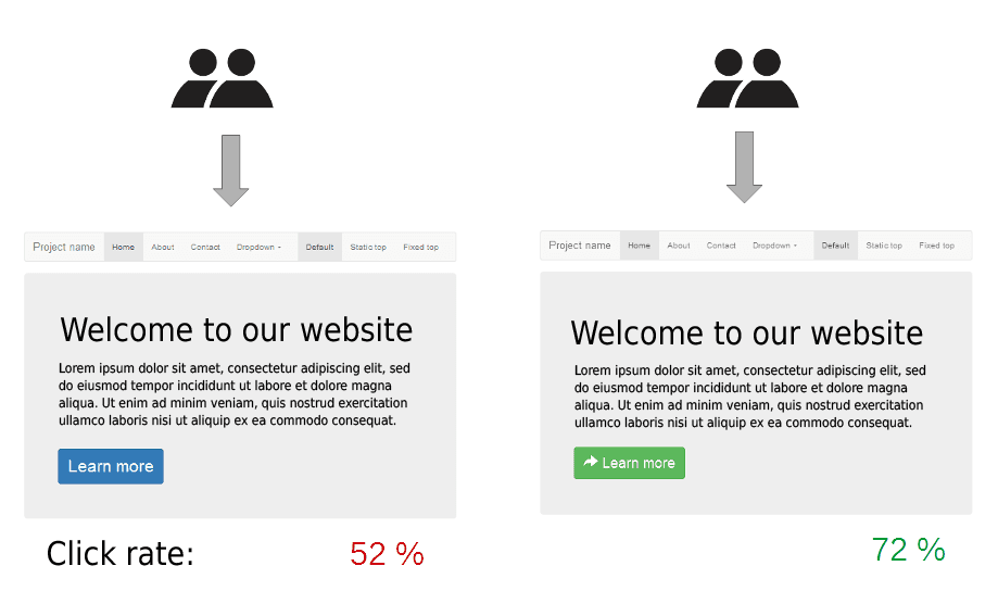
A/A Testing: Sanity-Checking Your Experiments
A/A testing is a fire drill for your A/B testing system. You run two identical versions of a page to ensure your tools are working correctly before a real experiment. The biggest footgun is panicking at a false positive; 1 in 20 tests will show.
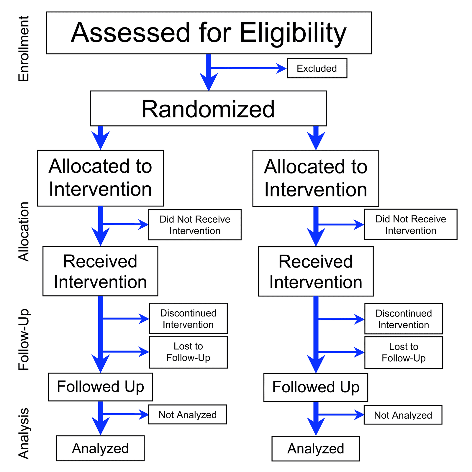
Randomization: Defeating Bias with Chance
Randomization uses chance to assign subjects to groups, isolating the effect you're testing from hidden variables. It's the foundation of A/B tests and clinical trials. The footgun is confusing 'haphazard' selection with true, unbiased randomization.
Decision Tree Learning: A Flowchart for Your Data
Decision tree learning builds a predictive flowchart from your data. It's used for classification (like spam vs. not spam) or regression (like predicting price). The main footgun is overfitting: creating a tree so specific it can't handle new data.
k-Means Clustering: Grouping Data Around Centroids
k-Means automatically groups data into a specified number of clusters (k) by finding the center of each group. It's used for customer segmentation, document categorization, and image compression.
k-Nearest Neighbors: You Are the Company You Keep
k-NN classifies new data by taking a vote from its closest neighbors. It's used for simple predictions where distance is meaningful, like product recommendations. The main footgun is choosing k: too small is noisy, too large blurs boundaries.

Logistic Regression: Predicting a Yes or No Outcome
Logistic regression predicts a binary outcome (yes/no, 1/0) by calculating the probability of an event. It's used for classifying things like spam email or fraudulent transactions. The footgun is mistaking its output for certainty instead of a probability.
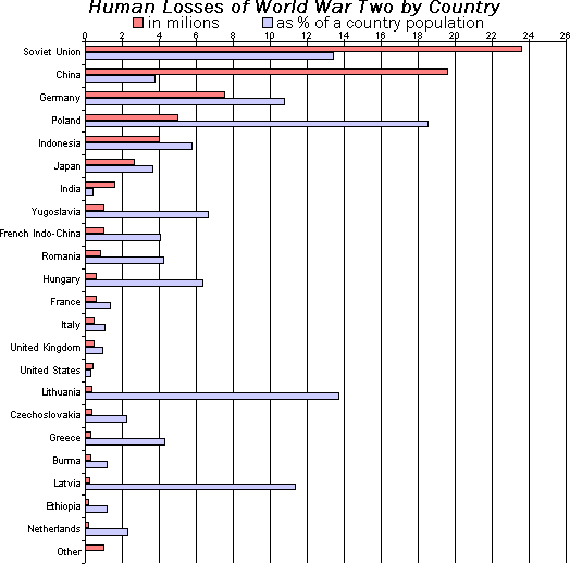
Bar Chart: Compare Categories at a Glance
A bar chart is a lineup of rulers for different categories, making it easy to compare values. It's perfect for showing "how much" for discrete items, like monthly sales or user counts by country. The footgun: don't use it for continuous data—use a line chart.

Box Plot: See a Distribution's Shape at a Glance
A box plot is a cheat sheet for a dataset's distribution, showing the median, the middle 50% of data (the box), and outliers. Use it to quickly compare distributions, like server response times across regions. The footgun: the line is the median, not the mean.

Scatter Plot: Visualizing Relationships Between Two Variables
A scatter plot visualizes the relationship between two variables as a cloud of data points. It's used to quickly spot trends, like whether increased study time correlates with higher test scores. The key footgun: correlation is not causation.

Histogram: See the Shape in Your Data
A histogram turns a raw list of numbers into a picture of its distribution, like sorting coins into stacks. It's used to see where data clusters and how it's spread out. The main footgun: the story your histogram tells depends entirely on the bin size.

Data Warehouse: The Central Repository for Analytics
A data warehouse is a central repository for historical analysis, integrating data from many systems. It's used for reporting and complex queries to find business insights, not for day-to-day transactions.
We are hiring for this. Every open role lists the topics its interview covers, so you can prepare for the real thing rather than guessing.
See open roles