Easy concepts in Design & UX, page 5
From Design to Code: Inspecting in Figma
Inspection translates a design into code-ready specs. It's the "view source" for a design file, showing exact colors, sizes, and spacing. Developers use it to build UIs; designers use it to verify consistency. Don't blindly copy auto-generated code.
System Usability Scale (SUS): A Quick Usability Score
The System Usability Scale (SUS) is a 10-question survey that gives a single 0-100 score for a system's perceived usability. It's a quick, industry-standard way to benchmark usability. The biggest footgun: the score is not a percentage; 68 is average.
ResearchOps: The Pit Crew for User Research
ResearchOps is the backstage crew that makes user research scale. It provides roles, tools, and processes so researchers focus on insights, not logistics. Teams often assume researchers self-manage operations, which bottlenecks research as companies grow.

The Hook: Earning the Read After the Headline
A hook is the opening line that pulls a reader from the headline into your copy by creating a curiosity gap or emotional tension. It's critical in ads and sales pages where readers are distracted. The footgun: if the hook fails, the rest is ignored.
Build-Measure-Learn Loop: Experiment Over Intuition
Ship a small test, watch real reactions, and steer the next version by data instead of gut instinct. Use it when you must know fast if a business model is viable. The footgun is calling the first release a product instead of an experiment.
Click-Through Rate (CTR): Measuring What Resonates
Click-Through Rate (CTR) is the percentage of people who click a link after seeing it. It's a direct measure of how compelling your message is, used to gauge initial interest in ads, emails, and search results.

Proto-Persona: Sketch Users from Team Assumptions
A proto-persona sketches your team's user assumptions in a quick workshop, creating shared targets without new research. It aligns Lean teams, but the footgun is treating these guessed profiles as facts rather than hypotheses.
Hashtag Strategy: Metadata, Not Magic
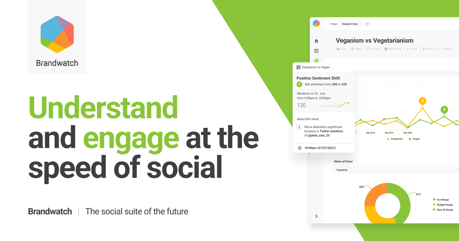
Hashtags are metadata, not magic. A good strategy uses a few targeted tags to categorize content for search, signal relevance to algorithms, and connect with communities. The footgun is "spray and pray"—modern platforms favor 3-5 relevant tags over volume.
Figma String Variables: Manage UI Text in One Place
A string variable is a single source of truth for UI text. Instead of typing text directly, you apply a variable. This is key for managing translations or different component states, like a button label changing from 'Submit' to 'Submitting...'.
Semantic Versioning: The MAJOR.MINOR.PATCH Contract
Semantic Versioning (MAJOR.MINOR.PATCH) is a contract that tells users if an update will break their code. It's used by package managers to safely resolve dependencies.
Aesthetics-Usability Effect
The aesthetics-usability effect is the tendency for users to perceive attractive designs as easier to use and to be more tolerant of minor usability problems in them, which can mask real issues during testing.

UX Competitive Analysis: Benchmark to Outperform
UX competitive analysis treats rivals as free design research: reverse-engineer what works and where the market is underserved. Run it before redesigns and repeat quarterly. The footgun is copying visuals instead of analyzing underlying flows and task success.
Critical Incident Technique: Story Mining
Skip asking what users want; ask for the exact moment something went great or terribly wrong. Researchers use this to pinpoint interactions that make or break an experience. Teams collect vague feedback instead of concrete stories with clear context.
Microcopy: The Small Words with Big Impact
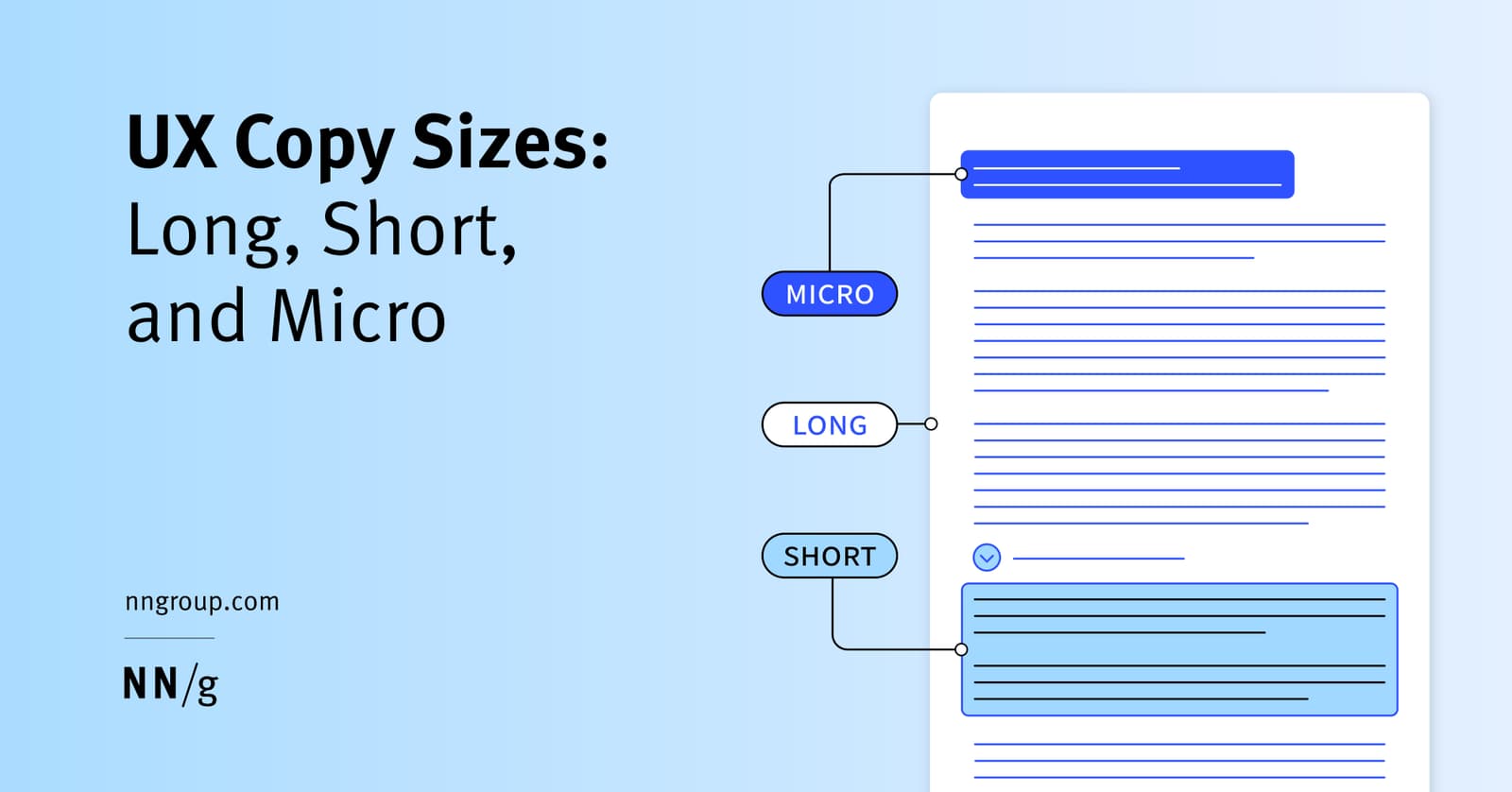
Microcopy is the small, functional text that guides users through an interface. It's the button labels, error messages, and tooltips that help users complete tasks.
Theme Provider Pattern: Centralized UI Styling
A Theme Provider acts like a global style guide, injecting design tokens like colors and fonts into all child components. It's used in frameworks like React to ensure a consistent look and feel. The footgun: components outside the provider won't get the theme.
Designing Helpful UX Error Messages
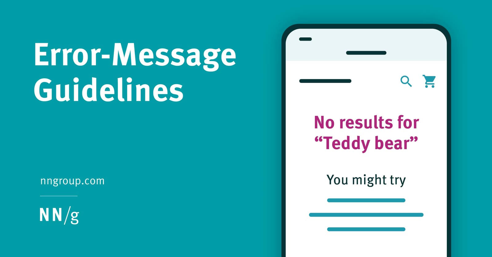
An error message is a guide, not a dead end. Design them to be visible and constructive by placing them near the error's source with clear, high-contrast styling. The footgun is showing errors prematurely, which feels hostile and punishes exploration.

CSS Custom Properties: Variables for Your Stylesheet
CSS custom properties are variables for your design system. Define a value like --primary-color once on :root and reuse it everywhere. This is ideal for theming, like switching between light and dark modes.
Tooltips: For Optional Hints, Not Critical Info
Tooltips are hover-activated hints providing optional, extra context for UI elements. Use them to explain why a form field is needed or what an ambiguous icon means. The footgun is hiding critical info, like password rules, inside them.
Information Architecture: The Blueprint for Your App
Think of Information Architecture (IA) as the blueprint for an app, defining its structure before visual design begins. It dictates navigation and content organization to make things findable.
prefers-color-scheme: Respect User Theme Preferences
The prefers-color-scheme media query lets your CSS automatically adapt to a user's system-wide light or dark mode. It's used to create themes that respect user preferences.
We are hiring for this. Every open role lists the topics its interview covers, so you can prepare for the real thing rather than guessing.
See open roles