Intermediate concepts in Design & UX
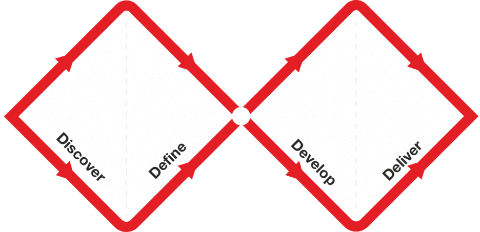
Double Diamond: Explore, Then Focus, Twice
The Double Diamond model prevents building the wrong thing by forcing two cycles of 'go wide, then narrow down.' First, explore the problem space, then define a specific problem. Second, explore solutions, then deliver a tested one.
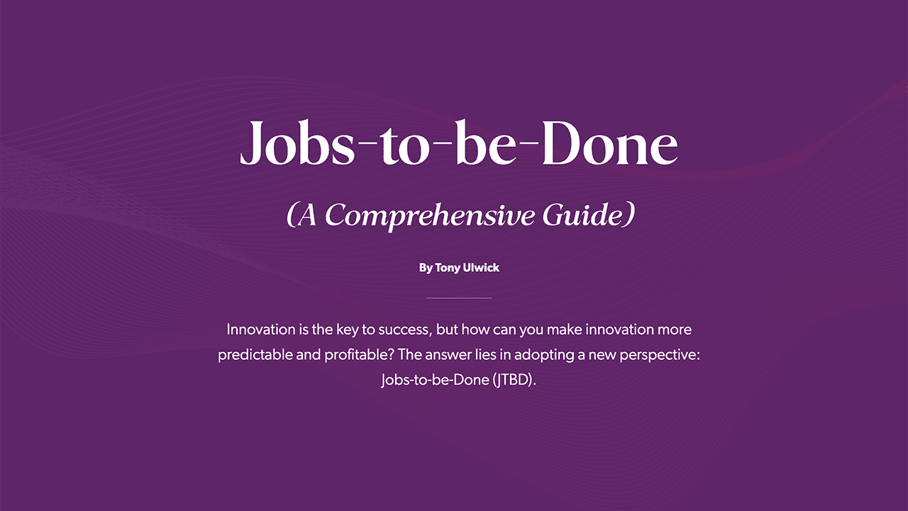
Jobs to Be Done: Sell the Hole, Not the Drill
The Jobs to Be Done framework says customers 'hire' products to get a job done. Instead of selling a drill, sell the quarter-inch hole. This reframes innovation around stable customer needs, not temporary product features.

The Inverted Pyramid: Lead with the Conclusion
Lead with the conclusion, then add details in decreasing order of importance. This structure ensures readers get the main point even if they stop reading early. It's crucial for news, bug reports, and docs. The footgun is burying the lede in context.
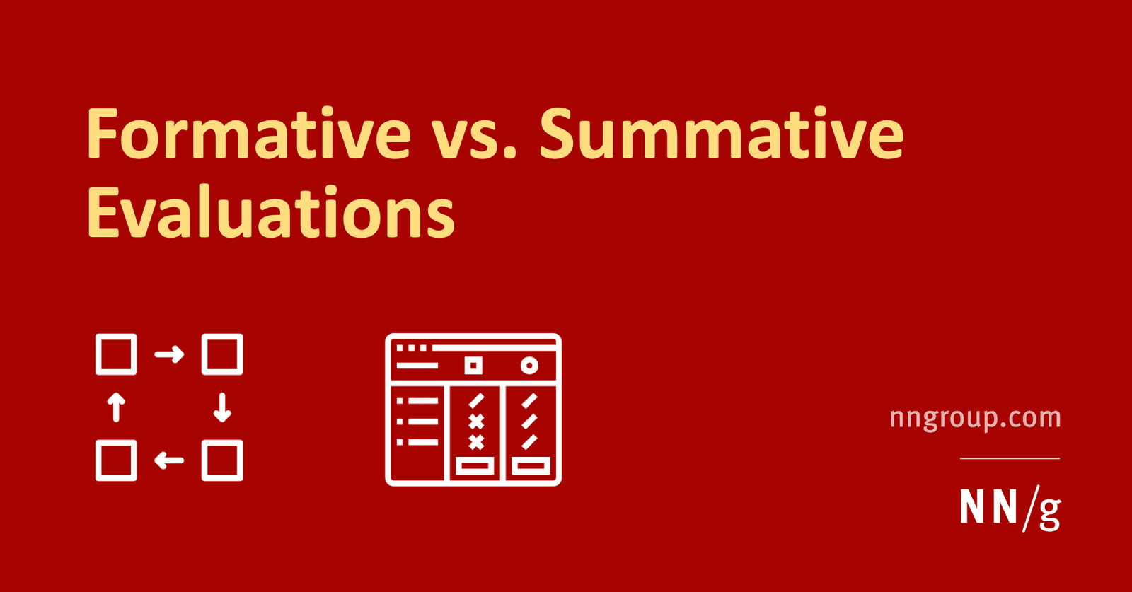
Formative vs. Summative Evaluation: Improve vs. Judge
Formative evaluation improves a design in progress; summative evaluation judges a finished one. Use formative tests to find and fix flaws iteratively. Use summative tests to measure a shipped product against a benchmark, like a prior version or a competitor.
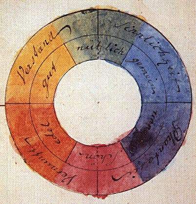
Color Theory: Harmony, Contrast, and Meaning in UI
Color theory is a system for using contrast, harmony, and symbolism to guide user experience. It's applied in UI to create visual hierarchy, evoke brand emotions, and ensure readability.

Atomic Design: Building UIs Like Chemistry
Atomic Design is like chemistry for UIs: you build complex screens from simple, indivisible 'atoms' like buttons and inputs. It's used to create consistent design systems. The footgun is treating it as a rigid, linear process instead of a mental model.

The PAS Formula: Turn a Reader's Pain into a Purchase
The PAS formula turns pain into a purchase by stating a problem, making it feel worse (agitating), then offering your product as the solution. It's used in ads and landing pages where you need to be persuasive fast.
UI Typography for Readability
Good typography isn't about fancy fonts; it's about making content effortless to read by controlling size, spacing, and alignment. It's crucial for body copy, headings, and labels. The footgun is using justified text or lines over 90 characters long.
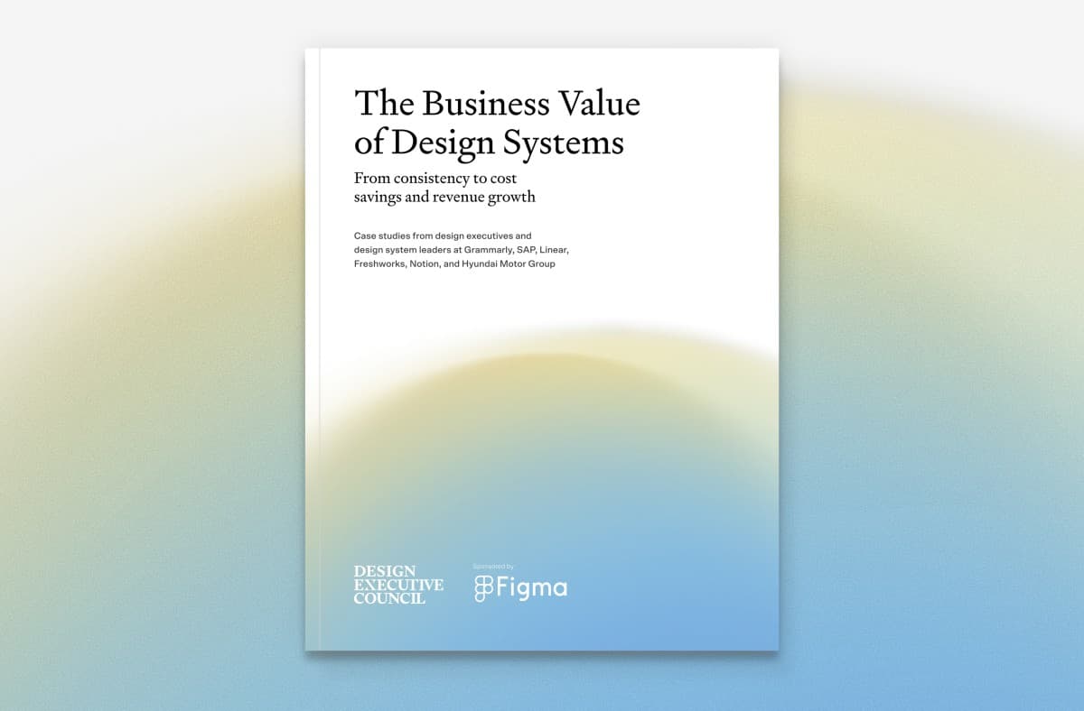
Design Systems: From UI Kits to Business Infrastructure
A design system is business infrastructure, not just a UI kit. It translates brand consistency into measurable ROI by reducing costs and accelerating delivery.

Brand Voice vs. Tone: Personality vs. Mood
Think of voice as your brand's consistent personality and tone as its mood, which adapts to the situation. This distinction guides all copy, from celebratory emails to error messages. The main footgun is forcing one tone, like humor, everywhere.
Affordances Are Actions, Signifiers Are Clues
An affordance is what's possible (a door can be pushed), while a signifier is the clue telling you how (the flat plate). In UI, a button's styling is a signifier for its click affordance. The footgun is saying 'affordance' when you mean 'signifier'.
Design Systems: Your UI's Single Source of Truth
A design system is the single source of truth for UI, giving designers and developers a shared toolkit of reusable components and standards. It ensures consistency and efficiency across projects.

Cialdini's Principles: The Science of Persuasion
Persuasion isn't an art; it's a science based on six universal principles for building relationships. Use them to ethically increase profits in business or get a "yes" in daily life, like asking a neighbor for a favor.

Jakob's Law: Don't Reinvent the UI Wheel
Users spend most of their time on other sites, so they expect yours to work like everything else they already know. Leverage familiar patterns for navigation, icons, and workflows.

Theming: One Design System, Many Visual Styles
Theming lets one component library wear many visual styles, like skins on a character. You can support multiple brands or dark/light modes by swapping design tokens instead of rebuilding components.

The Hero's Journey: A Blueprint for Compelling Stories
The Hero's Journey is a narrative blueprint: a character leaves their world, overcomes a crisis, and returns transformed. It's the structure behind blockbuster films and persuasive case studies.
Data Minimization: Collect Only What You Need
Treat user data like a liability, not an asset. The Data Minimization principle states you should only collect personal data that is strictly necessary for a specific purpose. This is a core tenant of GDPR. The footgun is collecting data "just-in-case".
Securing Research Data with a Management System
Treat data security as a living system for managing risk, not a one-off checklist. A framework like ISO 27001 helps you systematically protect sensitive research data by defining policies and controls.
WCAG Color Contrast: The 4.5:1 Rule for Readability
WCAG contrast ratios ensure text is readable for people with low vision by measuring relative luminance, not just color. Standard text needs a 4.5:1 ratio against its background.

Vertical Rhythm: A Formula for Consistent Spacing
Vertical rhythm is a system for consistent spacing derived from your body text's line height. Use this calculated unit between all elements—paragraphs, lists, and after headings—to create harmony.
We are hiring for this. Every open role lists the topics its interview covers, so you can prepare for the real thing rather than guessing.
See open roles