Concepts in Design & UX, page 10

Featured Snippets: Earning 'Position Zero' in Google
Featured Snippets are Google's attempt to answer a query directly on the results page, often called "position zero." You win them by structuring content to be the clearest answer to a specific question, but this can sometimes decrease your click-through rate.

Survey Response Bias: When Answers Mislead
Survey answers aren't raw data; they're filtered through human psychology. Response bias describes the predictable ways people answer inaccurately, common in user surveys and market research. The footgun is taking responses at face value, ignoring biases.
Keyboard Focus Order: Navigating by Tab
Keyboard focus order is the path a user takes through your UI using only the Tab key. It must follow a logical sequence that preserves meaning, especially in forms and modals. The footgun is when CSS creates a visual layout that diverges from the HTML.
Keyword Cannibalization: When Your Pages Compete Against Each Other
Keyword cannibalization is when your own pages fight for the same search rankings, splitting your authority. This happens when multiple articles target the same keyword and user intent.
TF-IDF Analysis
TF-IDF weights a term by how often it appears in a document against how rare it is across the corpus, surfacing words distinctive to that document rather than ones common everywhere, which powers keyword extraction and search ranking.
Clickstream Analysis: Following the User's Footsteps
Clickstream analysis is like watching a replay of a user's journey through your site, click by click. It's used to optimize conversion funnels and find friction points. The footgun is focusing on the *what* (the path) without asking *why* a user took it.
Figma's Slot Pattern: Flexible Components Without Detaching
Think of a slot as a 'bring your own content' area within a Figma component. It lets you customize instances with unique layouts, like in a card or modal, without detaching them from the main component and breaking your design system.

Image Alt Text: What Screen Readers Say About Pictures
Alt text tells screen readers what to say when an image can't be seen. For a photo, describe the scene. For a button, describe its action ("Submit form"). For pure decoration, use an empty alt="" to tell screen readers to skip it.
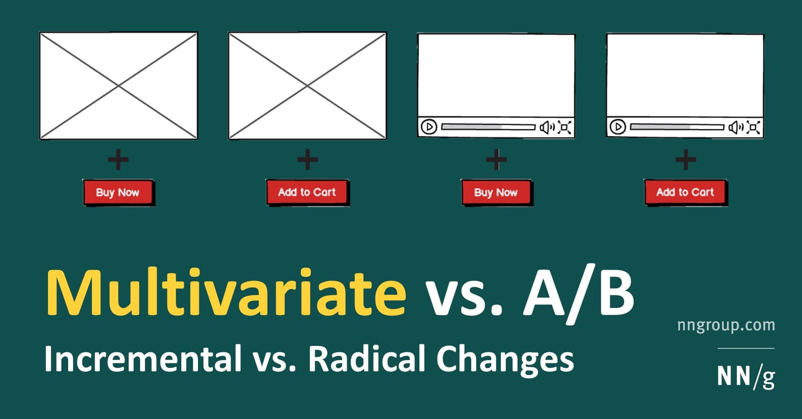
Multivariate Testing: Find Which UI Changes Interact
Multivariate testing finds the best *combination* of UI changes, not just which single design wins. Use it to see how a new headline interacts with a new button on a high-traffic page. The footgun: it requires far more traffic than A/B testing to get a.
Figma Prototype Scrolling: Simulating Overflow
Think of a frame as a window onto your content. To make it scroll, the content must be larger than the window. Use this for long pages, image carousels, or to fix navbars. The biggest footgun: if content doesn't extend beyond the frame, there's nothing.
Accessibility Linters: Automate Compliance in Your Design System
An accessibility linter is like a spellchecker for WCAG compliance, automatically flagging component errors like bad contrast or missing labels. It runs in CI/CD to catch bugs early, preventing them from propagating. The footgun: it can't catch everything.
Article Schema: A Nutritional Label for Your Content
Article schema is a nutritional label for your content, telling search engines exactly what each part is. Use it for blog posts and news to earn rich snippets, but the footgun is incomplete mapping—just defining the type is not enough.
MaxDiff Analysis: Find True Preferences, Not Just Ratings
MaxDiff finds what people truly value by asking them to pick the "best" and "worst" from a small set, not just rate them. Use it to rank features or messages without the ambiguity of 1-5 scales.
The Lede: Hook Your Reader in the First Paragraph
The lede is your opening paragraph's promise, telling the reader what the piece is about and why they should care. It's crucial for delivering the main idea upfront in articles or docs. The biggest mistake is 'burying the lede'—hiding the key takeaway.
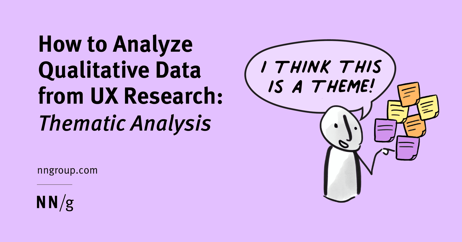
Qualitative Coding: Turning User Chatter into Actionable Themes
Think of thematic analysis as creating a tag cloud for user interviews. It groups raw feedback into meaningful patterns, turning noise into signal. Used after interviews to make sense of transcripts, the biggest mistake is just describing what users said.
Forced Colors Mode: When the User Overrides Your Palette
Forced Colors Mode is an accessibility feature where the browser overrides your site's colors with a user-defined, high-contrast palette. This ensures readability for users who depend on it. The footgun is disabling it and making your UI invisible.

Scarcity and Urgency: Driving Action by Limiting Supply
Scarcity drives action by making items seem more valuable because their availability is limited. This 'get it before it's gone' effect appears in e-commerce with 'only 3 left' notices or limited-time offers. The footgun is overuse, which erodes trust.
The 4 P's Formula: Picture, Promise, Prove, Push
The 4 P's formula structures persuasive copy in four steps: picture, promise, prove, push. It shines in emails and landing pages that must convert attention fast.
The Rainbow Spreadsheet: Collaborative UX Observation
A Rainbow Spreadsheet makes UX research a team sport. It's a shared doc where observers log findings in real-time, with each participant assigned a color. This replaces a slow, formal report and builds shared understanding.
Figma Interactive Components: Prototype Smarter
Interactive Components build prototype logic directly into your component variants. Instead of wiring up hundreds of frames for a form, you define interactions like 'On Click' or 'Hover' once, and every instance inherits them.
We are hiring for this. Every open role lists the topics its interview covers, so you can prepare for the real thing rather than guessing.
See open roles