Easy everything in Design & UX, page 10

Typographic Scale: A System for Consistent Text
A typographic scale is a predefined set of font sizes and line heights that creates visual harmony. Design systems use it for consistent, readable text across devices. The footgun is adding one-off font sizes, which breaks the system's rhythm and consistency.
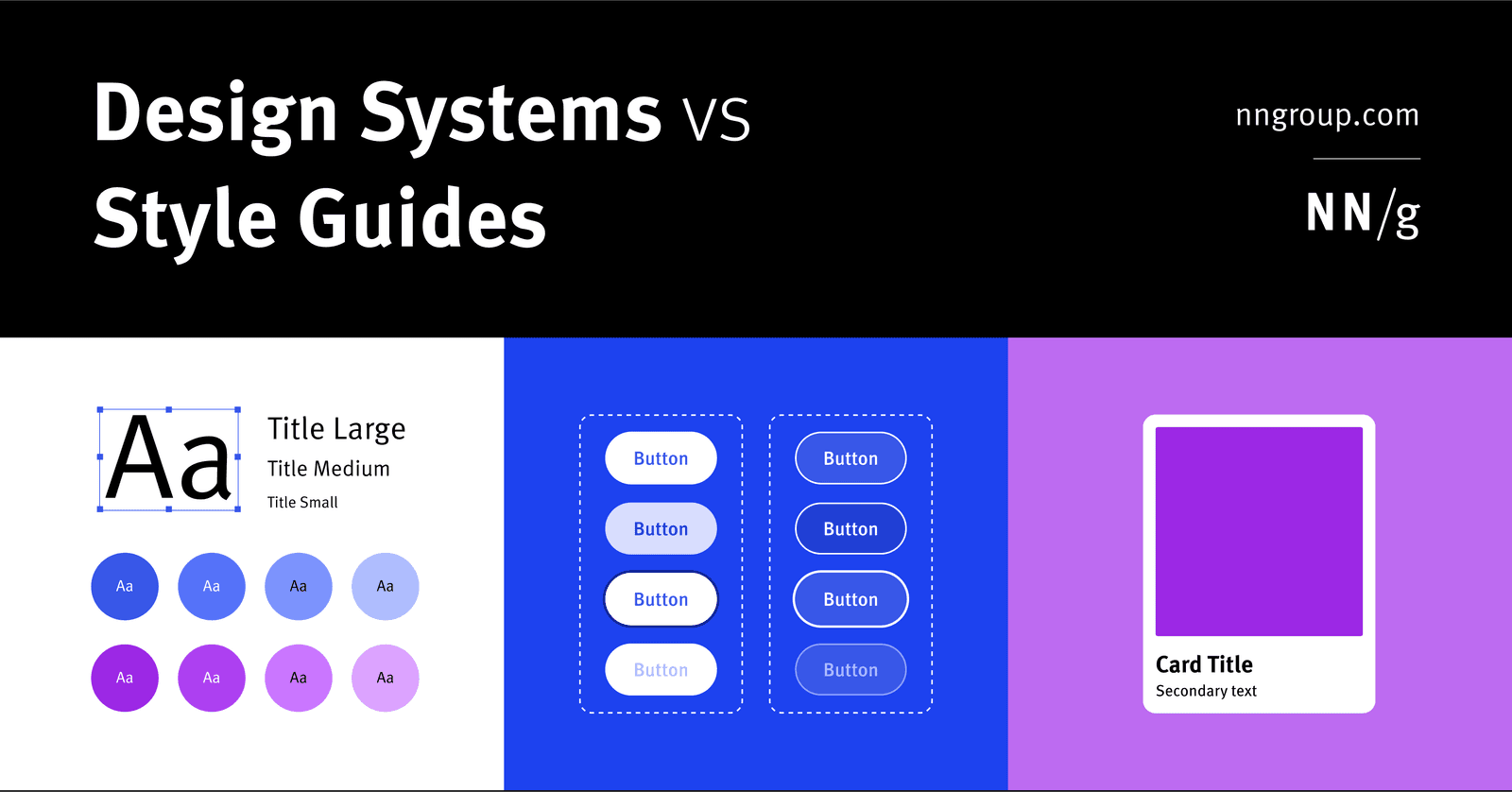
Design System: The Whole vs. Its Parts
A design system is the parent; style guides and component libraries are its children. It's the full toolkit for building consistent products at scale, containing rules, patterns, and ready-to-use code.
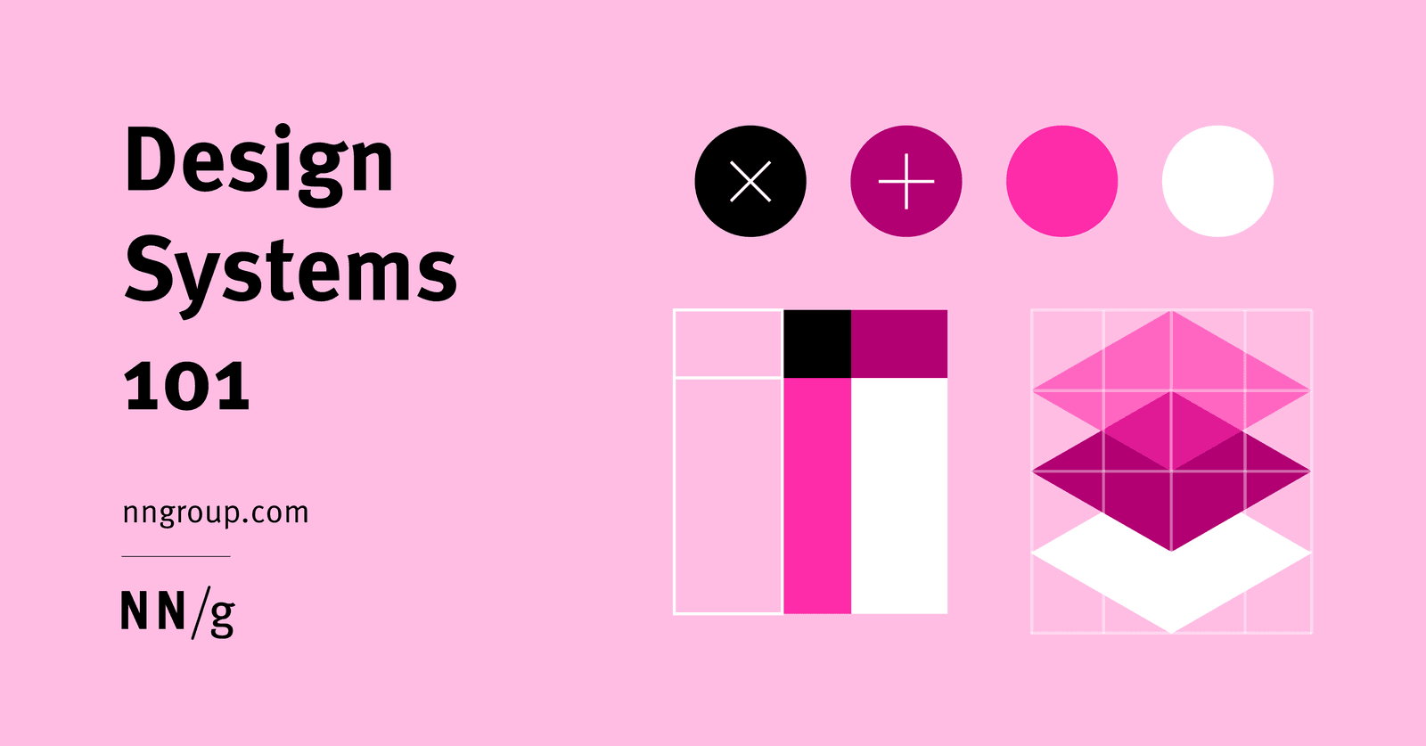
A Design System is a Shared Toolbox, Not Just a Sticker Sheet
A design system is a shared toolbox of reusable UI components and rules, not just a style guide. It ensures consistency and speed when multiple teams build products at scale.
Single Source of Truth (SSOT): One Place for All UI
A Single Source of Truth (SSOT) is the "don't repeat yourself" principle for UI. Define a component or style once in a central design system, and reference it everywhere. This prevents UI drift across teams.
The Byline: Attributing Work to its Author
A byline is the author's signature on an article, giving them credit and accountability. You see it between the headline and body text of news stories, magazine features, and blog posts.

Invoice: The Official 'Please Pay Me' Document
An invoice is your official request for payment after delivering work. Freelancers and businesses use it to bill clients for services, listing what was done and how much is owed. The footgun is confusing it with a receipt, which confirms payment has been made.
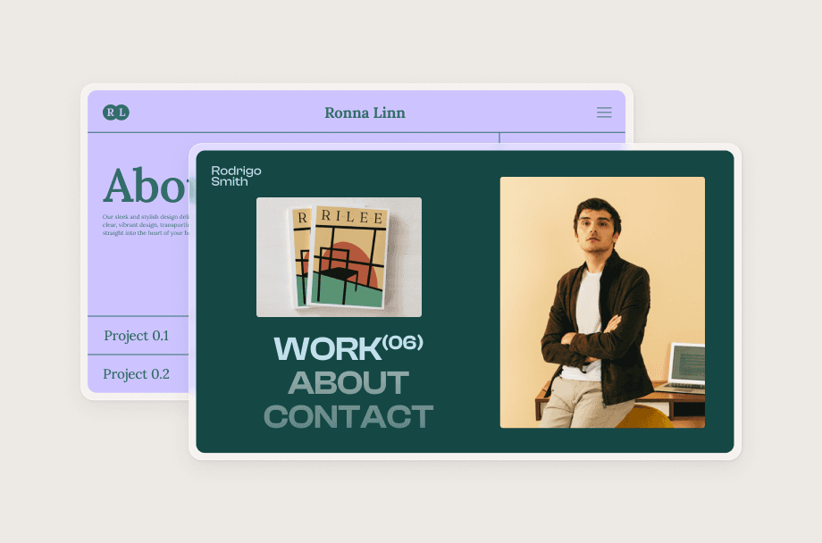
Writing Portfolio: Your Resume for Creative Work
A writing portfolio is your professional storefront, showing clients not just what you can write, but how you solve their problems. It's essential for landing freelance gigs or full-time jobs.

Public Domain: Use Creative Works Freely
The public domain is a global library of creative works anyone can use freely. It's essential for creators needing assets like images or music without licensing fees.
Copyright: Protection is Automatic, Registration is Power
Copyright protects your specific written expression—not the general idea—the moment it's 'fixed' on paper or a screen. While protection for your book or blog is automatic, you must register with the U.S. Copyright Office to sue for infringement in court.
Traffic Sources: Where Your Users Come From
Traffic sources pinpoint where users come from using a Source/Medium pair, like google/organic. This tells you which channels—SEO, paid ads, or social—drive visitors. The footgun is confusing them: google is a Source, organic is the Medium.
Bounce Rate: The Opposite of Engagement
Bounce rate is the percentage of website sessions that weren't engaged. In Google Analytics 4, a bounce means the visit was under 10 seconds, had no key events, and viewed only one page.
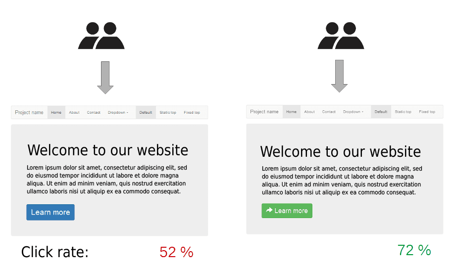
Control vs. Variation: The Core of A/B Testing
To know if a change works, compare it against the original. The original is your 'control,' and the new version is your 'variation.' This is the core of A/B testing, used to test new button colors or email subjects.
Five-Second Test: Capture a User's Gut Reaction
A five-second test captures a user's gut reaction by showing them a design for just five seconds. It's used to see if the visual style communicates the right brand identity before users have time to read. The footgun: don't warn users about the time limit.

Flesch-Kincaid: Measuring Readability with Math
Flesch-Kincaid scores aren't about quality, but simplicity, using word and sentence length to estimate reading difficulty. It's used in SEO tools and government forms to ensure accessibility. The footgun is chasing a score, which can make prose robotic.
Proofreading vs. Copyediting: Final Polish vs. Deep Clean
Copyediting is a deep clean for your writing, fixing style, flow, and clarity. Proofreading is the final spot-check for typos and formatting errors before you publish. They happen at different stages: copyediting on the draft, proofreading on the final layout.
Logline: Your Story's Core in One Sentence
A logline is a one-sentence pitch that distills a story to its central conflict and emotional hook. It's used to sell a script or summarize a film in a TV guide. The common mistake is summarizing the plot instead of the core premise that drives.

Two-Column Script Format: Aligning Sights and Sounds
A two-column script is a production blueprint, aligning what the audience sees (video) on the left with what they hear (audio) on the right. It's used for ads, live TV, and corporate videos. The main footgun: capitalize everything *except* spoken dialogue.

Writing for the Ear: Simple Language for Listeners
Write for listeners, not readers. Use short, simple sentences because your audience can't reread a confusing phrase in a podcast or broadcast. The biggest mistake is using complex, print-style writing that forces listeners to tune out.
Tooltips: For Optional Hints, Not Critical Info
Tooltips are hover-activated hints providing optional, extra context for UI elements. Use them to explain why a form field is needed or what an ambiguous icon means. The footgun is hiding critical info, like password rules, inside them.
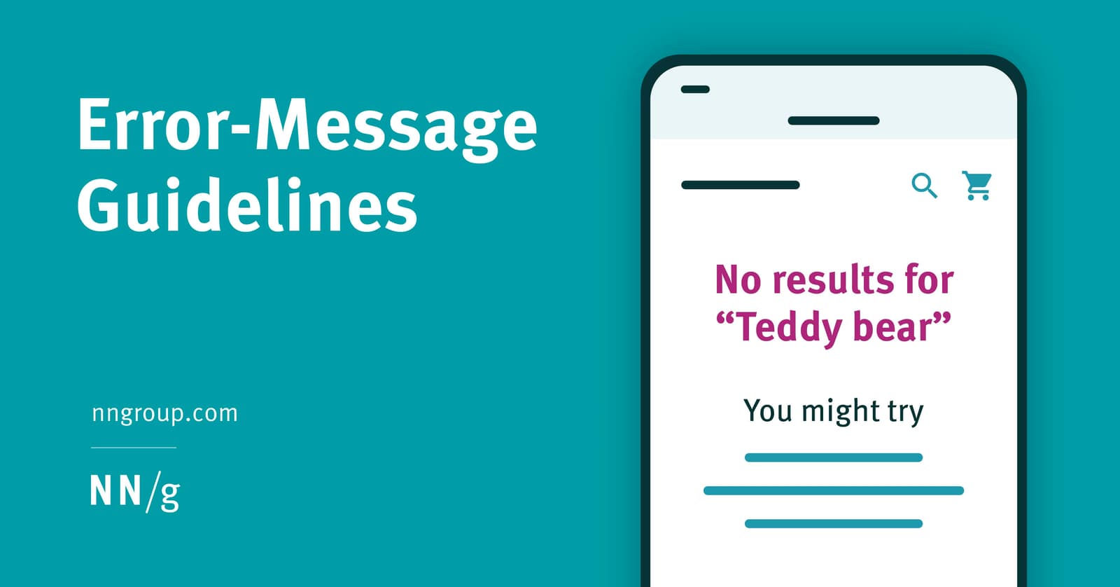
Designing Helpful UX Error Messages
An error message is a guide, not a dead end. Design them to be visible and constructive by placing them near the error's source with clear, high-contrast styling. The footgun is showing errors prematurely, which feels hostile and punishes exploration.
We are hiring for this. Every open role lists the topics its interview covers, so you can prepare for the real thing rather than guessing.
See open roles