More in Design & UX — page 24
When would you wrap layers in a Frame versus a Group?
WHAT IT TESTS: Whether you know Frames have bounds, clipping, and scroll overflow while Groups do not. ANSWER OUTLINE: Use a Frame when you need Clip content, scroll overflow, or constraints on children.
How do you optimize nested Auto Layout for performance?
Tests architectural restraint and layer complexity in Figma. Strong answers use Grid and Wrap to avoid deep nesting, remove redundant groups, and favor component instances. Red flag: proposing invisible spacers or manual positioning hacks.
How do you apply systematic rules to asymmetrical layouts predictably?
WHAT IT TESTS: Boxing visual tension with rigid rules. ANSWER OUTLINE: Grid and spacing tokens as guardrails; deliberate ratios create asymmetry, not random offsets; engineers get rules, not pixels.
How do you enforce proximity with Figma Auto Layout and spacing variables?
Tests translating Gestalt proximity into systematic spacing. Strong answers map t-shirt scales to Auto Layout gap and padding, then bind them to Figma spacing variables. Red flag: confusing proximity with alignment or manual nudging.
How do you build a responsive Figma component across breakpoints?
Tests Figma auto layout and constraint logic for responsive components. Strong answers mention nested frames, hug/fill modes, breakpoint variants or variables, and resizing previews. Red flag: copying static frames instead of using constraints.

How would you structure a multi-theme color system in Figma and CSS?
WHAT IT TESTS: Token architecture bridging Figma modes to code. ANSWER OUTLINE: Primitives and Semantic collections with theme modes; pipeline to CSS variables; components use semantic tokens only.

How would you optimize and implement a full-bleed responsive hero image?
WHAT IT TESTS: responsive image delivery and performance budgeting across breakpoints. ANSWER OUTLINE: use srcset with AVIF/WebP, CSS object-fit cover, and width/height to prevent CLS. RED FLAG: serving one 4K JPEG as a background image with no size hints.
Assess WCAG AA contrast for light grey text on off-white
Tests your fluency in WCAG relative luminance and design collaboration. A strong answer extracts sRGB values, computes contrast ratio, checks 4.5:1 or 3:1 by text size, and suggests a darker tint preserving hue.

How would you establish a modular typographic scale for a design system?
This tests systems thinking and contextual ratio choice. A strong answer picks a ratio by contrast—high for marketing, low for dashboards—rounds values, adds sizes for dense UIs, adjusts base size across breakpoints.

Line-height vs letter-spacing: impact on readability and values for body vs headings
This tests whether you distinguish vertical rhythm from horizontal glyph spacing. A strong answer sets body line-height to at least 1.5x per WCAG with minimal tracking, while headings use tighter line-height and tighter tracking. Red flag: identical values.
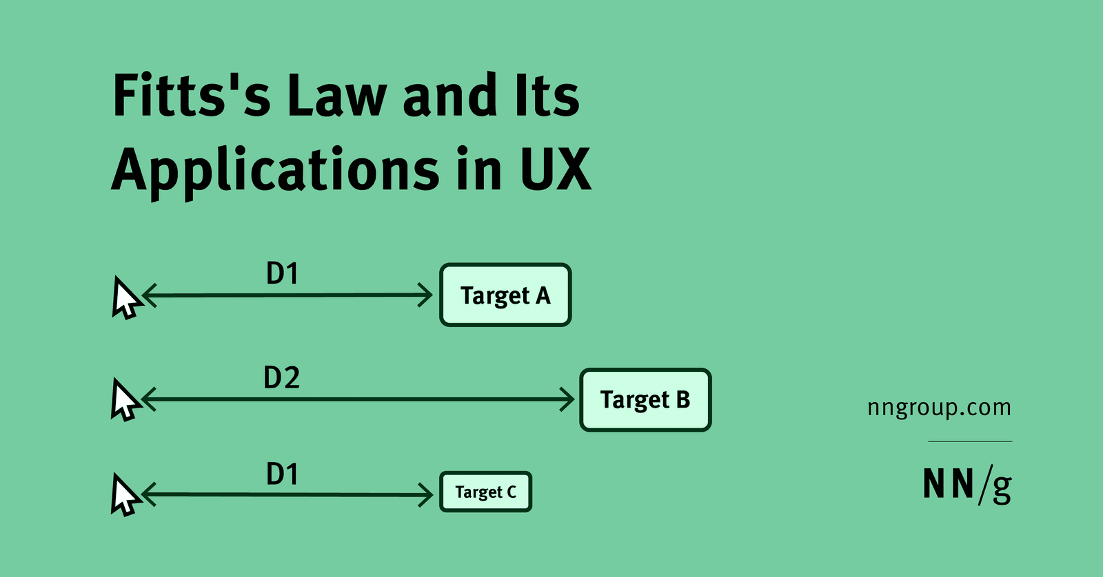
Use Fitts's Law to size and place primary vs secondary mobile actions
WHAT IT TESTS: Fitts's size-distance tradeoff applied to mobile thumb zones. OUTLINE: Large primary actions in easy thumb zones; secondary actions farther but keep minimum targets. RED FLAG: Bigger buttons alone, ignoring distance or finger precision.

How do you model and articulate long-term design debt cost to stakeholders?
WHAT IT TESTS: Quantifying UX debt as compound interest on rework and churn. ANSWER: Estimate refactor hours and support tickets; show fixes cost 3-5x more later; map inconsistency to trust erosion. RED FLAG: Treating it as taste not system tax.
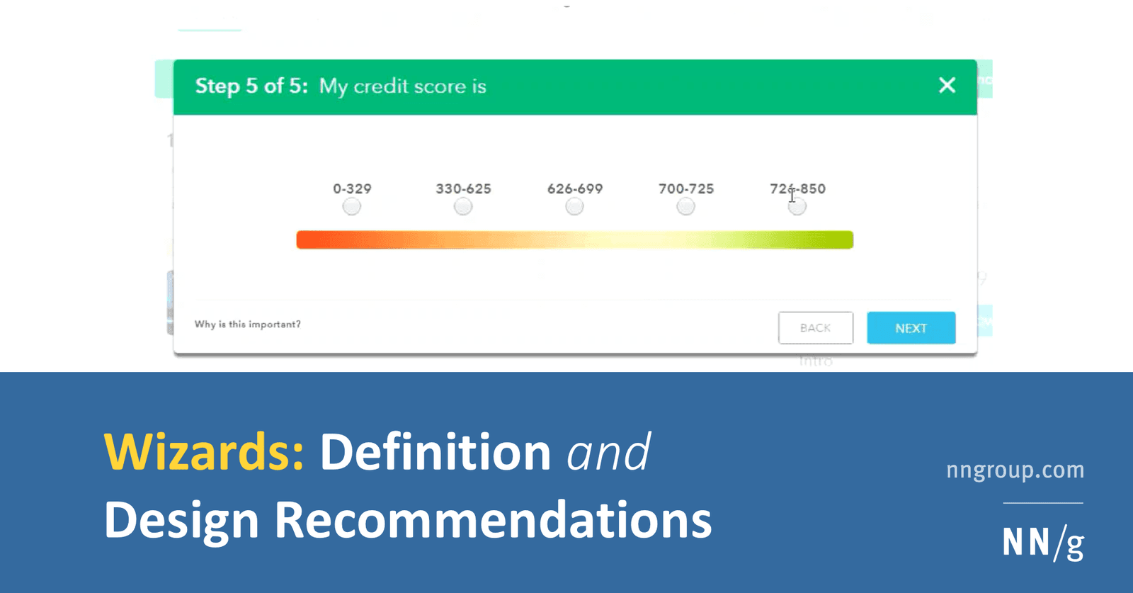
How do you design a low-cognitive-load wizard and implement it technically?
WHAT IT TESTS: pairing progressive disclosure with solid architecture. A strong answer hits step validation, URL-synced navigation, and isolated step components. RED FLAG: one monolithic form using only local useState without validation boundaries.
How does affordance guide choosing a native button over a styled div?
This tests if you see affordance as built-in behavior, not only looks. A strong answer picks the native button for free keyboard, focus, and reader support, noting a div needs tabindex, role, and keydown logic. A red flag is treating it as purely visual.

How do you apply progressive disclosure and hierarchy in complex data tables?
This tests layered UI decomposition. Strong answer: default to essential columns with horizontal dividers; disclose sort and filter on interaction; paginate at 48-56px row height; apply contrast and color cues sparingly.
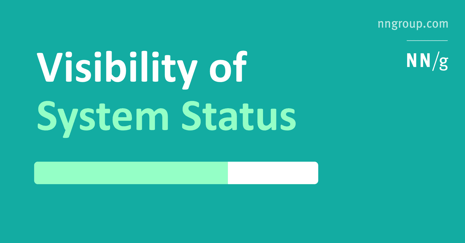
How would you show system status during a multi-megabyte file upload?
Tests turning Nielsen's heuristic into concrete frontend patterns for uncertain waits. Cover granular progress like percent and bytes, distinct states for upload versus processing, time estimates, and error recovery.
Explain UI feedback and implement immediate feedback for API calls
WHAT IT TESTS: Connecting Nielsen's system-status heuristic to frontend architecture. ANSWER OUTLINE: Define feedback as real-time state communication; describe optimistic UI or spinners resolving to success or error after the API call.
What is a design system's purpose and how does it enforce consistency?
This tests if you see a design system as a single source of truth for design, not just a UI kit. A strong answer cites components and style guides that standardize output. Calling it only a Figma file without developer adoption is a red flag.
Section-Scoped Variable Modes in Figma
A Figma section acts as a local variable mode override, letting you park dark-mode beside light-mode on the same page. Watch out for nested sections: conflicting mode overrides stack silently, and the deepest scope always wins without warning.
Generative AI Plugins in Figma
Figma AI plugins are a junior designer on demand: prompt for UI, copy, or images and get editable layers. Use them to unblock frames. Never ship raw output; generated layers break auto-layout and ignore accessibility, so treat them as scratchpads, not specs.