More in Product Management — page 31
Explain correlation vs. causation with a software example
This tests your critical thinking about data and ability to avoid logical fallacies. A good answer defines both terms, then gives a software example where a third, confounding variable (like traffic) is the true cause of two correlated metrics.
A/B test p-value is 0.08, PM wants to ship. What now?
Tests if you can translate statistical risk into business terms for a PM. A good answer defines the 8% false positive risk, weighs it against the cost of shipping, and suggests next steps like running the test longer instead of just saying no.
What does a p-value of 0.03 mean in an A/B test?
This tests your grasp of statistical significance and ability to make a data-driven decision. A great answer defines p-value, compares it to alpha (0.03 < 0.05), and concludes to reject the null hypothesis. A red flag is misstating the p-value's definition.
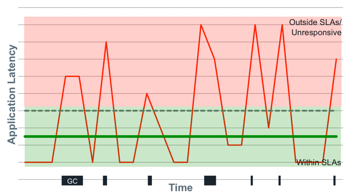
Mean vs. Median for API Response Times?
Tests your understanding of non-normal distributions like latency. Choose median as it's robust to outliers that skew the mean. Then, state that even median is insufficient; percentiles (p99, max) are crucial for capturing the full user experience.

Design a Fast, Multi-Dimensional Analytics Dashboard
This tests your grasp of data warehousing trade-offs for analytics. A great answer compares OLAP cubes (fast, pre-computed) vs. columnar DBs (flexible, real-time), then proposes a hybrid model.
How would you validate a feature's success, correcting for self-selection?
This tests your ability to separate correlation from causation. A great answer identifies self-selection bias, proposes a quasi-experimental method like Propensity Score Matching to create a control group, and then compares outcomes.
A/B Test Results with Skewed Traffic: What's Next?
This tests your ability to spot confounding variables. A good answer invalidates the results due to sampling bias, proposes segmenting the data by device to find the true effect, and suggests re-running the test with correct randomization.

How to query a monthly cohort retention table in SQL?
Tests your ability to translate a core business metric into a multi-step SQL query. A good answer finds each user's acquisition month, joins that back to their activity, and pivots the data into a cohort grid. A red flag is calculating aggregate retention.

Average latency is up 50ms, but p99 is flat. How do you diagnose this?
Tests your grasp of latency metrics. A rising average with flat p99 means the *bulk* of requests (p50-p90) slowed, not the tail. Hypothesize a common bottleneck and segment data by endpoint/user to find it. Red flag: blaming new, slow outliers.
Is Feature X Causal for 20% Higher Retention?
This tests your ability to separate correlation from causation. A great answer first identifies confounding variables (e.g., power users), then proposes an A/B test to isolate the feature's true effect, and finally suggests quasi-experiments if a test isn't…
DAU dropped 10%. How do you investigate?
Tests structured problem diagnosis. First, verify the data isn't corrupt. Then, segment the drop by user type (new vs. returning), platform (iOS/Android/Web), and geography to isolate the 'what' before hypothesizing the 'why'.
How would you visually represent statistical uncertainty in a chart?
This tests your ability to accurately communicate statistical significance. A great answer discusses error bars (with 95% CIs), then more advanced options like gradient or violin plots, and frames the choice by audience.
Strategy for Visualizing Millions of Time-Series Points
Tests your strategy for balancing performance and visual fidelity with large datasets. Propose backend downsampling with an algorithm like LTTB to preserve peaks, then discuss multi-resolution data fetching on the frontend.

Explain pre-attentive attributes in data visualization
Tests designing high-signal UIs. Define pre-attentive attributes as visual cues processed instantly (e.g., color, size, shape). Apply one to make key data 'pop' in a dense chart.
Stakeholder claims correlation implies causation. How do you investigate?
This tests your scientific rigor beyond the simple "correlation isn't causation" mantra. Acknowledge the finding, probe for confounding variables, suggest cohort analysis, and propose an A/B test. A red flag is reciting the mantra without a concrete plan.

How would you design a product management dashboard?
This tests your ability to structure data hierarchically for a specific persona (PM). A great answer outlines a 3-tier structure: summary KPIs, trend analysis, and drill-downs. A red flag is listing charts without explaining how they guide PM decisions.
Bar Chart vs. Line Chart for Market Share Comparison?
This tests your grasp of visualization fundamentals for categorical vs. time-series data. A bar chart is correct for comparing discrete categories (companies) at one point in time. A line chart wrongly implies a trend. Red flag: justifying a line chart.

When is a pie chart an appropriate visualization?
Tests your grasp of data viz principles for part-to-whole data. A good answer defines this use case (e.g., market share), then lists pitfalls like too many slices or comparing multiple pies. A red flag is defending pie charts for complex data.

How do you manage schema evolution in an analytics pipeline?
This tests your grasp of data as a contract. A great answer covers schema registries, backward compatibility, and a phased rollout from producer to warehouse. A red flag is only mentioning an `ALTER TABLE` command, ignoring the entire data pipeline.
Challenges of Grouping by High-Cardinality Dimensions
This tests your grasp of system-level impacts of data shape. A good answer explains how high cardinality strains memory during aggregation, reduces compression, and inflates index size, leading to slow, expensive queries. A red flag is just saying 'it's slow'.